A report visual is useful when it displays information in a meaningful context. This context refers to other relevant data that helps someone interpret figures in a visual and use it to make decisions or take actions. The most common way to provide context is to compare actuals to a target.
There are many ways to compare actuals to a target, and in this article, we will explain in detail one way to do this by using a popular variant of the bar chart known as a bullet chart.

In the rest of this article, we will explain the use-cases for charts like this, what different chart types you can use, and the different ways to build a bullet chart in Power BI reports. As always, at the bottom of the article, you can find the .pbix files and templates to apply these charts to your own reports.
Providing context in reports
Before we continue, it is important to first understand why we use visuals like this to compare actuals and target. Why do we not show the actuals alone, or show everything in one big table or matrix?
Consider the following card and bar chart, which shows Sales Amount by product category in a report. When you look at these visuals, try to interpret the numbers; what do they mean to you?
- Are these sales good or bad?
- How good or bad are they?
- If you were a user of this report, do you think this would be useful?
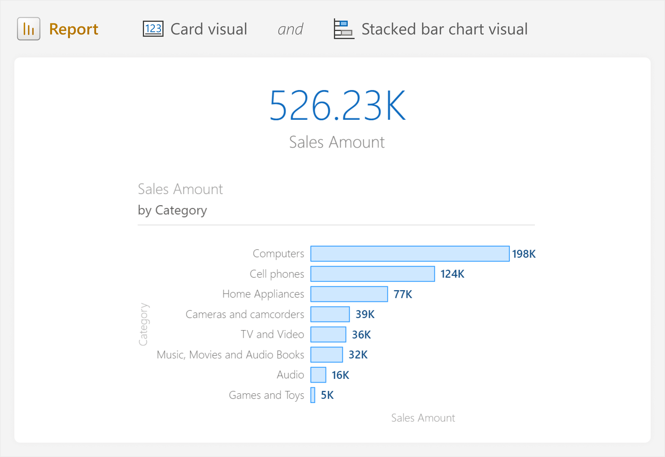
Trying to interpret these visuals, you probably thought: This means nothing to me; I have no idea if this is good or bad. This is true; unless you implicitly know something about this business, it is impossible to interpret these figures because the visual lacks context. Context is what makes a visual useful because it provides that meaning. In this case, the only context we have is comparing categories; for instance, “Computers” sell much more than the rest. We have no idea, however, if the total sales of 526K is good or bad (sentiment), how good or bad it is (magnitude), and whether the situation is improving or getting worse (trend over time).
A good report provides sufficient context to interpret the visuals, but what context could we show?
Choosing what context to show
To provide context, we could compare Sales Amount to a target. Common targets might be a budget, forecast, previous period, or an average or median by category. In this case, we can compare the sales figures to sales in the same period of the previous year. To do this, we will calculate Sales Amount for the same period of the previous year, hiding future dates for the DAX calculation. This ensures a valid comparison of the current year in progress to the previous year (without using a cumulative year-to-date calculation).
The date table includes a calculated column to flag only dates that contain sales:
Dates with Sales =
VAR _LatestDateWithSales =
    MAX ( 'Sales'[Order Date] )
RETURN
    IF (
        'Date'[Date] < _LatestDateWithSales,
        TRUE,
        FALSE
    )
We use this calculated column in a measure for the target, Sales Amount (PY):
Sales Amount (PY) =
    CALCULATE (
        [Sales Amount],
        CALCULATETABLE (
            SAMEPERIODLASTYEAR ( 'Date'[Date] ), -- Table of dates for previous year
            'Date'[Dates with Sales] = TRUE      -- Filter to only dates with sales
        )
    )
We might then use this target to calculate a comparison between actual and target, such as Sales Amount vs. PY (%), which shows the difference in percent, or Sales Amount vs. PY (Δ), which shows the difference in dollars. Choosing between these two options, we could then visualize the difference between actual and target to provide some of the missing context.
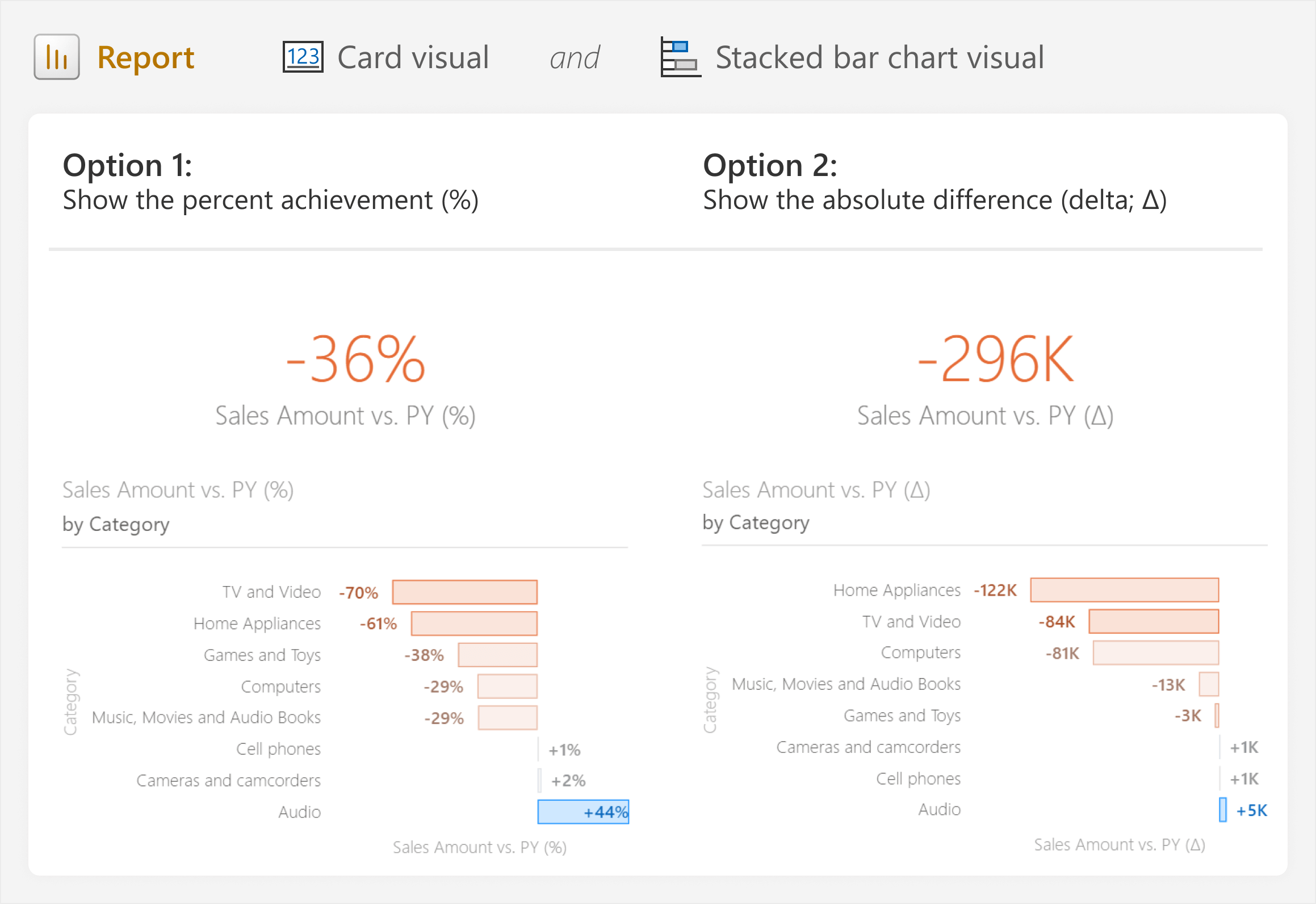
Either of these options is better than the original bar chart, because they quickly help to address the root question about whether sales performance is good or not; how each category is performing. Depending on the specific purpose of the report, you might opt for the first or second option:
- Option 1 is a good choice to show the relative achievement, which helps show which category is performing the worst compared to its own target.
- Option 2 is a good choice to show the magnitude difference, which helps to identify which categories are having the biggest impact on overall sales performance.
However, both options still lack important information:
- Option 1 lacks context about the impact of the difference on the total sales performance. For instance, “Games and Toys” is -38% compared to the previous year, but is it meaningful in the context of our total sales performance? Should we focus on this, or another category, instead?
- Option 2 lacks context about the impact of the difference within the sales of a category. For instance, “Audio” is overperforming by 5K, but is this a lot for the “Audio” category (and thus a big achievement), or is it only a narrow over-achievement?
- Both option 1 and option 2 lack information about what the absolute sales figures actually are. We can say we are -36% or -296K compared to the previous year… but what are the total sales?
One way to provide this additional contextual information is by adding it to the tooltip. That way, when a user hovers over the category, they can see additional information aside from what is shown in the visuals.
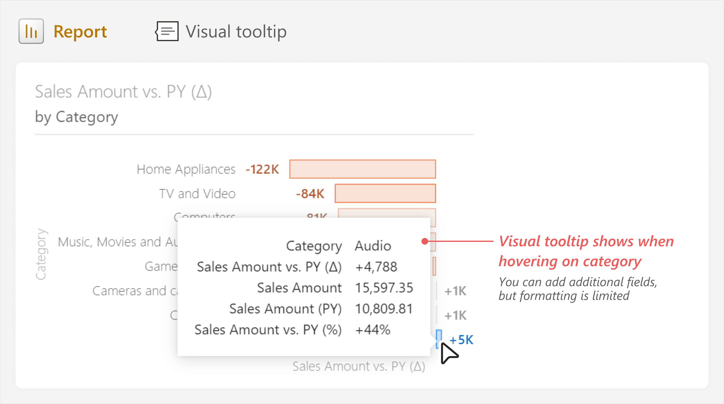
However, tooltips have limited formatting options and can be inconvenient for users who want to view these figures without interaction. Additionally, tooltips are also impractical to compare categories within or across visuals. Providing the right amount of context becomes even more challenging when you have multiple targets.
For this reason, it is very common to see both report creators and users turn to matrix and table visuals to show all the contextual information at once. While this might seem straightforward and convenient, it can quickly turn into “The One Table to Rule Them All”, which contains too much information.
The following table is a simple example with a single measure and target; in real reports, such a table often has multiple categories, measures, and targets.
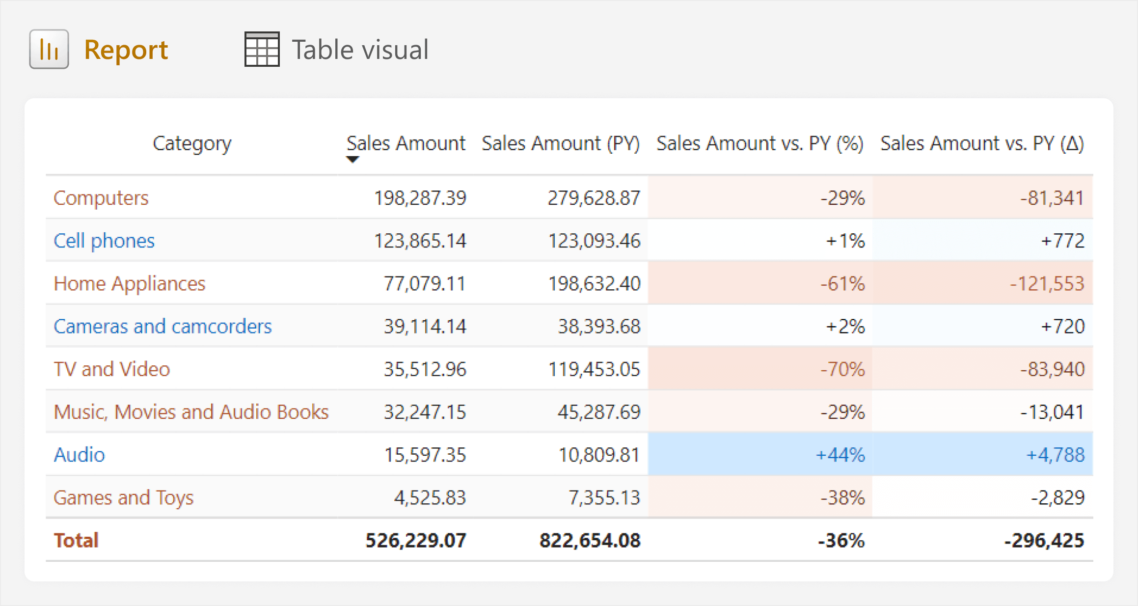
These tables and matrixes become overwhelming and inefficient to use, as users spend too much time looking for or thinking about the numbers. These tables are also often a precursor to “data dumps” that users export to Excel, so that they can more easily find what they need. This situation is not ideal, and usually indicative that you are not getting the most from Power BI.
Choosing what context to show is a common challenge for many report developers, because there is no single, easy answer. Showing everything is inefficient, yet choosing one measure might leave out part of the picture that some users prefer or need. This emphasizes again the importance of good requirements gathering. When you gather good requirements, you understand the business problems and questions the report should address, and what information reports should show to enable people to do their jobs and achieve their objectives.
Choosing what to show is only half the battle. You also have to choose how to best show it.
Choosing how to show context
In the previous section, we showed several different ways that you can compare actuals to targets in Power BI, like comparing actual results to budgeted results, or comparing actual results to previous years. There are many more chart types that you can use for this, as shown below.
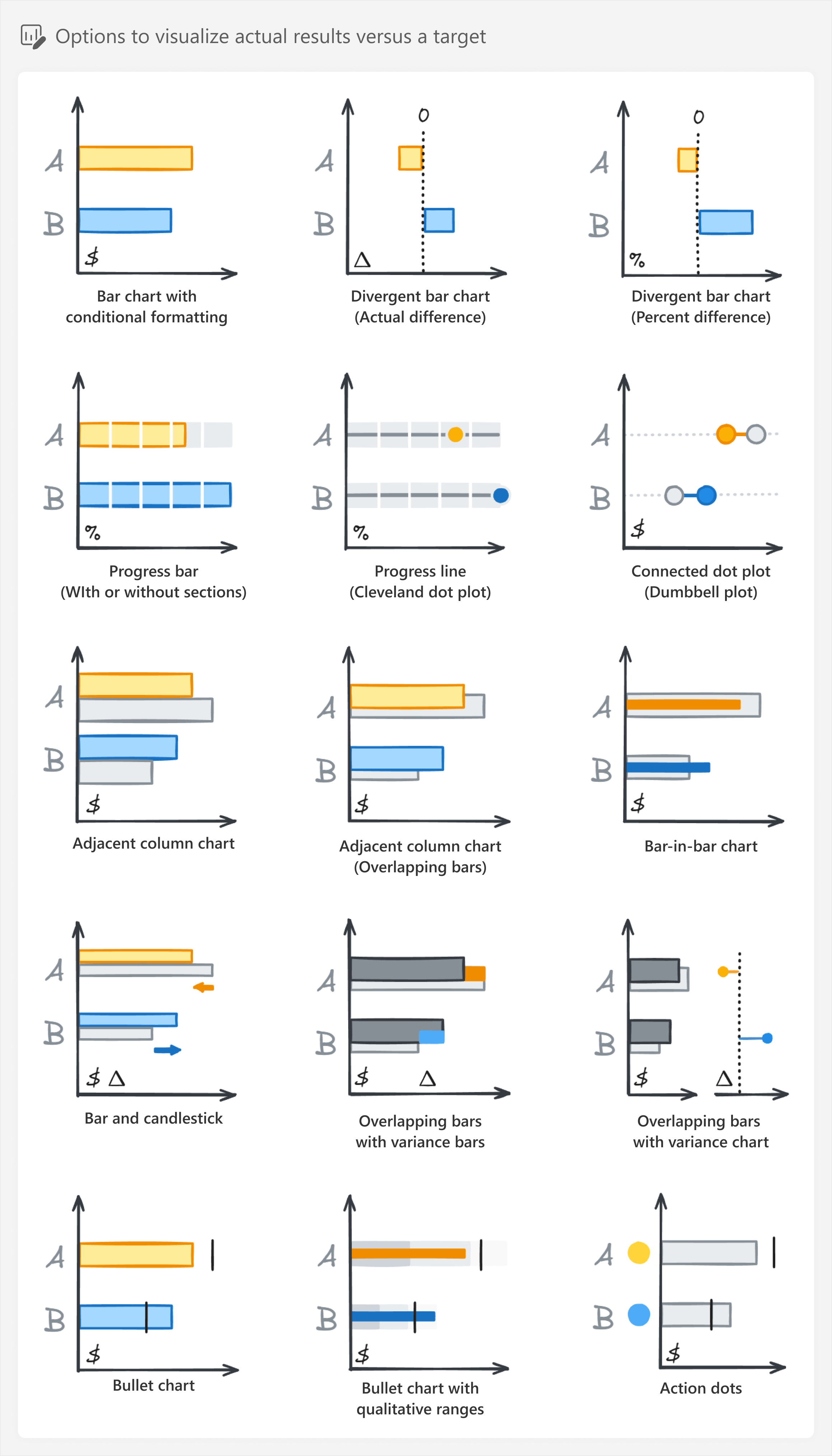
A common and popular choice that is straightforward to build in Power BI is the bullet chart, which is in the bottom-left of the previous diagram. The bullet chart is not a “core visual” available out-of-the-box in Power BI, so we will show you several different ways to make one using some custom visuals.
Building the bullet chart
The bullet chart (or bullet graph) was originally designed by Steven Few (2005), and has become a common chart type to compare figures to a target. The bullet chart is popular because it is simple, making it easy-to-read. It is also compact, meaning it can effectively show a lot of information at once. Furthermore, when thinking about the 3-30-300 rule, you can use a bullet chart both in a 3-second view to help effectively show an overview, but also in the 30-second view to help users filter and zoom on certain categories.
You can see common parts of a bullet chart explained in the following diagram.
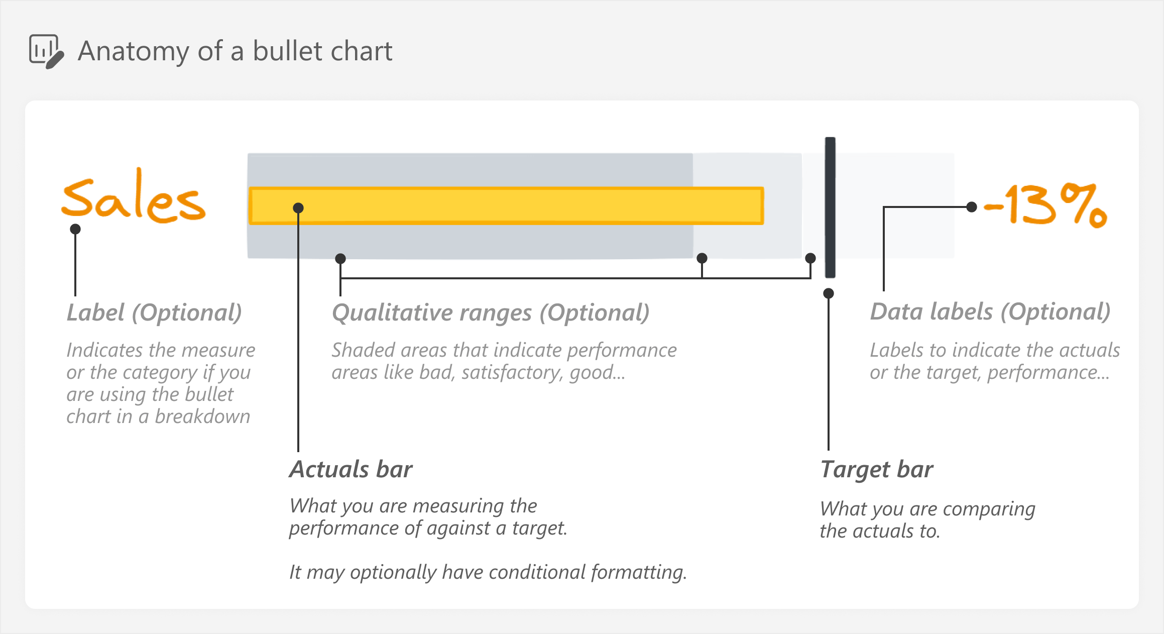
Note that the optional elements of the bullet chart produce a lot of possible variants, depending on how you decide to implement it. In Power BI reports, generally, you might not include qualitative ranges if such data is not available. You might try to include some arbitrary qualitative ranges, but it is important that you first agree upon this with users before you implement it, otherwise they might not understand (or agree) with these ranges.
In the rest of this article, we will focus on building a bullet chart for a single target. Since the bullet chart is not a core visual, we need to choose from the custom visual approaches described in a previous article.
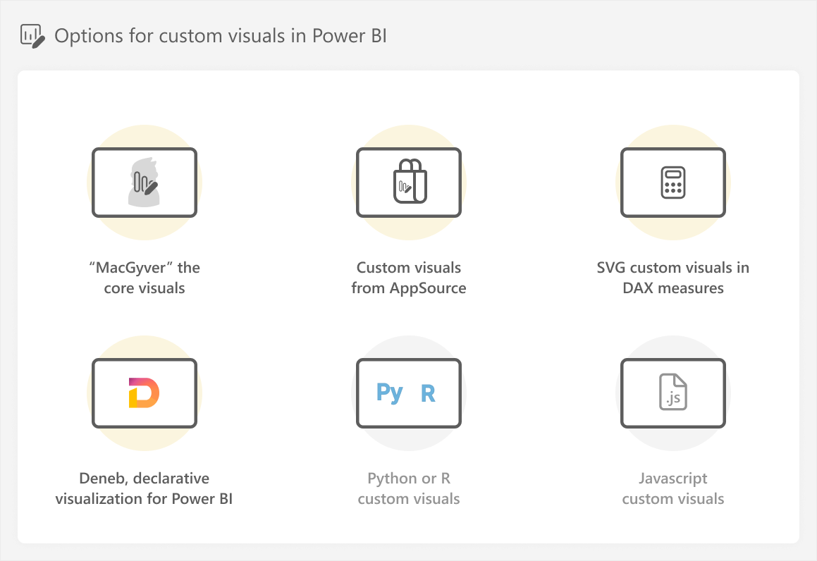
We will walk through each of these approaches, except for Python, R, and Javascript custom visuals. The reason for that is that you typically choose to use Python, R, or Javascript when you are already proficient in these languages, or you plan to use the code in other applications.
MacGyvering core visuals to build a bullet chart
In the first approach, we can use formatting tricks with the standard bar chart visuals in Power BI to create a basic bullet chart. To “MacGyver” a bullet chart from the core visuals, we start from our original chart showing Sales Amount by product category.
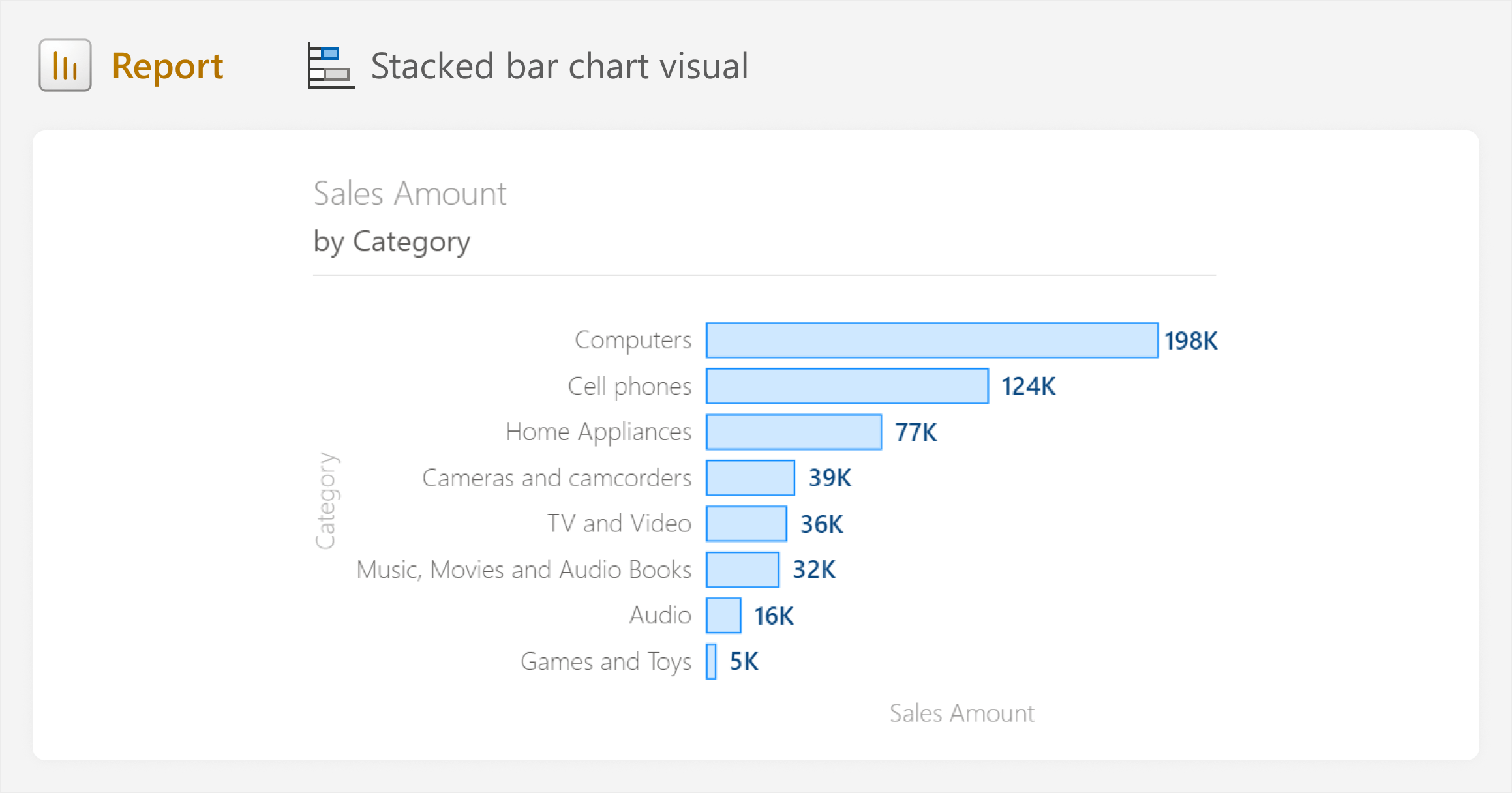
From here, all we need to do is add the line that marks the target. We can do this by adding the Sales Amount (PY) target to the “Error bars” (both the upper and lower bounds) after we enable them. Error bars are typically used in visuals to show uncertainty or variation in the data. However, in this case, we are instead only using them to force the appearance of a marker at the position of the target.
Once we enable the error bars, we format the bar and marker width to their maximum values (10 px) and set the border width to the minimum (0 px). The result is that we have a large vertical marker at Sales Amount (PY) which we can compare to the target of Sales Amount.
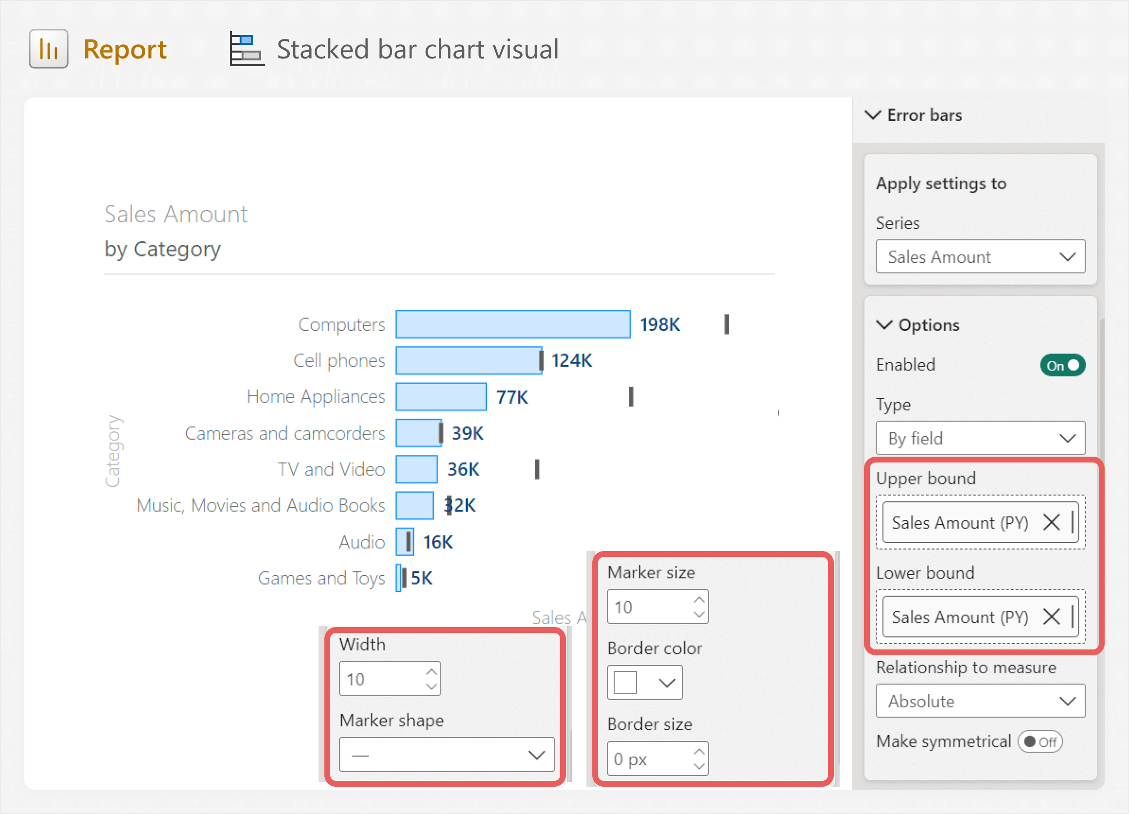
This already gives our result. However, we could improve this further with some additional formatting, such as:
- Increasing the space between categories to shrink down bars.
- Conditionally formatting bars and data labels to highlight underperforming categories.
- Adding gridlines to visually identify the values without labels.
- Modifying the title so that it is clear we are comparing Sales Amount to the previous year.
The result of our bullet chart would look like the following.
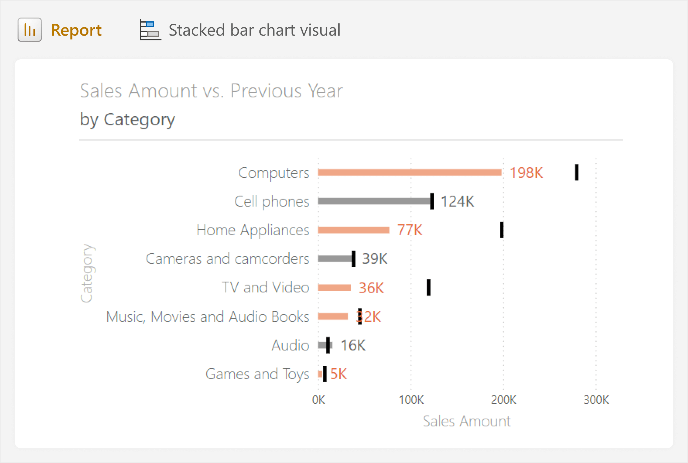
MacGuyvering a bullet chart from core visuals is straightforward, and in simple scenarios when comparing categories, it might be the best approach. However, formatting limitations might prevent you from using this approach to visualize aggregate performance, or adding other improvements like the qualitative ranges behind bars. When you need more advanced formatting or customization, you are better to consider one of the other approaches as an alternative.
Using an out-of-the-box bullet chart custom visual
If enabled in your tenant, you can use custom visuals created by other third-parties on AppSource. You can browse for custom visuals by selecting the ellipses (…) on the visualization (build) pane, then selecting “Get more visuals”. If you do not see this option, then custom visuals might be disabled by your Fabric administrator. In this scenario, if you need custom visuals, consider putting together a business case for an exception, explaining the potential value of enabling whitelisted or certified visuals.
The following diagram shows you how to search AppSource for out-of-the-box bullet chart custom visuals.
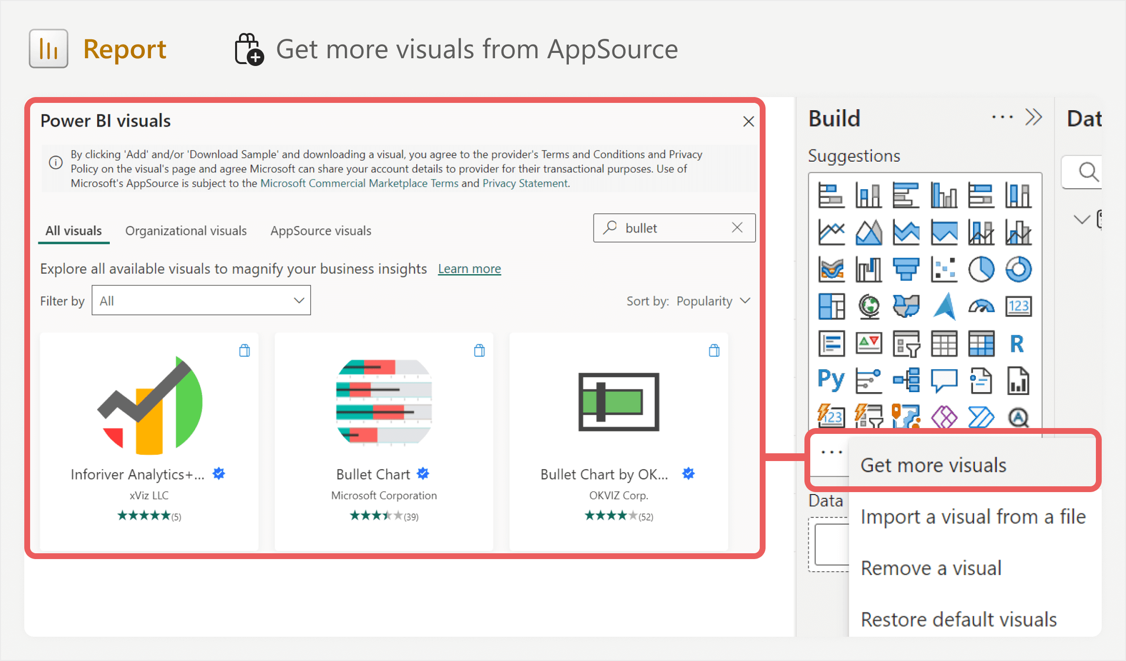
When you select a custom visual to add to your report, it appears among the core visuals in the visualizations pane for this .pbix file. You can set it to appear for all future reports by right-clicking the visual icon and selecting “Pin to visualizations pane”.
There are several different custom visuals available for a bullet chart, each of which have their own configuration, customization, and limitations. What is important to know is that the custom visuals from AppSource might have some features which are unlocked by paying for a paid license. Some custom visuals are open source (free), while you often pay for others that have advanced customization and features.
The following diagram shows an example of the free version of the OKVIZ bullet chart (Shameless plug: OKVIZ is part of SQLBI):
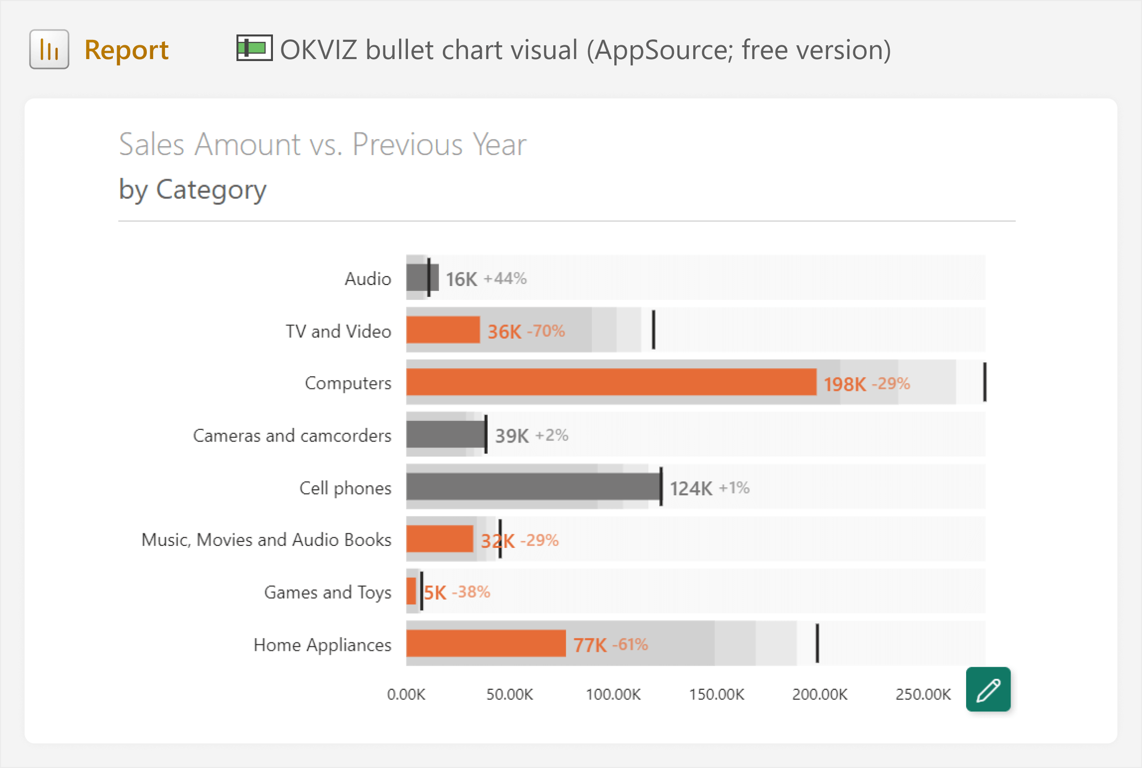
Even when using the free version of the OKVIZ bullet chart visual, we can recreate the bullet chart from the core visuals more easily. We also have more formatting options, like adding the qualitative ranges. With a paid license, there are additional options available, like saving and re-using templates, showing variance, additional label options, and even incremental loading for faster visual rendering.
For common chart types like a bullet chart, custom visuals from AppSource can be a very good choice, because they are often easier and quicker to both set up and maintain. For paid custom visuals, the time saved might be worth the investment compared to other approaches.
However, custom visuals are still limited to only the options that their developers provide. Furthermore, any issues with these custom visuals require support from the developers. For open source custom visuals, this might mean that an important visual in your report could stop working after a Power BI update, and you are unable to fix it until the developer of that visual can or chooses to do so.
If the out-of-the-box custom visuals do not have the options that you need, then you might consider making your own bullet chart, for example, in Deneb.
Building a bullet chart in Deneb
Another custom visual that you can get from AppSource is called Deneb. Deneb is different from other custom visuals, because it lets you define your own visual using the Vega or Vega-Lite specifications. Unless you have used Deneb before, this probably means nothing to you. To put it in simple terms, in Deneb, you can create your own visual by using a JSON-like syntax, or starting from a template. This syntax lets you essentially create and format the visual however you like by defining how it works and looks in this specification. However, creating your own visual does cost significantly more time and effort.
A Vega-Lite JSON specification for a bullet chart is already available, so we can use this as a starting point. The first step is to get the Deneb custom visual from AppSource, and add it to the canvas. Once we do this, we should follow the instructions in the empty visual to open up the Deneb advanced editor. From there, we can either add a template (like the one in the sample files of this article) or create a new specification.
When you open Deneb’s advanced editor, it looks like the following image.
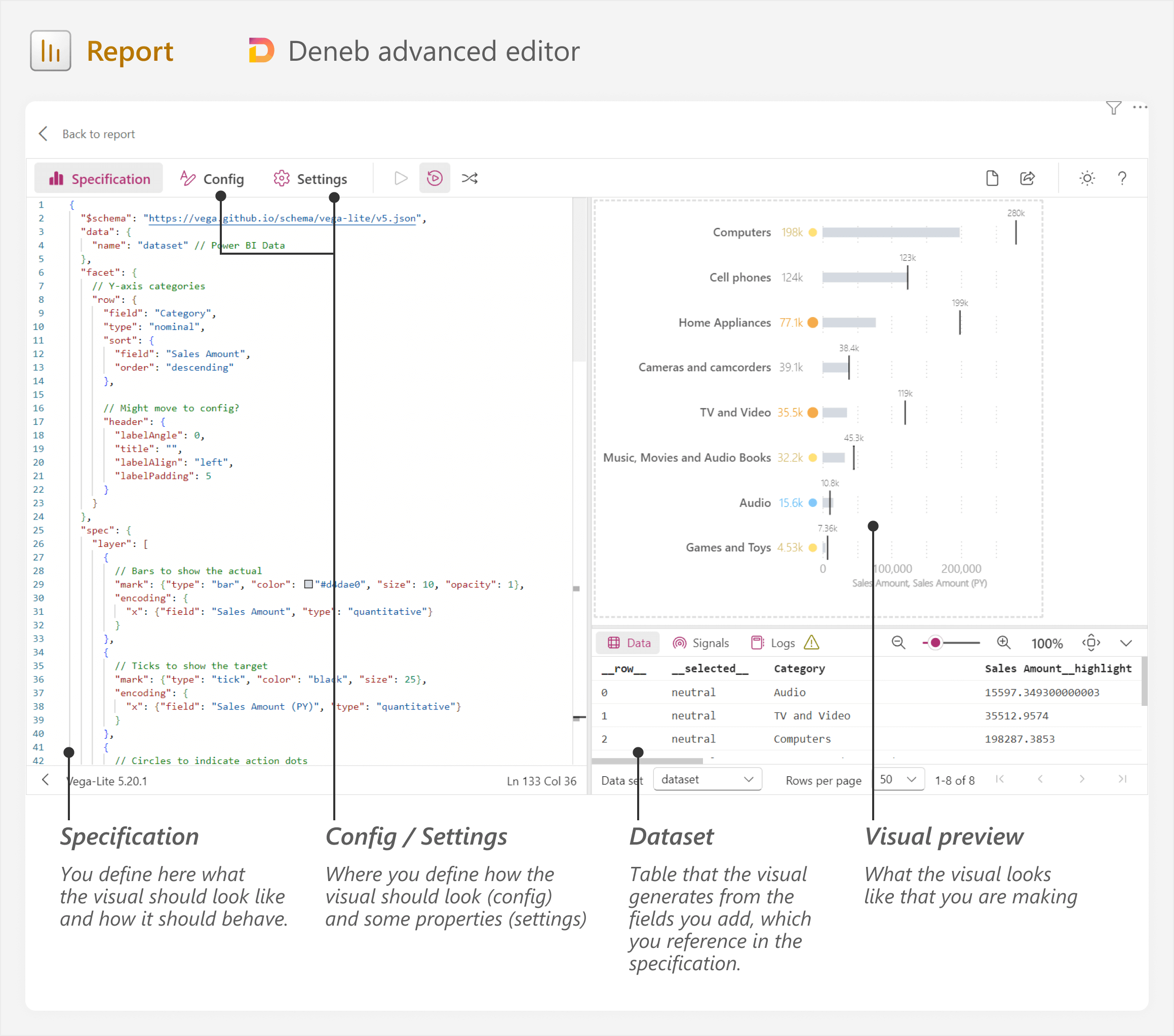
When you add fields to the Deneb visual, it creates a single-table dataset for the visual to use. You reference the fields in this dataset for your specification, and you can also see the table in the bottom-right of the advanced editor. The specification might seem complex at first glance, but it is straightforward to start using with the Vega / Vega-Lite examples. There are also many community resources and templates like those from Kerry Kolosko, Thys, Andrzej Leszkiewicz, Sentido Analítica, and others. Furthermore, LLMs like ChatGPT work quite well with these specifications, which means that you can get quite far rather quickly, with little to no experience in Deneb.
Because Deneb is very flexible, we can do things that were not possible with the previous approaches. For instance, we can take a combined approach to show both a bullet chart and action dots, including labels for actuals and target. Action dots are a useful way to draw attention to over- or under-performers.
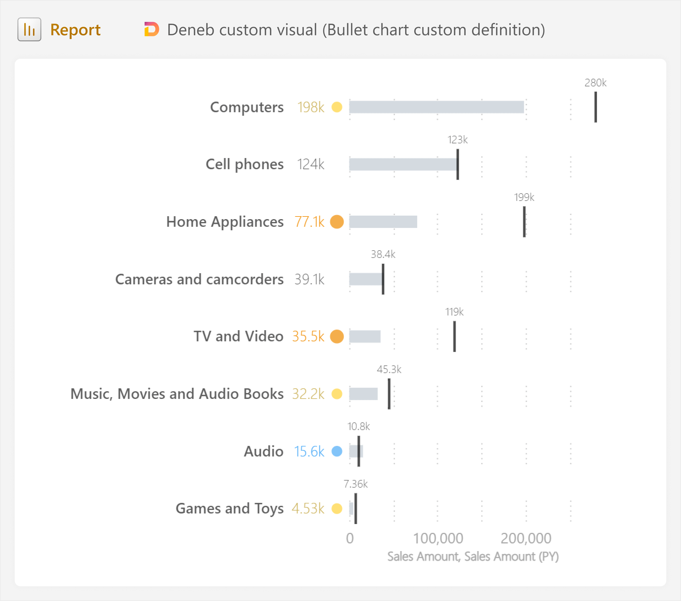
The visual that we make in Deneb is performant and responsive to other visuals and interactions in the report. However, we do need to spend additional time testing it under different conditions and filter contexts to ensure that it does not produce unexpected results (such as when there is heavy filtering, blanks, or very small / large values). It is also important to test performance and optimize the visual, if possible.
Deneb is a good choice when you want actual pixel-perfect visuals and reports, without resorting to full-blown code in Python or Javascript. However, you pay for the flexibility by dealing with the Vega / Vega-Lite specification yourself, which might cost additional time, unless you leverage templates. However, teams that have a high visual maturity level can greatly benefit from Deneb while mitigating this cost. Indeed, they can build and curate their own library of templates to re-use across reports. In case it is not clear, Deneb has a higher learning curve than the other approaches we talked about so far, but it is very powerful.
Lastly, like other AppSource visuals, if custom visuals are not an option in your organization and you are unsuccessful in lobbying to get an exception, then this option will not work for you either. Furthermore, if you only want a bullet chart to compliment an existing table or card visual, then you might consider using SVG custom visuals in DAX measures.
Designing a bullet chart using SVG custom visuals in DAX measures
All of the previous approaches assume that you want the bullet chart to be an entire visual. However, there might be cases where you want to use a bullet chart to complement an existing table or matrix. When used effectively, this can greatly reduce information density and make your tables and matrixes more effective and convenient for people to read.
To do this, you can use SVG custom visuals in DAX measures, an approach that we described in a previous article. This approach involves specifying an SVG definition as a valid string in a DAX measure, and then setting the Data Category property to ImageUrl so that it renders the SVG image. You can set vector properties (like positions, sizes, and colors) to be dynamic, which is how you make the visual. This approach also gives you full control of the visual formatting like Deneb, but it is more abstract and complex, which makes it potentially take longer and become more difficult to maintain.
To streamline this process, we can design the bullet chart entirely in Figma, and then copy the SVG definitions to a DAX measure. Next, we just turn the definition to a valid string and replace values to make the shapes dynamic.
The result of this process is shown below, with a bullet chart comparable to the one made in Deneb.
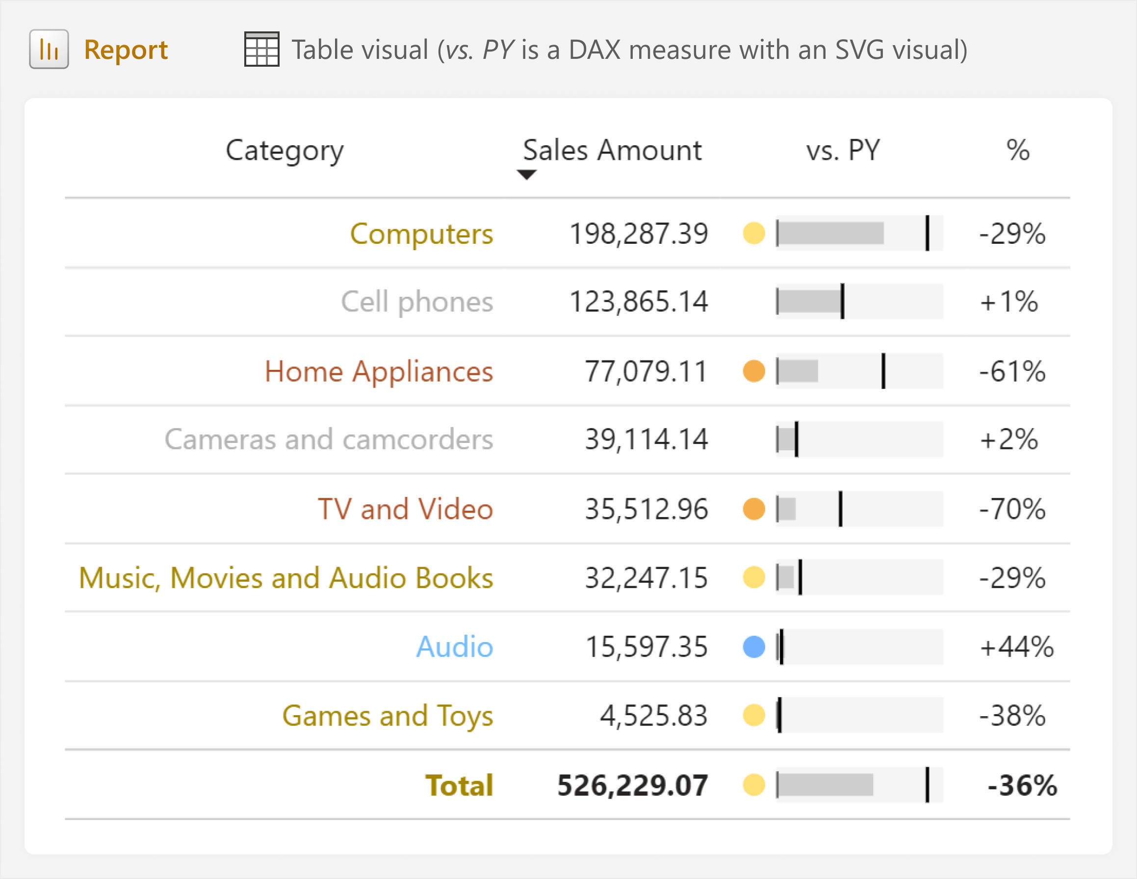
An advantage of the SVG approach is that you do not have to worry about labels, since these can be added as columns in the table or matrix. Additionally, you can potentially re-use the SVG in other visuals, like the new card or new slicer visuals. Since it simply renders the DAX measure as an image, it is supported in all reports, irrespective of administrator settings, installations, or licenses.
However, the visual is small, and without space for a legend or labels, it might be confusing for users. To mitigate this, it is important to train people on how to read and interpret the visual. You also should include a link to a FAQ page that concisely and visually explains this.
The other caveats of this approach are the same that we discussed in the previous article about creating custom visuals with DAX. Notably, these measures can be complex to maintain if not documented well. The DAX code is convoluted and hard to read, with a high risk of performance issues or bugs if we do not adequately test the visual. These report-specific measures can also pollute the semantic model if they are not properly segregated from standard model objects.
Each of the approaches we discussed have their own pros and cons, and choosing the best approach for you depends on various factors. What is important is that you balance the simplicity and maintainability of the solution with the business value it will generate. With custom visuals, you should ensure that there is a clear benefit for users; do not opt for a custom visual simply because you think it looks nice. If you ignore this advice, you may end up overcomplicating your report, making something that users find hard to read and use, and that developers find hard to fix and maintain.
As we always say, there is a difference between a report that looks nice and one that is useful.
In conclusion
Context is something that we usually talk about with regard to filter, row, and visual context in DAX evaluations. However, context is also important in your visuals; giving numbers meaning. Visuals with context make your reports more useful. One way to show context in visuals is to compare to a target, which you can do effectively by using a bullet chart. While this is not one of the default chart types of Power BI, you can make a bullet chart using custom visuals with different approaches, each of which comes with its own benefits and caveats that you should weigh before deciding what you will implement.
 Kurt Buhler