 Kurt Buhler
Effective visualizations provide context so that you can interpret the numbers and what they mean to you. Is this number bad or is it good? This is particularly important for visuals that aim to provide a quick, 3-second overview, like cards, KPIs, and simple trendlines. You can provide context by comparing to a target, but if no target is available, you can also compare to a measure of central tendency, like the average or median. However, instead of comparing to an aggregate, you might also want to compare to other categories.
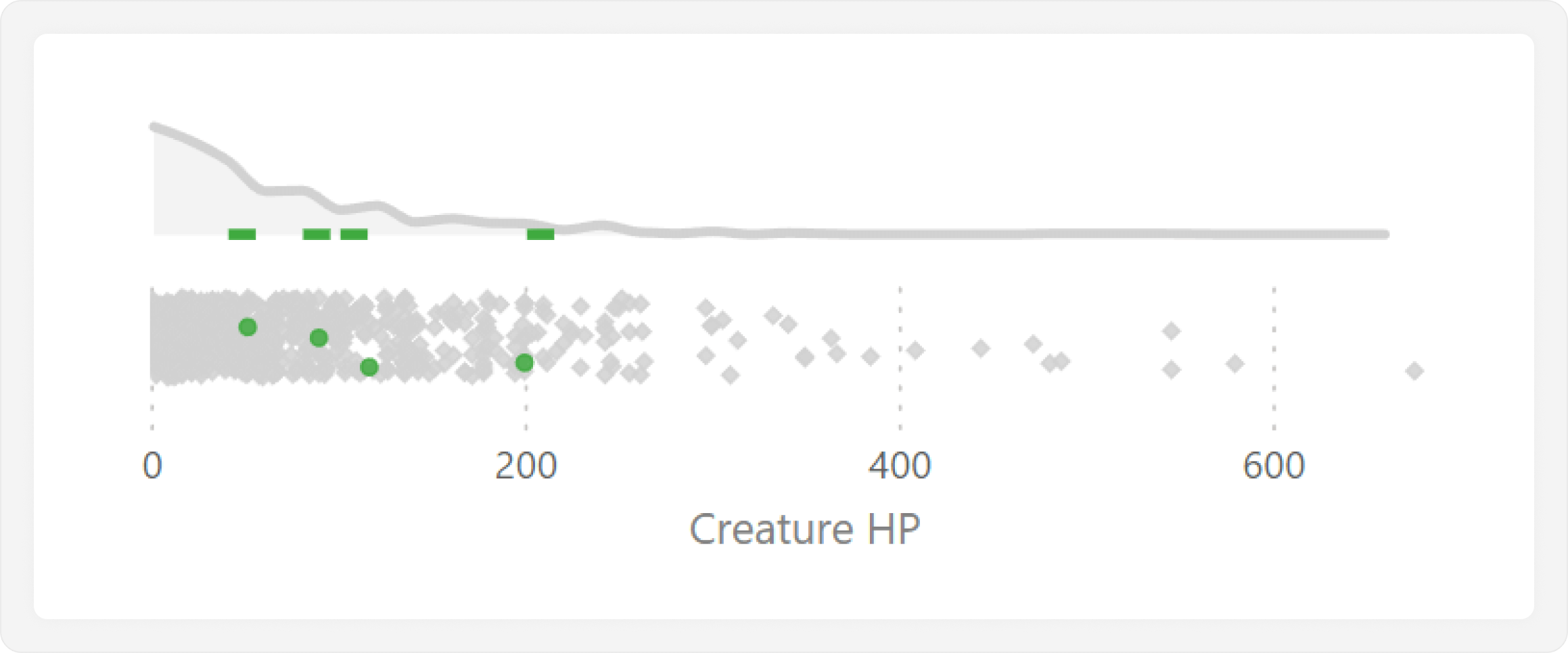
Consider the following example, which shows the desired end result for this article: a plot which highlights a selected value so that the user can compare it to all others. This example uses some DAX and formatting with a line chart and scatterplot to achieve the result of a joint plot atop a jitter plot. If you want to learn more about what a joint plot or a jitter plot is, we gave an overview of these and similar chart types in a previous article.
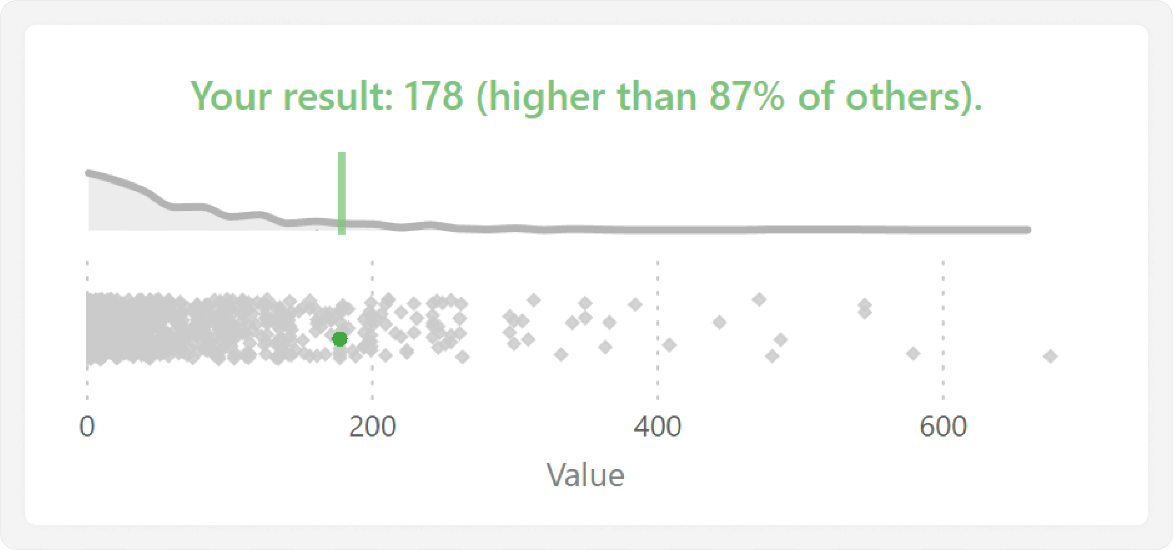
In this example, we are highlighting a single data point to compare to others in a distribution. This way, we can see the full context, including the total number of data points, their distribution, and what the highest and lowest values are. This approach is particularly useful when distributions are atypical, such as when outliers or clusters of data points offset an average, or when it is important to show the number of data points.
There are many possible real-world scenarios where you might want to apply this approach. For instance, you might want to show target achievement of an individual (like a sales representative) or sales of a category (like customer) compared to all others. You often use charts like this when creating drillthrough reports.
For this article, we are going to have some fun and look at a not-so-real world example. We will conduct this analysis by using the statistics of fantasy creatures from the open-source Basic Rules of the tabletop roleplaying game Dungeons & Dragons.
Creating a jitter plot
In this analysis, we want to analyze various statistics of different creatures, such as their health, or hit points (HP). Generally, the purpose of this report is to examine one creature at a time, and compare its statistics to all other creatures. To do this, we will use a type of scatterplot called a jitter plot (or swarm plot), which lets us compare the distribution of data points for a single measure.
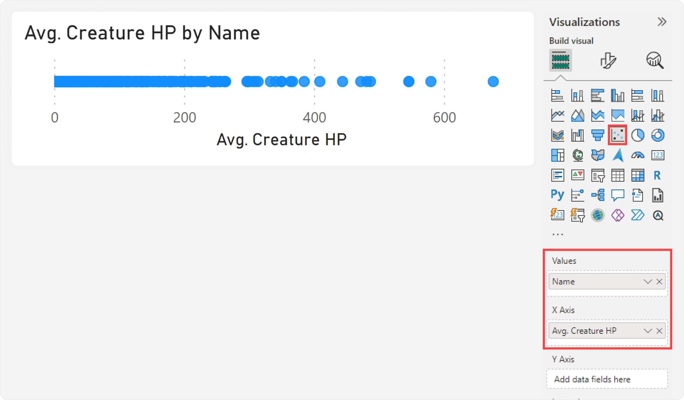
A jitter plot is not a default chart type, although there are scenarios where we can create one by using the scatterplot core visual. The first step is to create the jitter plot to visualize the distribution of a single metric for all creatures. To do this, we first create a measure to compute Avg. Creature HP and add it to the values of the scatterplot visual, and then add the Name of the Creature to the “Values” field well:
Avg. Creature HP = AVERAGE ( 'Creatures'[HP] )
This results in the following scatterplot, re-sized to have a greater width than height.
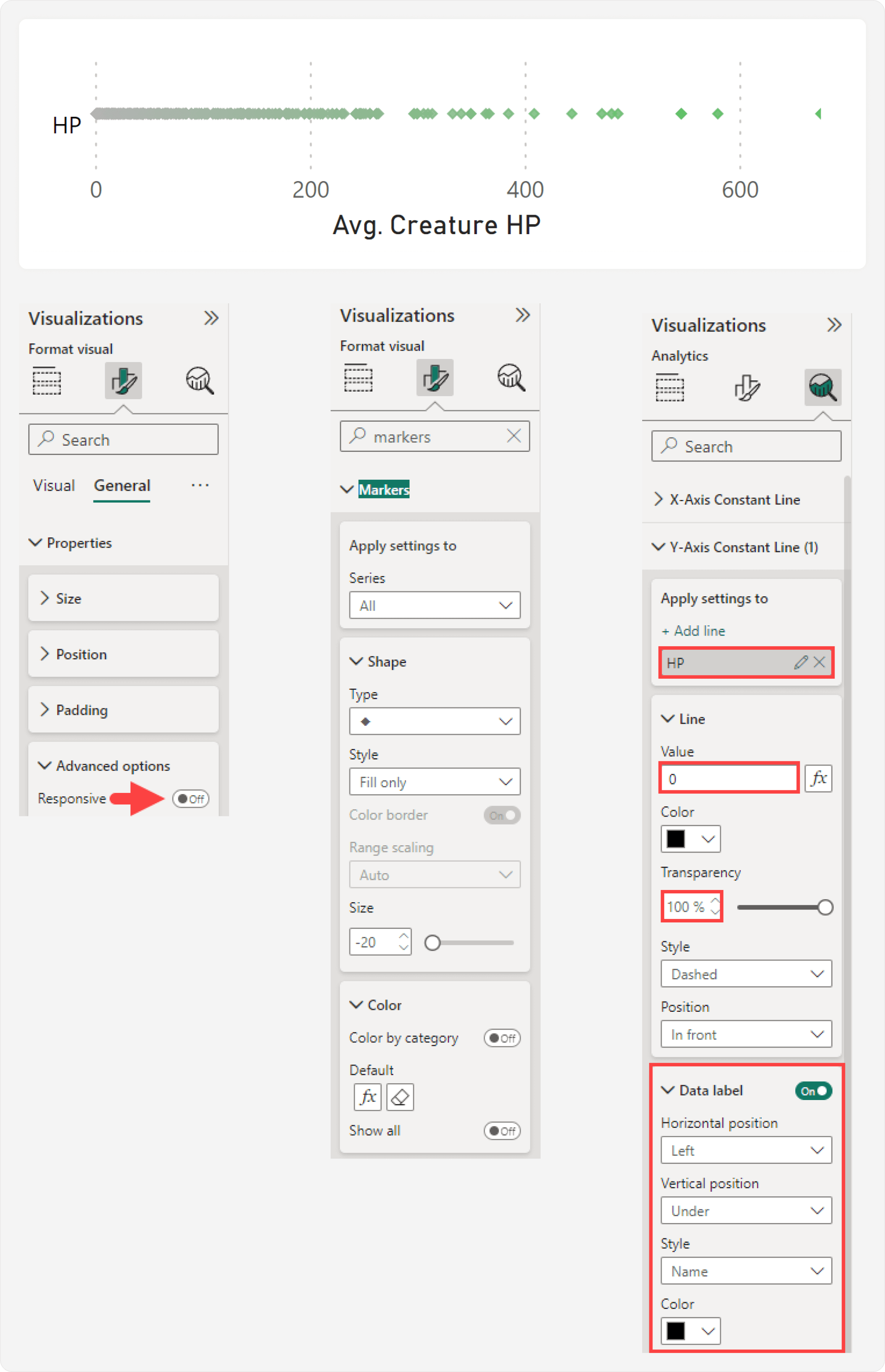
To use a scatterplot this way, you should disable the Responsive property for the general settings of the visual container. Additionally, you can already format the markers, title, and axes at this point. One formatting trick that is helpful involves adding a Y-axis label, to more clearly indicate where the chart begins. This Y-axis label is actually a Y-axis constant line named “HP”, visible because the X-axis minimum is set to a lower negative value.
In theory, we could stop here with this dot plot, as it already shows the distribution. However, this is not effective, as overlapping data points are hard to distinguish. The overlap detracts from the analysis, as it obfuscates the number of data points and any groups that might be present. To solve this problem, we proceed with the next step, which is adding random jitter—or scatter—to the Y-axis.
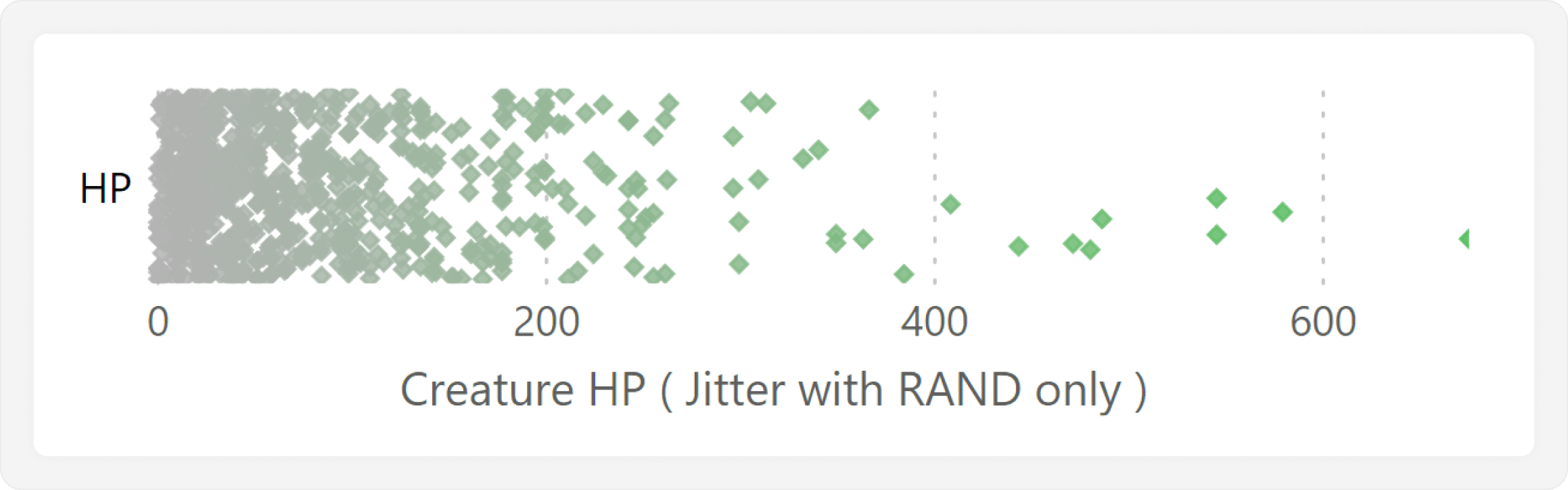
Adding the jitter simply means that we distribute the data points randomly along the Y-axis so that they are less likely to overlap. We can do this by using the RAND DAX function in a measure, which returns a random number between 0 and 1 for each data point:
Jitter (RAND) = RAND ()
When we add this measure to the Y-axis, it is easier to see the number and distribution of the data points. Note that in a measure, RAND will evaluate to a different random number each time the user interacts with the report. This is annoying, because the data points jump around along the Y-axis, and can mislead the user to think that they are filtering the visual. We fix this later by moving the jitter to a calculated column, which is instead only evaluated when its table is refreshed.
Looking at the jitter plot, we see that the data points scatter across a lot of vertical space and make the chart look cluttered. We can adjust this by adjusting the jitter to make it more conservative:
Jitter (Adjusted RAND) = ( RAND () – 0.5 ) * 0.9
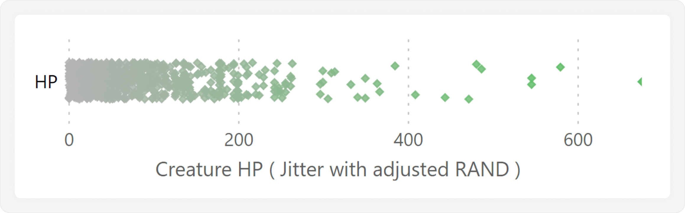
This results in the swarm plot which shows the distribution of creature HP. We can clearly see that it is a left-skewed distribution, where the vast majority of creatures have low HP, and a few very powerful creatures have high HP. The next step is to add functionality where we can select a single monster, and highlight it in this jitter plot.
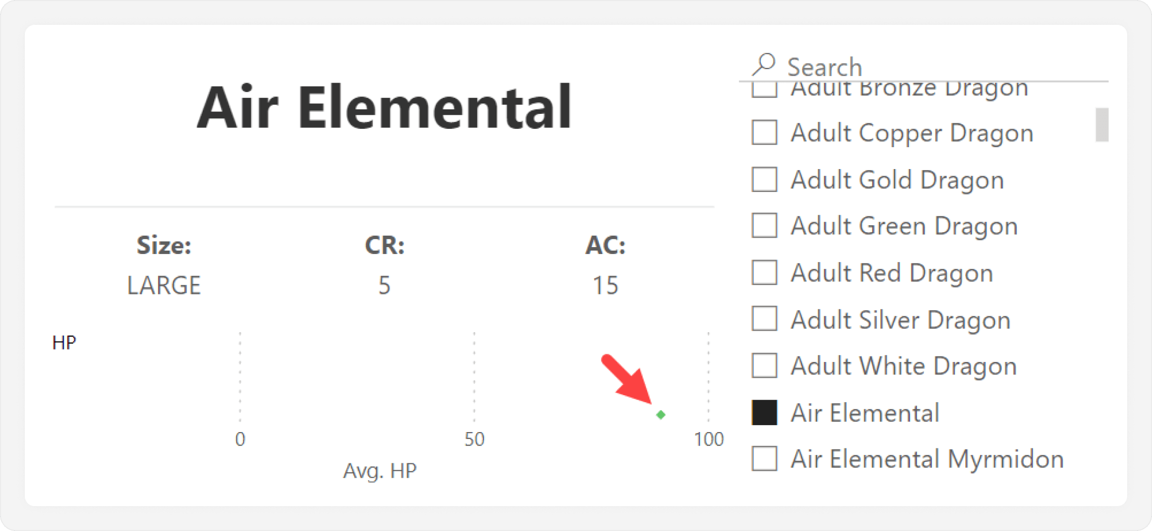
Highlighting only the selected data point
In the current jitter plot, selecting a single creature will result in a single data point, causing us to lose context. This is obviously not very useful, as we see in the following example.
Instead, we want the selected data point to be highlighted among all others. This helps us understand the context for that value when comparing across categories. To do this, we first need to add a few things in the data model.
The first step is that we need a dimension table for the creature names. Additionally, we will include the jitter as a column in this calculated table, so that RAND evaluates only at model refresh, and not after every report interaction. This calculated table will be disconnected from the rest of the model; it has no relationships with other tables. We add this by using DAX in an import model, but you can do it using whatever other upstream approach that you prefer:
Creature Names =
    ADDCOLUMNS (
         DISTINCT ( 'Creatures'[Name] ),
         "Jitter", ( RAND () - 0.5 ) * 0.9
     )
Once this table is created, we add the Name column to the “Values” well of the jitter plot, replacing the original Name column from the Creatures table. The Jitter measure used in the Y-axis should now take the random value only from the Creatures Names table:
Jitter (Calculated Column) = MAX ( 'Creatures Names'[Jitter] )
When we use Jitter (Calculated Column), it will not re-calculate each time we interact with the report.
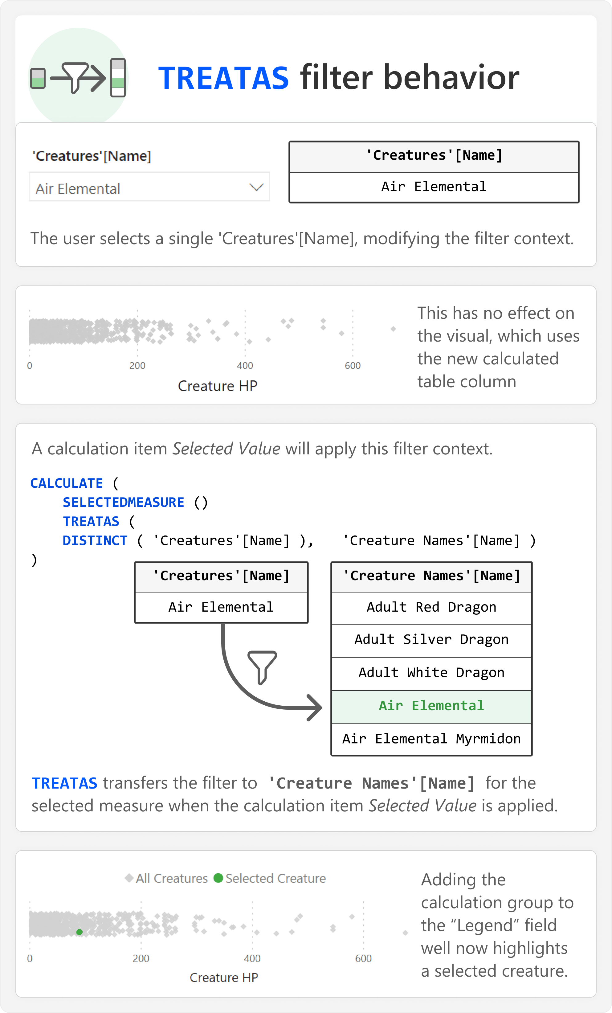
Next, we need to adjust the Avg. Creature HP measure. Specifically, we have to apply a virtual relationship by using TREATAS, so that Name from the new calculated table can take the filter context from the same column in the original Creatures table. This ensures that we get the appropriate distribution of the creature HP:
Avg. Creature HP =
CALCULATE (
    AVERAGE ( 'Creatures'[HP] ),
    TREATAS (
        DISTINCT ( 'Creature Names'[Name] ), --Virtual relationship from here…
        'Creatures'[Name]                    --…to here.
    )
)
The reason why we use this disconnected, calculated table is to leverage a filter context that we can manipulate in DAX. Consider the following diagram, which depicts the normal effect of selecting a creature name in the slicer upon a visual.
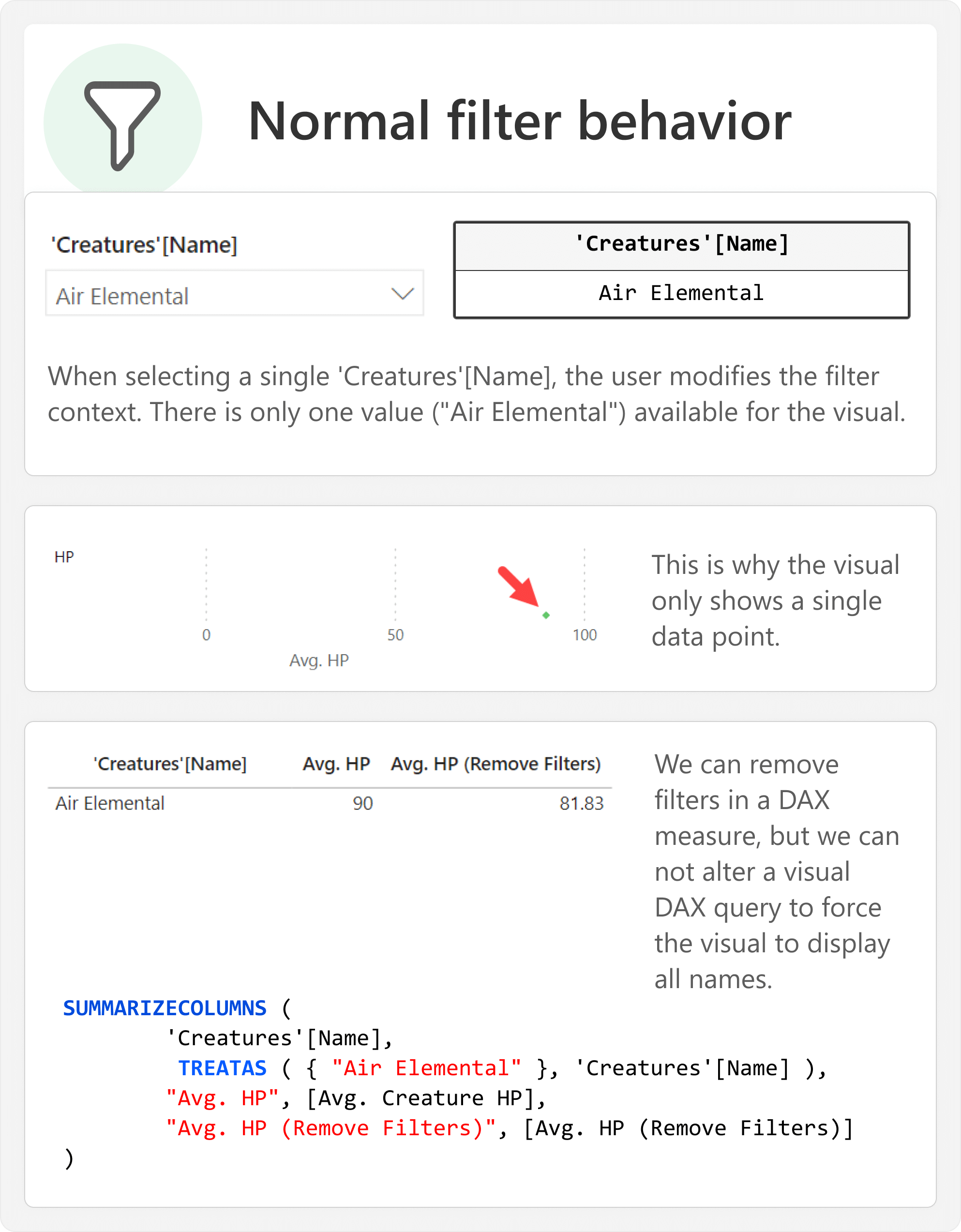
Normally, selecting a creature name from the slicer results in filtering to specific rows of the Creatures table. The only rows that exist are those that have the selected value for Name. As a result, the jitter plot shows a single creature; the one we selected. It is not possible for us to force the visual to show more creatures, since this filter is applied at the level of the visual’s SUMMARIZECOLUMNS query, which we cannot intercept.
Instead, we create a new table of creature names unaffected by this slicer. We can then selectively apply the filter context from that slicer to achieve the highlight. We do this in DAX by using a Highlighted Creature calculation group. This calculation group has two calculation items, Selected Creature and All Creatures:
Selected Creature =
CALCULATE (
    SELECTEDMEASURE ( ),
    KEEPFILTERS ( -- Optional; allows for selective highlighting of multiple values.
        TREATAS (
            DISTINCT ( 'Creatures'[Name] ), -- Apply the filter from here…
            'Creature Names'[Name]           -- …to here.
        )
    )
)
The first calculation item, Selected Creature, uses TREATAS to apply the filter context from Name in the Creatures table to Name in the Creature Names table. The result is that the selected measure will only evaluate for the selected creatures:
All Creatures = SELECTEDMEASURE () --Unmodified filter context
The second calculation item, All Creatures, returns only the selected measure without modifying the filter context. Alternatively, it could also filter out the selected values to only return Other Creatures:
Other Creatures =
         --Alternative to All Creatures, not used in the samples or images.
CALCULATE (
    SELECTEDMEASURE ( ),
    KEEPFILTERS (
         EXCEPT (
             ALL ( 'Creature Names'[Name] ),
             DISTINCT ( 'Creatures'[Name] )
        )
    )
)
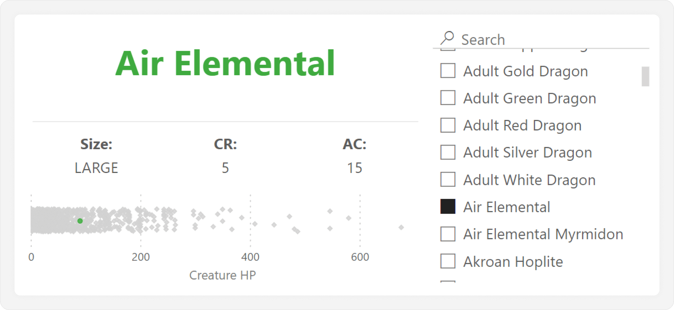
To summarize, after adding these new DAX objects, we make the following changes to highlight a selected value:
- Add Name from the Creature Names calculated table to the “Detail” well.
- Change the Jitter measure to use the calculated table column.
- Change the Creature HP measure to use a virtual relationship from Name in the calculated table to Name in the Creatures table.
- Add the new calculation group, Highlighted Creature, to the “Legend” well. This calculation group should have two calculation items, Selected Creature and All Creatures.
- Format the markers such that Selected Creature is highlighted, and All Creatures is grey.
- (Optional) Change the ordinal of the Selected Creature calculation item to be higher (1) than the All Creatures calculation item (0). This ensures that the highlighted data point appears on top.
We now obtain the following result, which highlights the selected creature, as expected.
We explain how this selective highlighting works in the following diagram.
In this new scenario, the filter from the Creatures table is applied to Creature Names only in the Selected Creature calculation item by using the TREATAS in CALCULATE for the SELECTEDMEASURE. In the remaining calculation item All Creatures, the filter is not applied. Instead, we filter the SELECTEDVALUE of Name from Creature Names, so that it shows all others. When applying this calculation group to the visual legend, it produces the desired effect, highlighting only the selected value.
We used a calculation group for this approach, but we could also use a DAX measure that applies conditional formatting. The DAX code for such a measure is shown below:
Highlighting (Conditional Formatting) =
    IF (
         SELECTEDVALUE ( 'Creature Names'[Name] )
         IN
         DISTINCT ( 'Creatures'[Name] ),
         "#56B056", -- Green highlight
         "#D2D2D2"  -- Grey default
    )
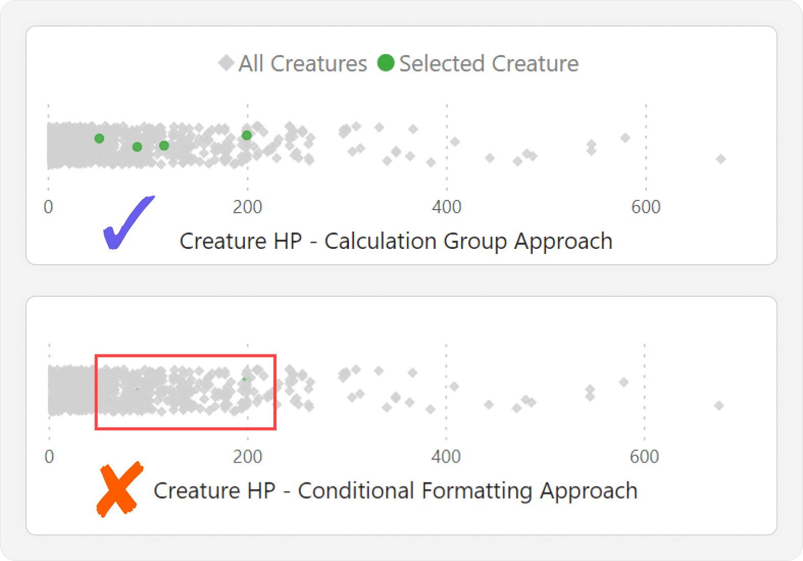
While the DAX measure for conditional formatting is simpler and easier to understand, it cannot be used in other contexts outside of conditional formatting. For instance, we may wish to use this method to compare categories in other visual types or for other measures, where the calculation group would be most useful. Furthermore, there are more limitations with the conditional formatting approach. Indeed, we cannot control the Z-order or shape of formatted data points, so they can easily be hidden when among a cluster, which defeats the purpose of the visual. An example of this is shown below.
Creating the joint plot
By now, we have created a jitter plot that shows distribution of a metric by a category, and lets us view one or more selected categories, and compare them to the rest. However, even with the jitter plot, it is still difficult to get a more precise sense of the number of data points within a cluster. One way to address this is to add a second chart to provide supplemental information about the distribution, called a joint plot.
In the joint plot, we want to see the distribution of creatures by HP value. We could do this in a histogram or a line/area chart, but we will choose the line chart for this example. To do this, we first need to modify our calculated table to include creature HP. However, we will group the HP into bins of size 20 using the FLOOR function, which will smoothen the distribution:
Creature Names =
    ADDCOLUMNS (
         DISTINCT ( 'Creatures'[Name] ),
         "HP (bins)", CALCULATE ( FLOOR ( MAX ( 'Creatures'[HP] ), 20 ) ), -- Newly added
         "Jitter", ( RAND () - 0.5 ) * 0.9
     )
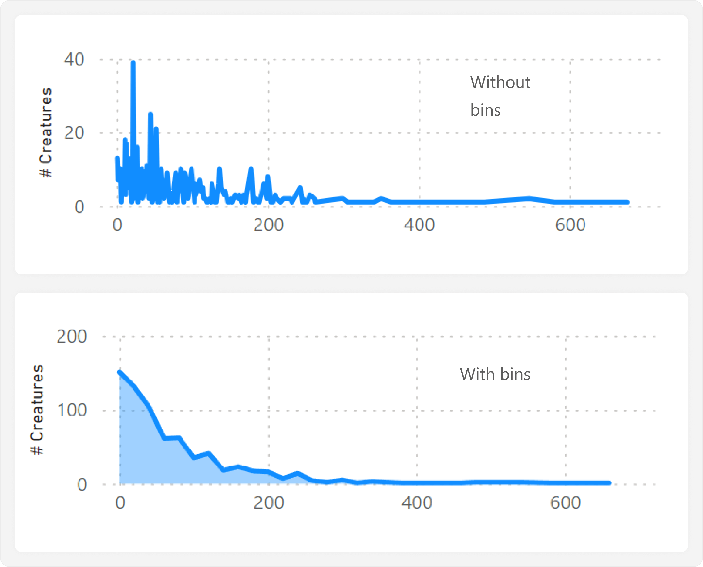
To make the joint plot, we create a line chart that plots HP (bins) (from the adjusted calculated table Creature Names) along the X-axis, and the # Creatures along the Y-axis:
# Creatures = COUNTROWS ( DISTINCT ( 'Creature Names'[Name] ) )
Similar to the joint plot, we disable “Responsive” and shrink the line chart to be more horizontal than vertical. We then position it directly above the jitter plot, ensuring that the X-axes are aligned, and apply some basic formatting:
- Disable axes and axis titles.
- Color lines and area to match the joint plot we already created.
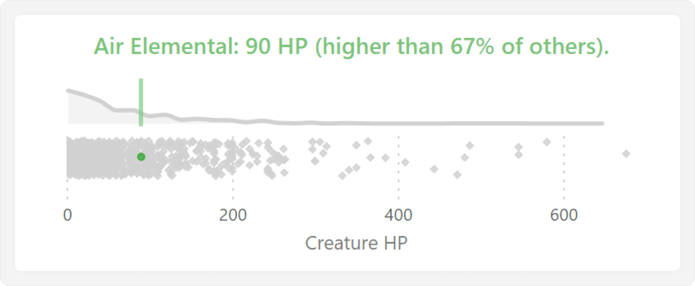
The final step is then to highlight the selected creature in this distribution. The simplest way to do this is by just returning the SELECTEDVALUE of HP, which we use in an X-axis constant line:
Selected Creature HP = SELECTEDVALUE ( 'Creatures'[HP] )
Optionally, we can also conclude with a final step that uses a dynamic title to state the selected value. The title might also provide additional contextual information, such as how many data points are below that selected value. This produces our final, desired result, where we can quickly and easily compare a value for a selected category against all others.
It is important to mention that this specific approach is limited to showing only one selected value at a time. Showing multiple values can be done by applying the calculation group approach that we used previously to make the jitter plot. However, this approach does not allow us to use lines; it will only show values in the bins, which do not align with the jitter plot like the X-axis constant line did.
To wrap up, we should perform some final clean-up of the visuals. For instance, we can add a background container, then group and name all visual containers in the selection pane. We should also handle both tooltips and header icons (like “Focus Mode”) so that they do not obstruct the visual, for instance, by disabling them if they are not needed, or using custom report page tooltips so as to avoid showing confusing information in them, like the jitter values.
Managing the reporting objects
This method involves creating several reporting objects exclusively for specific visual requirements. As always, it is important to avoid that these reporting objects clutter the model and confuse users or other developers. To mitigate this, you should segregate these objects away from the “core” semantic model. For instance, you can hide measures, calculation groups, and calculated tables, and isolate reporting object measures in their own measure table. You should also document in the object descriptions which visuals use these objects, and how they work.
Additionally, with this solution, we have duplicated some information in our model; however, the impact of this is negligible. The new table has a low cardinality (706 values), and takes up minimal space in the small model. To avoid confusion with users and other developers, we can also hide the table, or set it to private, which hides it without the possibility to view hidden objects or see the object name arise in DAX autocomplete.
Conclusion
When you want to see the distribution of a single metric for a category, jitter plots are a good choice. These plots are possible with some adjustments to the scatterplot core visual, and can help users identify clusters and outliers of data points. Jitter plots become even more effective when you use them to show context for a selected data point compared to all others, and you can improve this further by adding a joint plot when the number of data points is particularly high.
Returns a random number greater than or equal to 0 and less than 1, evenly distributed. Random numbers change on recalculation.
RAND ( )
Treats the columns of the input table as columns from other tables. For each column, filters out any values that are not present in its respective output column.
TREATAS ( <Expression>, <ColumnName> [, <ColumnName> [, … ] ] )
Create a summary table for the requested totals over set of groups.
SUMMARIZECOLUMNS ( [<GroupBy_ColumnName> [, [<FilterTable>] [, [<Name>] [, [<Expression>] [, <GroupBy_ColumnName> [, [<FilterTable>] [, [<Name>] [, [<Expression>] [, … ] ] ] ] ] ] ] ] ] )
Evaluates an expression in a context modified by filters.
CALCULATE ( <Expression> [, <Filter> [, <Filter> [, … ] ] ] )
Returns the measure that is currently being evaluated.
SELECTEDMEASURE ( )
Returns the value when there’s only one value in the specified column, otherwise returns the alternate result.
SELECTEDVALUE ( <ColumnName> [, <AlternateResult>] )
Rounds a number down, toward zero, to the nearest multiple of significance.
FLOOR ( <Number>, <Significance> )