The new forecasting capabilities are available in Power View for Office 365 when you use the HTML5 visualization. In this blog post on MSDN you see how to enable and use this feature. There are a few requirements to use forecasting and the most challenging is related to the x-axis value you have to use in a line chart with a single line. The x-axis value requires a uniformly increasing number or date, and you cannot use a string column (even if a numeric column sorts it). This condition seems easy to comply with, but there are a number of scenarios where you have to modify the data model.
If you use a whole number in x-axis, you need a value that has a constant increase step. This can be easily satisfied for year (2011, 2012, 2013, 2014, 2015, …). However, if you want to represent a month, you cannot use a human-readable format such as YYYYMM (201311, 201312, 201401, 201402, …) because it does not increase uniformly when the year changes. For the same reason, you cannot use a format such as YYYYMMDD. You can use a number that identify day, week or months (1, 2, 3, … 11, 12, 13, 14, …) but this is not easy to read.
If you have a Date table in your data model, using a date column seems the smartest thing to do. This is true only if the measure you display in the line chart has values available only at regular intervals. Thus, if you have sales total for each day, and the analysis is based on daily sales, this is fine. However, if you want to analyze data aggregated by week, month or quarter, then you probably created a column that display a string or a number in a format that is not compatible with the forecasting feature.
The right approach, in this case, is creating a calculated column in the Date table that has always the first (or last) day of the period you consider (week, month, quarter) for all the days in that period. For example, for a regular calendar that has a Date column, you can create the Month Start column in this way:
Month Start =DATE ( YEAR ( 'Date'[Date] ), MONTH ( 'Date'[Date] ), 1) |
If you have a ISO Calendar (see Week Based Time Intelligence in DAX), then you can create ISO Week Start and ISO Month Start in this way:
ISO Week Start =CALCULATE ( MIN ( 'Date'[Date] ), ALLEXCEPT ( 'Date', 'Date'[ISO Year Week] )) |
ISO Month Start =DATE ( 'Date'[ISO Year Number], 'Date'[ISO Month Number], 1) |
ISO Quarter Start =DATE ( 'Date'[ISO Year Number], INT ( ( 'Date'[ISO Month Number] - 1 ) / 3) * 3 + 1, 1) |
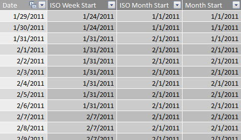
For each period, you have only the first date, as you see in the following screenshot:

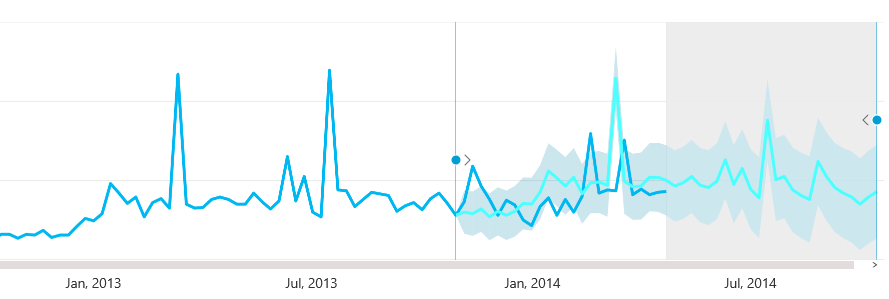
When you apply one of these new columns in a Power View line chart, you see the month name and the year instead of a date, which makes the chart more readable. The following chart displays data aggregated at the week level, showing also forecast and hindcast.
The forecasting feature requires a uniformly distribution of data across dates. For this reason it is useful to aggregate data at a week, month or quarter level, following the guidelines described in this article to obtain a column that you place in the x-axis of a line chart.
 Marco Russo
 Copy
Copy Conventions