If you build Power BI reports, then you know how much time it costs to format visuals so that they work and look the way that you want them to. This applies not only when you make new reports, but also when you need to maintain or make changes to existing ones. When a report gets fancy in its design (sometimes unnecessarily so, if we are frank), then, often, this is accompanied by a need for many formatting tweaks and changes. Inevitably, this formatting becomes time consuming (and sometimes frustrating) to deal with when there is a problem to fix or a modification to make. How can we make formatting and maintaining Power BI reports both more convenient and more efficient?
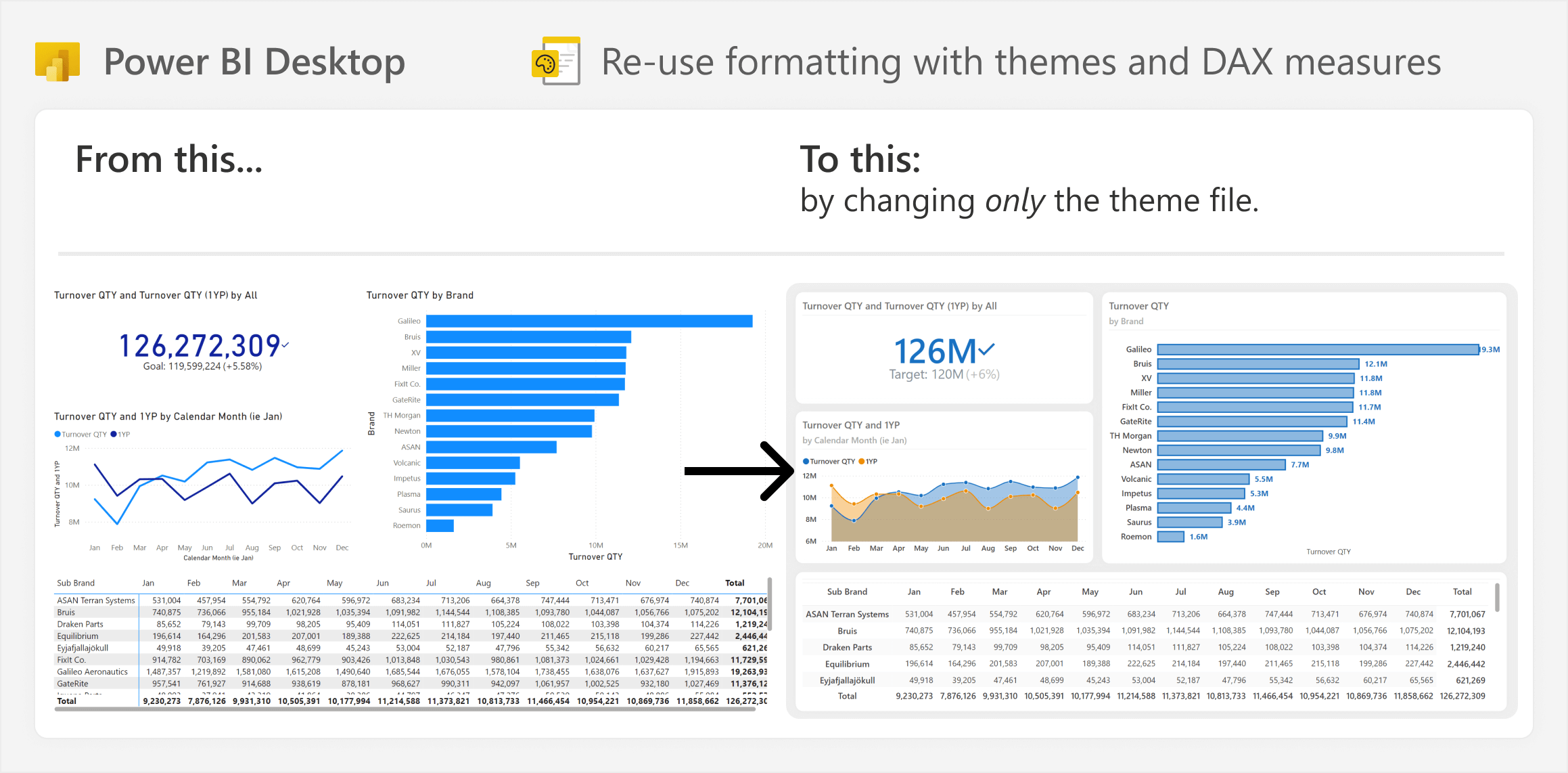
One way is by using theme files to centralize static formatting, while using DAX measures to centralize conditional formatting. Below you can see an example of how applying a simple theme can format a report and make it look better than the default.
In a previous article we introduced the concept of Atomic Design, where you re-use parts of a model or report, including objects, patterns, and templates. To review, an object is a simple single building block, which you combine to create patterns that serve a purpose or perform a function. You combine patterns to create visuals, pages, or entire reports, which you can turn into re-usable templates.
Some examples of re-usable parts of a model or report are presented in the below diagram.
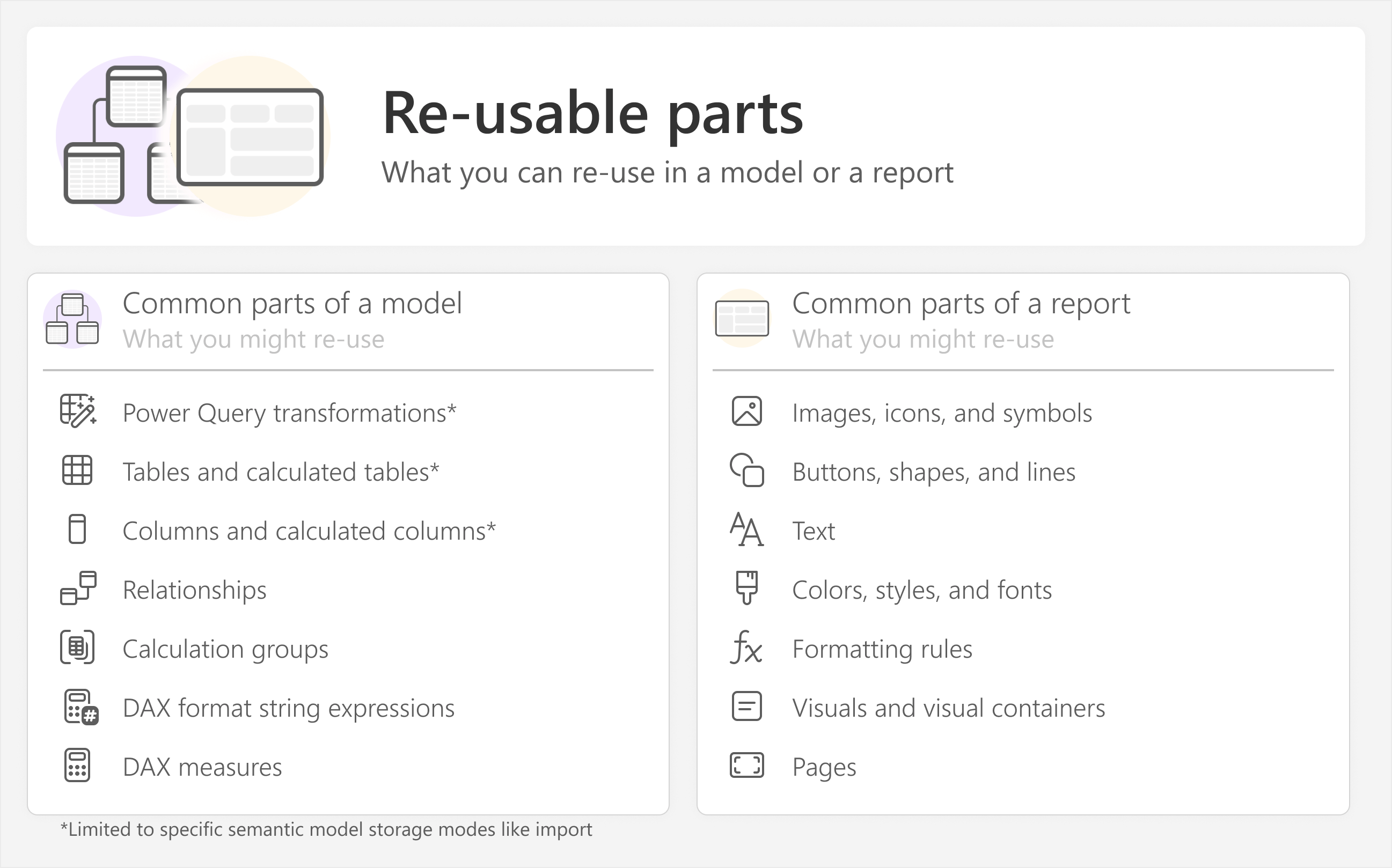
Clearly, with models, there are tools like Tabular Editor (with C# scripts) and Fabric notebooks (with semantic link labs) that provide ways for you to re-use your model logic. But what about reports – specifically, what about report formatting? While the tooling is not quite there yet to create visual templates (like we proposed in the original article), there are still many things that you can do with Power BI Desktop alone to re-use parts of a model or report, including report formatting.
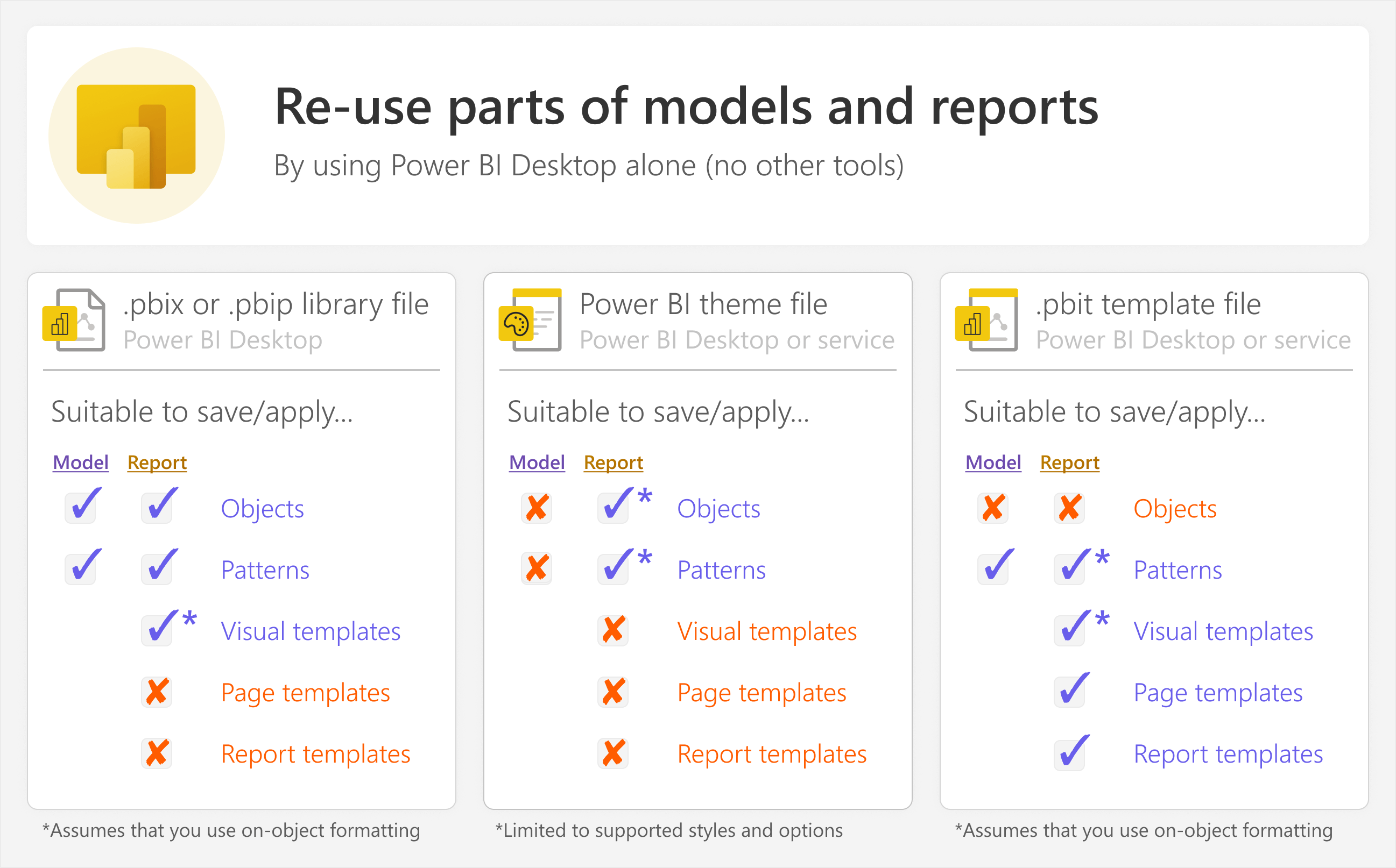
Specifically, you can re-use parts of models and reports in the following ways:
- A library of re-usable parts in a Power BI Desktop (.pbix) or Power BI project (.pbip) file.
- Power BI theme files.
- Power BI template (.pbit) files.
When it comes to report formatting, one way to re-use it is by using Power BI theme files to centralize styles, and using your semantic model to centralize formatting logic. This approach can hopefully help you make Power BI report formatting easier and more convenient to set up and maintain.
The following diagram depicts at a high level the overall approach to re-use formatting that we will explain in this article.

In a nutshell, typically, many report creators rely solely on the Power BI Desktop user interface to format each visual, often with custom colors. It is instead more efficient to create a Power BI theme to set the default (static) formatting and styles. Then, you can centralize conditional formatting logic in DAX measures. You can use these measures to format multiple properties for multiple visuals and multiple reports, which is both faster to set up and easier to maintain since it is in one place.
DAX measures used in formatting can also reference theme colors. This makes it easier to maintain and change formatting, because the formatting styles are stored in your theme, while the formatting logic is in an isolated part of your model.
The rest of this article explains this approach in more detail.
Centralizing report styles by using Power BI themes
If you plan to create multiple pages or reports, then the best way that you can save time is by setting the default formatting of reports and visuals early-on in a Power BI theme. Power BI themes are JSON files which specify the default formatting for your Power BI report. Every Power BI report has a theme; if you never changed yours, then it uses a default theme.
Why use a theme?
Most people who create Power BI reports use the default theme of Power BI, then manually customize the formatting of their report and visual pages. This includes choosing custom colors, fonts, and all the other formatting for visual elements (like lines, bars, and markers) and their containers (like visual titles, backgrounds, and borders). This manual formatting is where many people waste time, especially when creating multiple reports or maintaining them over time.
Instead, it is better to consider using a Power BI theme to set the default (static) formatting for your reports. Using a theme has several benefits:
- Save yourself time: You can set the default styles for pages and visuals in a theme. Once you have the theme, visuals look the way you want them to from the get-go. You do not have to waste time manually formatting each new page, report, or visual.
- Standardization and improved reports: Once you create a theme with styles that you and your users like, you can re-use it for new, future reports. Having this theme ensures consistency across reports. Consistency helps users read and interpret new reports, since they are already familiar with the existing styles. Consistency also helps make your reports look and feel more professional.
- Help others save time and improve reports: When you create a Power BI theme, you can set organization- or team-specific formatting, or apply design standards that will help improve reports. This task is a true efficiency multiplier – the impact goes beyond you and your reports, because other people can also use the theme in their This can not only save these people time, but they can also leverage your design skills to make their reports better. Particularly when you work in an organization where report creation is decentralized with many self-service users, creating a few quality, flexible themes can dramatically improve the quality of reports throughout the organization.
We strongly recommend that – if you haven’t already – you create a custom theme for your team or organization. It is a high-value task that produces a significant return on the time and effort you invest in creating it!
Where to find and change the theme in Power BI Desktop
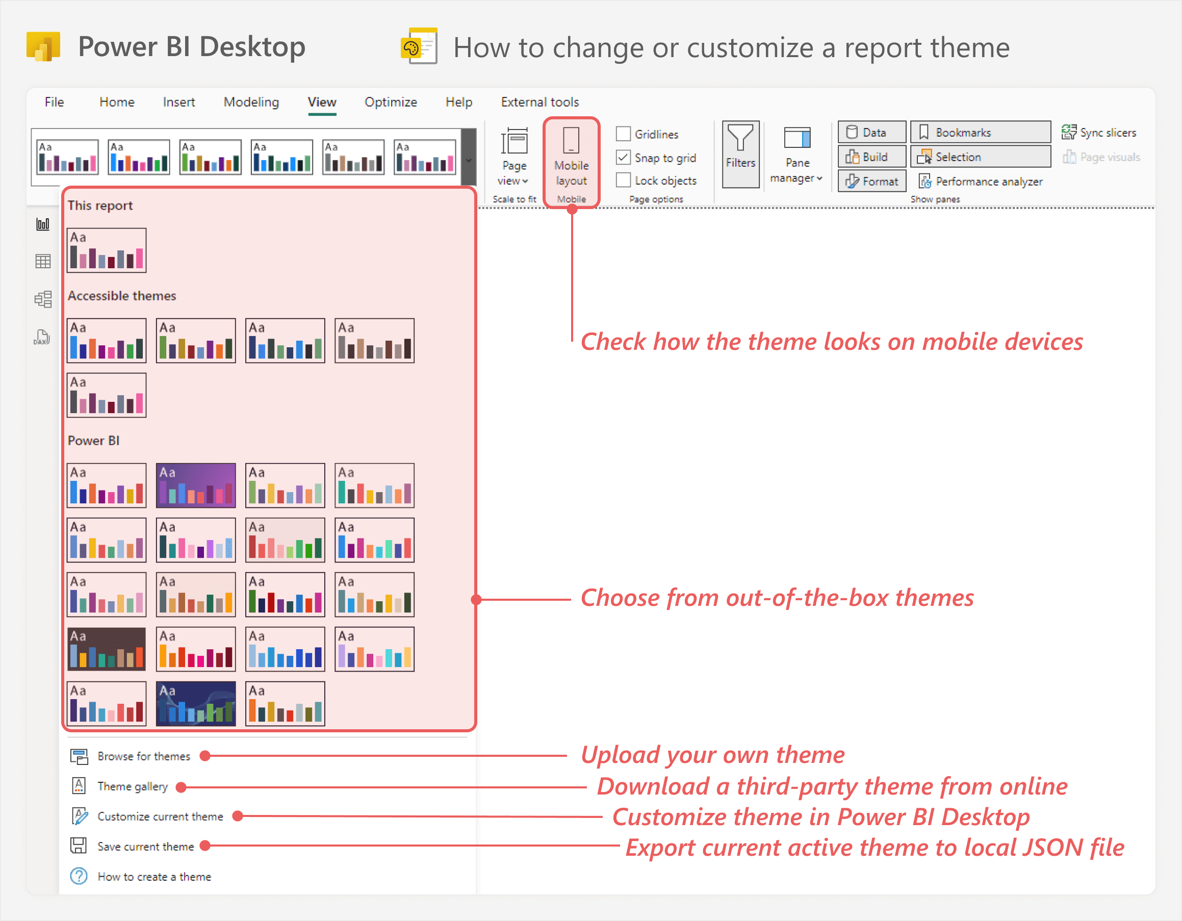
You can view and change the theme for your Power BI report under the “View” ribbon of Power BI Desktop.

You can select one of the themes previewed in the ribbon, or select the dropdown for more options. This includes the ability to upload your own theme, download a third-party theme from a gallery, or customize the existing theme from within Power BI Desktop.
The following image shows what it looks like when you customize a theme in Power BI Desktop.
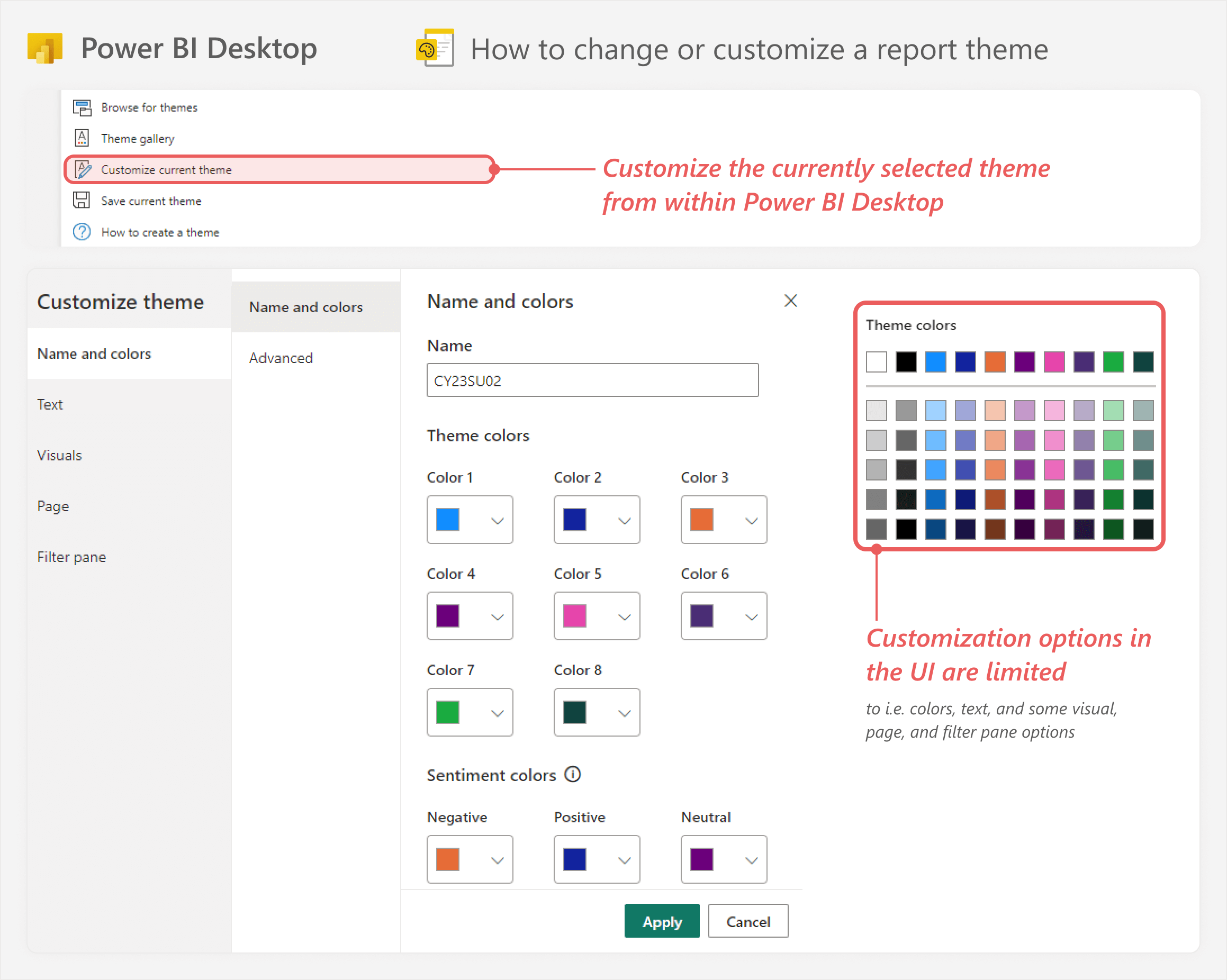
So you can customize the theme in Power BI Desktop, which can already be useful to choose the default colors, fonts, and sizes. This is already useful. However, Power BI Desktop currently only lets you modify a few of the theme properties. For instance, you cannot set formatting for specific visual types.
If you want to create a complete theme with visual-specific formatting and more, you have to export the current theme and modify the JSON file in a text or code editor, like VS Code. When you do this, the theme file looks as follows.
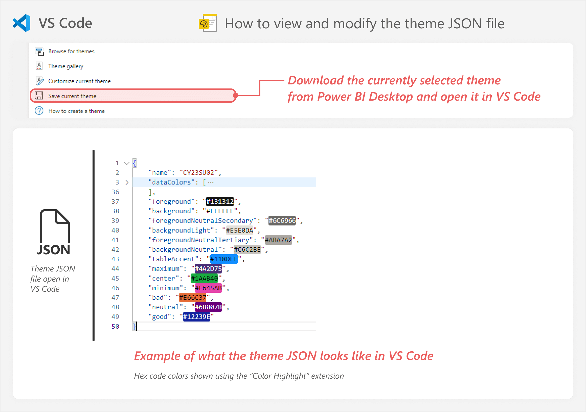
As you can see, the theme file has the colors, including the “theme colors” (in the “dataColors” property) and other secondary colors, such as visual backgrounds, diverging colors (maximum, center, and minimum) and sentiment colors (bad, neutral, and good).
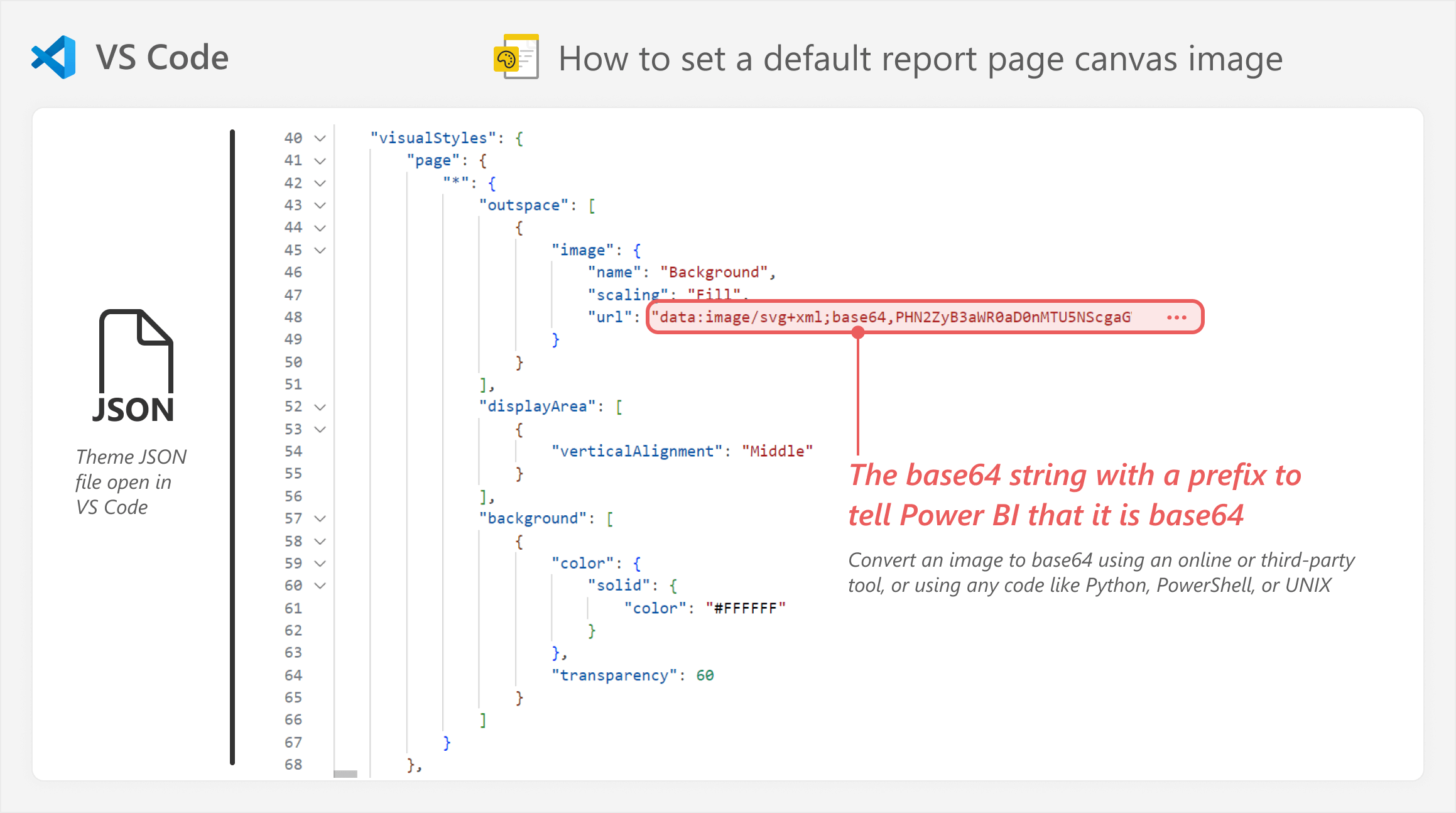
Again, these colors are only a small sample of what you can do with Power BI themes. For instance, you can set the default report page canvas background, or set it to an image URL (such as using an SVG or base64 definition). You can see an example of how to do this, below, but again, the point of this article is not to be a comprehensive guide to themes and everything that you can do to them. Rather, we just want to convince you that they are worth making and using, for yourself.
For a full list of the available properties in a JSON theme, you can consult the JSON schema for Power BI themes available on GitHub. This schema is updated monthly. As you can appreciate, the theme file is actually quite complex; you can set the default styles for each visual type. A full theme is also long. Complete theme files are often thousands or tens of thousands of lines long.
Thankfully, you do not have to spend hours and days writing a theme file from scratch. Instead, you can use some other tools to simplify the process.
Using and modifying template themes
There are various free and commercial sources of theme files available online within the Power BI community. You can use these theme templates as a starting point, modifying them how you see fit. We also provide one such partial example Power BI theme in the sample files of this article. In later articles we will provide many more, fuller examples of theme files.
Note that if you do intend to modify the theme file yourself, it is important to understand some precedence among the theme properties. That means that top-level properties are applied first, but they are over-written by more specific properties set deeper in the theme file. To make this easier to explain, consider the following example:
- Top-level: Top-level theme properties are applied first, like colors such as “foreground” or “background”.
- Text classes: Next, specific properties for text classes are applied. For instance, if you set a color for “foregroundNeutralSecondary”, this applies to data labels. But if you set a different color for the “label” text class, then the text class label will take priority.
- Visual styles wildcard: Next, if you set properties for wildcard visual styles (denoted by “*”), then this applies to all visuals. For instance, if you set the data label color here, it will override both the top-level and text class properties.
- Specific visual properties: Next, if you set the property for a specific visual type, like the data labels of the “barChart” visual, then this overrides all previous properties.
- Report visual configuration: Finally, if you set any custom formatting by using the Power BI Desktop user interface, this takes precedence over any theme styles. Custom formatting also cannot be changed with the theme; you can only modify custom formatting in the report or the report metadata, and not centrally from the theme file.
Of course, creating a theme from scratch takes a lot of time and it is not so easy (nor exciting). So you can also use other tools to support the creation of your themes, which we explain next.
Using generative AI tools like Chat-GPT or Claude to create themes
You can give the JSON schema and some examples to tools like Chat-GPT, then use these tools to generate or modify a theme. Example themes might be one you use now, or from community resources like the GitHub repo of David Eldersveld. Since themes only contain styling information, they do not typically contain confidential information. Still, you should be careful with embedded images, which might be proprietary.
However, all generative AI tools can hallucinate, producing unexpected, incorrect, or even fictitious results. While you can get more specific and useful results by giving the tool more context (such as the JSON schema) or instructions (such as well-constructed prompts, including examples), there is no amount of grounding data or meta-prompting which can completely eliminate hallucinations entirely and make an LLM-based tool 100% reliable.
For your theme file, the consequence of these hallucinations is that the tool might return an incomplete theme, change a property that you did not want to change, or even invent an invalid theme property or value. If you try to generate a theme file from scratch, it is very likely that the result will be an invalid theme that Power BI Desktop cannot use, that it will not contain all properties, or that it will apply changes and values that you did not request nor expect.
When you try to upload an invalid theme file in Power BI Desktop, it will produce an error.
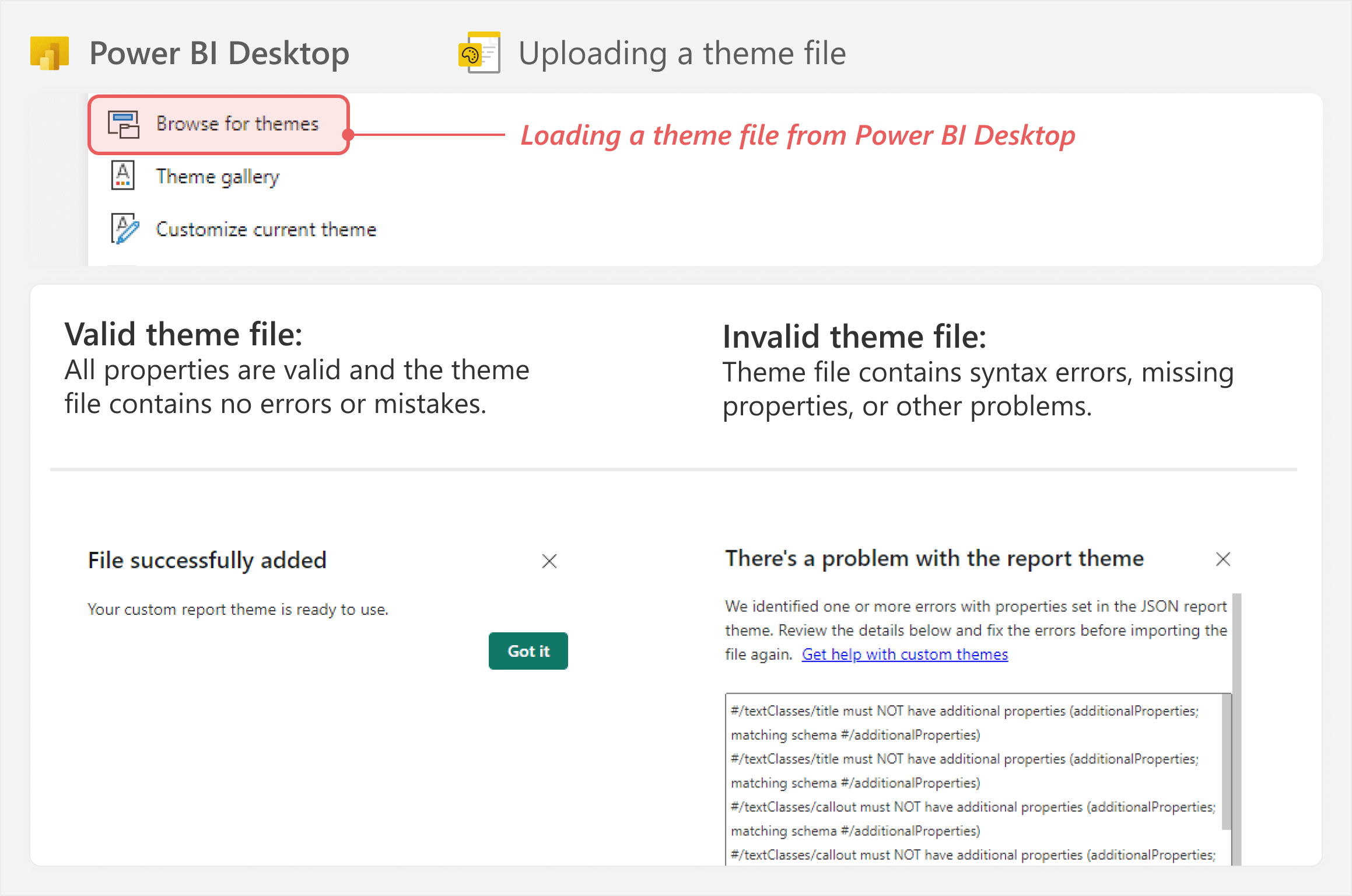
These errors can be problematic, because you waste a lot of time troubleshooting. This troubleshooting and iterating with prompts can offset any potential efficiency gains. If you have to iterate dozens of times or invest time in writing a long specific prompt with all of your instructions, then it might just be faster to do it yourself in a code editor.
Using third-party tools to create themes
Instead of using generative AI tools to create a theme, you might also use other third-party theme generators. These tools help you create themes with a user interface. Some of these tools might also show a preview of what the theme looks like, or even let you select from preset themes to start from.
Some examples of third-party tools to generate themes are listed below. The purpose of this article is not to guide or endorse any specific theme generator. You may however want to evaluate for yourself each tool against your specific needs, by following the links:
Note that some of these tools might also incorporate generative AI. Therefore, they also might present the same risks as when you use generative AI tools alone – such as hallucinations, unintentional changes, and so forth. Some tools might reduce this risk by adding a schema validation step during post-processing, although it is not clear whether any tools do this today.
Using a theme file for static formatting
Once you create a theme file, you can apply it to your Power BI report to use the default styles.
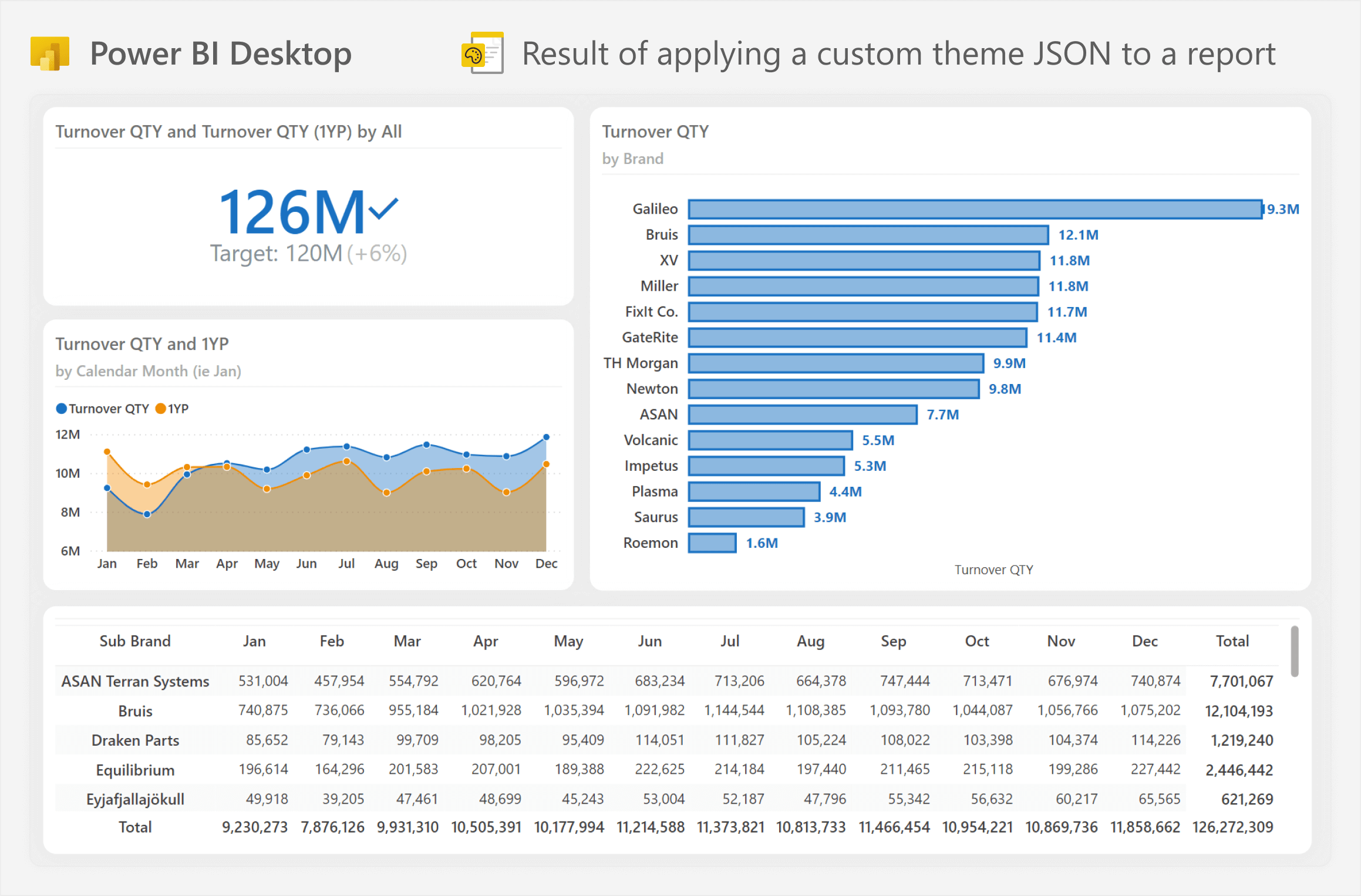
When using a theme file, consider the following tips to get the most from it:
- Avoid changing visual formatting with the Power BI Desktop user interface, if you can help it. This includes custom colors or applying customized font styles. Once you customize a visual, the formatting becomes part of the visual configuration; you cannot change it via the theme file.
- If you want the theme to be used by others, involve them in the design. If people do not like the theme, then they will not use it. Defer to more general, flexible formatting that is useful for most scenarios, rather than specific formatting that suits only the reports you make or designs you like.
- Invest in learning how to apply visual best practices in your theme files, such as:
- Effective choice of colors.
- Ensuring color and font style choices are accessible.
- Avoiding excessive use of color, thick lines, and large text that easily overwhelms report viewers.
- Test the theme on multiple reports before you use it, and request feedback from users about the styles. Also test the report with different visual and page sizes, as well as different devices and screens (including mobile devices and tablets).
- Document the theme file and communicate and share it in your organization. If you do not document or share it, then people will defer to using Power BI Desktop to customize their report visuals, even if it takes them significantly longer.
Theme files work fine for static formatting, but what about conditional formatting? Furthermore, what if you do need custom colors that you want to apply in your report? The next section of this article explains how you can use DAX measures for that. This does not involve themes yet, but later in this article, we will explain how you can combine conditional formatting in DAX together with theme files.
Centralizing formatting logic in DAX measures
You can define conditional formatting logic in DAX measures. These measures evaluate to a single text value which can be a valid color definition, such as a hex color code, CSS color name, or RGBA color code. You can see an example below with the SalesColor DAX measure:
SalesColor =
IF (
    [Sales amount] > [Sales amount PY],
    "#0070dd", -- Blue
    "#coral"   -- Orange, or 'coral'
)
To use these measures in conditional formatting, you have to use the “Field value” format style. This option lets you select a measure, which happens to be called a field in the user interface. Depending on the evaluation result, Power BI will format the element according to the color. In the following example, the card uses the SalesColor measure to format both the card border and font color.

The advantage of this approach is that you maintain the formatting logic and color in one place, despite using it in multiple visual properties, different visuals, and even separate report pages and reports. If you want to change the color, or the condition to return it, you only have to modify one measure. Additionally, you do not have to waste time setting up the formatting rules in the user interface or selecting custom colors; it just works.
Combining the two approaches: referencing theme colors from DAX
Now, how do we use this with our themes? Well, it turns out that you can refer to theme colors from DAX. Like CSS color names, any top-level theme property that is a color can be used in a DAX expression. Examples include:
- Sentiment colors: “good”, “bad”, or “neutral”, which refer to positive, negative, and neutral sentiment theme colors, respectively.
- Diverging colors: “minColor”, “midColor”, or “maxColor”, which refer to min, middle, and max diverging theme colors, respectively.
- Container style colors: “foreground”, “background”, or “foregroundNeutralTertiary”, which refer to various elements as explained in the documentation for theme structural colors.
- Other structural colors: “tableAccent”, “null”, or “hyperlink”, which refer to the border of the table or matrix visual, empty colors in diverging conditional formatting, and the color of hyperlinks in tables and matrix visuals, respectively.
Unfortunately, it is not clear yet how to reference the main colors (“dataColors”) in a theme file. Indeed, they are stored as an array and not a top-level color property. Regardless, we can still use the theme to refer to saved colors via DAX measures. This lets us centralize formatting logic in the measure, while control of the actual color is centralized to the report theme. The combination of these two things makes it easier to set up and maintain formatting; however, do ensure that you document your approach for others.
You can see an example of this approach, below, where the SentimentCondition DAX measure uses the “good” or “bad” color instead of a hard-coded hex color code. Note that the Power BI Desktop user interface refers to the colors by a different name: Positive for “good”, Negative for “bad”. Unfortunately, it is often the case that the Power BI user interface and report or model property names are not aligned.
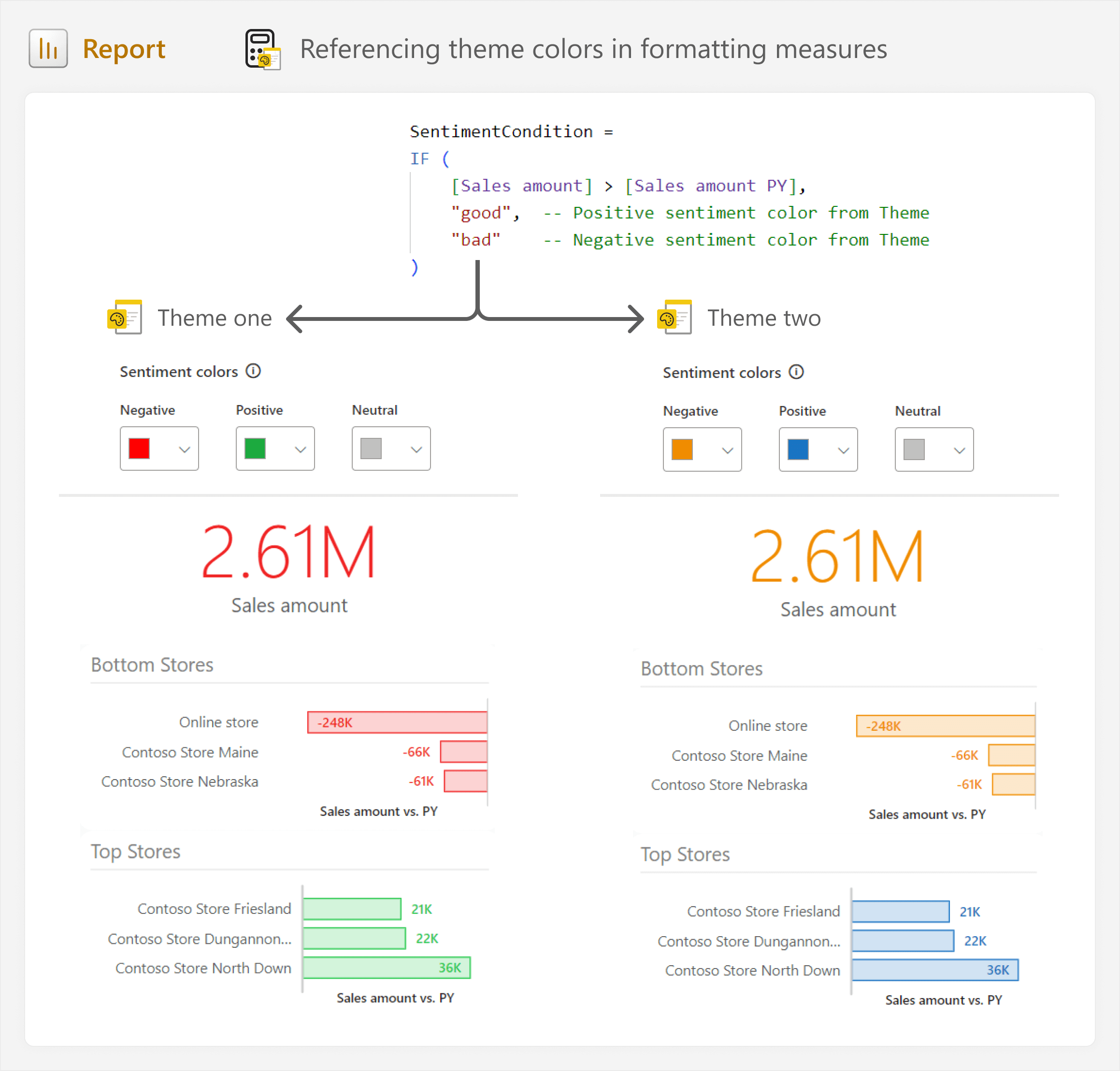
As you see in the example, the logic is retained, but the colors will change if you change the “Sentiment colors” in the report theme. This allows you to re-use formatting with DAX measures, while still giving report authors the flexibility to control the colors.
Tips for managing model measures that you use for report formatting
In summary, you can use DAX measures to control conditional formatting logic and colors, and you can reference theme colors too. However, it is important to ensure that you manage these measures in your model appropriately. This means that you need to organize them so that they are sequestered away from the rest of the model. Here are a few ways you can achieve this:
- Consider placing these measures in their own measure table in your model.
- Organize the measures into a display folder.
- Use clear naming conventions to identify the purpose of the measure in formatting.
- Provide instructions about how to use them in the measure description and include both the condition and resulting colors. Mention whether a theme color is referenced or not.
Taking steps like this ensures that other developers (including future you) and users can leverage this centralized logic, rather than resorting to customizing things themselves.
Changing the theme of published reports
Now, if you want to change the colors or styles of your visuals, you can simply change the theme. Of course, you will probably always have specific, bespoke changes to make to certain visuals. However, in general, you should avoid doing this if you can avoid it; you simply want to avoid slipping back down the slope toward the formatting logic living in each individual visual.
To change the theme, most people open the report in Power BI Desktop and then simply browse and apply the new theme to the existing report. But what if you have many reports, and what if you want to apply the theme to reports that are already published?
Using semantic link labs in Fabric notebooks
To change the theme of published reports, you can use the Fabric APIs. The easiest way to do this is by using semantic-link-labs in Fabric notebooks. Semantic-link-labs is a tool to help you manage and automate Fabric items, including Power BI models and reports. It is a Python library developed by Michael Kovalsky of the Fabric CAT team at Microsoft.
Any Fabric workspace can use semantic link labs in a notebook, but you first need to install the library either in the notebook or a custom environment. You first need to make your new theme accessible to semantic-link-labs, somehow. For example, you can extract the theme from a published report, or read the theme JSON file loaded to a lakehouse. Then, you can just use a simple Python function to set the theme. You do not need to know Python to use this.
This function can scale across many reports and workspaces. The best part is that the reports do not have to be in a Fabric workspace; only the notebook does. This approach works even if the reports are in a Power BI Pro workspace.
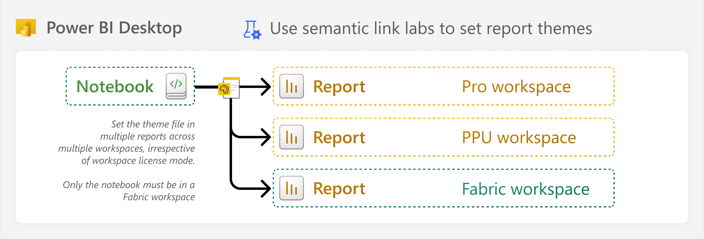
This means that if you stick to the theme styles, you can change the formatting of many published reports quickly from a single notebook.
What about Power BI template (.pbit) files?
It might seem strange to talk about re-using formatting, visuals, or reports, and not talking about Power BI template files. Mostly, these template files are useful as a demonstration or “starter kit” report and/or model. For instance, with reports, you can include a theme, and some visuals, images, and icons pre-packaged. For reports, you can include measure and date tables, calculation groups, and even complex DAX patterns, such as currency conversion or Pareto analysis. People can then refer to these templates as an example – for instance, by copying objects and patterns into their own models and reports – or use the templates to get a head start on their own work.
If you invest time in making a Power BI theme file, then you should also make at least one Power BI template that has that theme applied, and at least one example report page showing what the various styles look like. These example templates can be very useful for self-service users, and they help to improve the adoption and use of the theme that you invested time in creating. Additionally, you might include some guidance for report creators about how they can best use the theme, or how they might centralize formatting logic in DAX measures, like we describe in this article.
Atomic design is more about people and processes than it is about tools and technology. Like reports, you can have the most beautiful and interesting themes, but if you do it without people and processes in mind, then it will not be useful, and it will not be used. This has always been the case, and it is not something that will change!
Conclusion
Formatting Power BI visuals can cost a lot of time, especially when you put special effort into creating an elegant and useful design (remember: the key word is useful and not elegant). To lower this time expenditure, you should centralize styles in a Power BI theme and centralize formatting logic in DAX measures. DAX measures can refer to theme colors, harmonizing the two approaches. Over time, more options and tools will make re-using formatting even more efficient, but this approach means that you only have to maintain formatting in two places (your theme and model) rather than across your many report visuals. Best of all, it is another wrung in the ladder to climb towards adopting an Atomic Design methodology for data visualization.
However, we know that despite their best efforts to centralize and streamline formatting, report authors will often defer to using custom colors and styles in each visual. In a future article, we will explain how you can conveniently manage and change the formatting of reports in these scenarios.
 Kurt Buhler