 Kurt Buhler
In Power BI, advanced report creators often need to use custom visuals to fulfill their requirements or create certain designs. In previous articles that we published at SQLBI, we discussed the options available to make custom visuals, such as SVG visuals that you can make by using DAX. We also gave examples of when you might choose one approach over another, for example, if you want to make a bullet chart. However, creating custom visuals in Power BI is complex, and requires technical skills that most Power BI report creators do not have. In this article, we examine how you can use AI assistance to help you plan and create custom visuals.
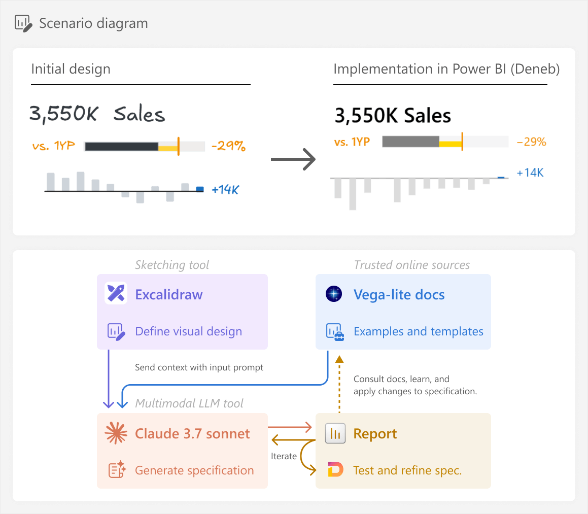
A high-level overview of the process we will take and the desired result is below. It is important to emphasize that this article focuses on the general process, and not specific steps to obtain the result.
Creating custom visuals with code
As we discussed in previous articles, we classify six different options that you can use to make custom visuals in Power BI.
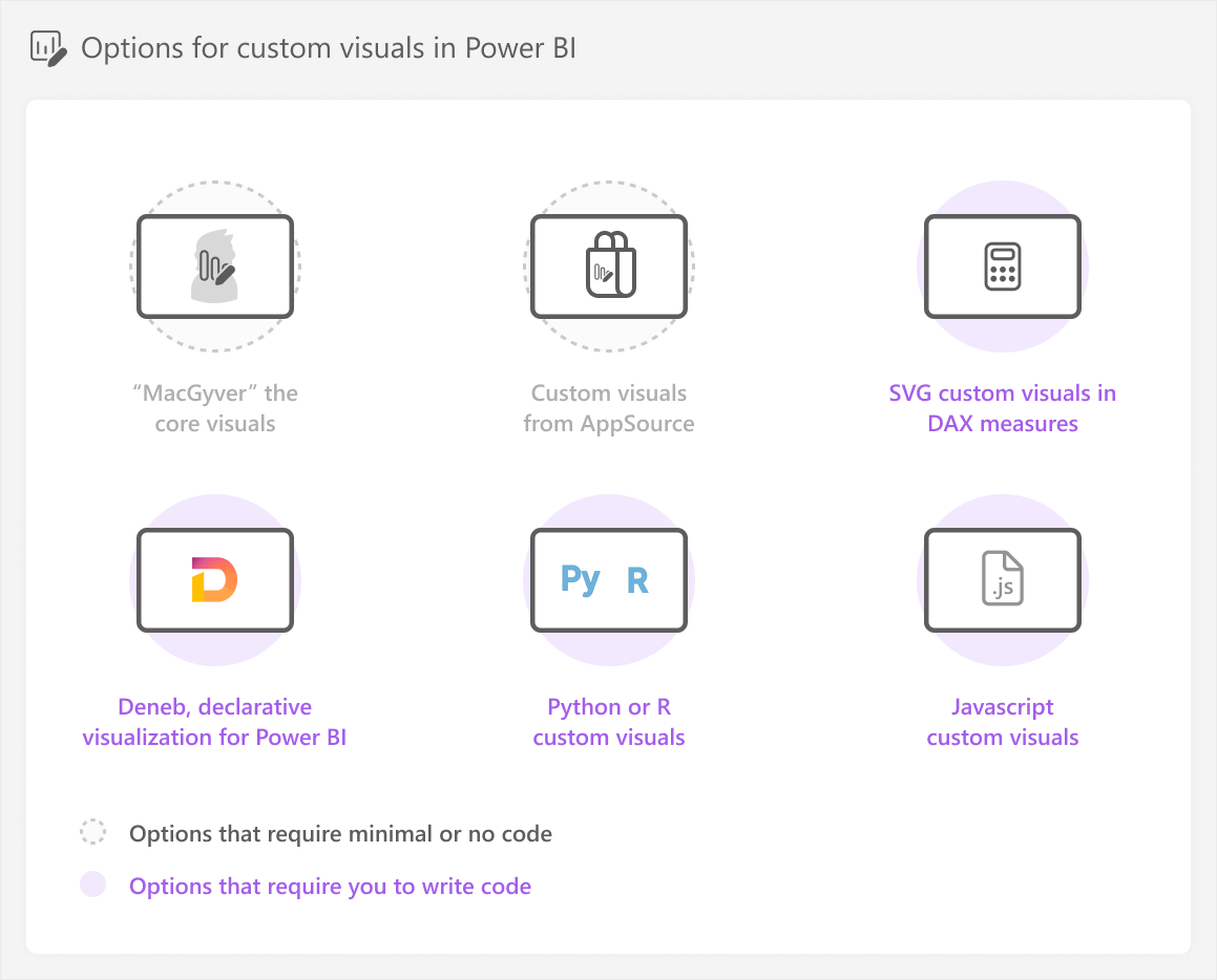
As a reminder, the “MacGyver” approach refers to the movie character MacGyver who is able to achieve anything he desires with whatever simple tools he can find.
Options using core or AppSource visuals require minimal code (like creating DAX measures), but other options do require you to write code or define a specification (or spec, for short). A specification is just the definition for the image, which might be in JSON (for Deneb) or XML (for SVG):
- SVG custom visuals in DAX measures require you to write DAX and SVG specifications.
- Deneb requires you to write Vega or Vega-lite specifications (Vega-lite is a higher-level, simpler syntax than Vega, but has less options and flexibility). In this article, we will create the custom visual in Deneb. However, in theory, you could use any of the code-based approaches for custom visuals that we list here.
- Python or R custom visuals require you to write Python or R code, with packages like seaborn or ggplot2, respectively.
- Javascript custom visuals require you to write javascript code with libraries like js and the tools to make these Power BI custom visuals.
With code comes additional complexity, as well as additional effort to develop, test, and maintain the custom visual. This is important to understand, because you are making a conscious trade-off: flexibility and customization for complexity, effort, and time. However, it is also important to be aware of templates, tools, and technologies that can offset this cost. An example of this is generative AI; specifically, large language models (or LLMs).
Explaining LLMs goes beyond the scope and intent of this article. If you want to understand more about how LLMs and generative AI technology work, check the following references. When you learn about LLMs, we recommend that you focus not only on the use-cases and benefits, but also on their risks, limitations, and societal impact:
- Article: How GPT models work by Bea Stollnitz (2023).
- Technical Papers: Language Models are Few-Shot Learners by Brown, T.H., et al. (2020) and On the Opportunities and Risks of Foundation Models by Bommasani, R. et al. (2021).
- Video (YouTube): Deep Dive into LLMs like ChatGPT and How I Use LLMs by Andrej Karpathy.
- Video (Microsoft Learn): Generative AI for Beginners and Fundamentals of Generative AI module by Microsoft.
LLMs can be useful for building custom visuals because their unlicensed training data likely includes code and specifications. Therefore, you can use these assistive tools to help you generate the code that you need. This can help you get either part of, or the full result, depending on your scenario. However, as you will see in the rest of this article, using LLMs can be helpful, but it still requires significant effort, time investment, knowledge, and critical thought from you.
This article is intended to show you an example of how to use LLMs to solve a problem – like building a custom visual in Deneb – by leveraging trusted sources, critical thinking, and context-awareness of your scenario. We could write a short article showing you “the magic” of how an LLM can create a basic, static visual from a drawing in a single shot (in one prompt). However, that would misrepresent the time and effort required to get a useful output in a real-world scenario; there is enough hyperbolic marketing about this technology, as-is from vendors and influencers, alike.
Explaining the scenario
In this article, we are designing a simple sales performance report that focuses on comparing sales to a target, like the previous year (PY, or 1 year prior; 1YP). The report is a good candidate for the 3-30-300 rule, which means that users should be able to get a quick overview of overall sales performance in 3 seconds or less. To accomplish this, discussions with users reveal that a KPI card with critical information would be the most effective way to give an overview.
Step 0: Understand the business process
We consider this as step zero because it is the most important step that you should always take when you create, change, or migrate models and reports in Power BI. Understanding the underlying process that you are reporting on is imperative to creating things that are useful for other people. We discuss this further in our article about the 3-30-300 rule for better reports, and in the Microsoft BI Solution Planning guidance (written in part by Kurt Buhler, also known as data-goblin).
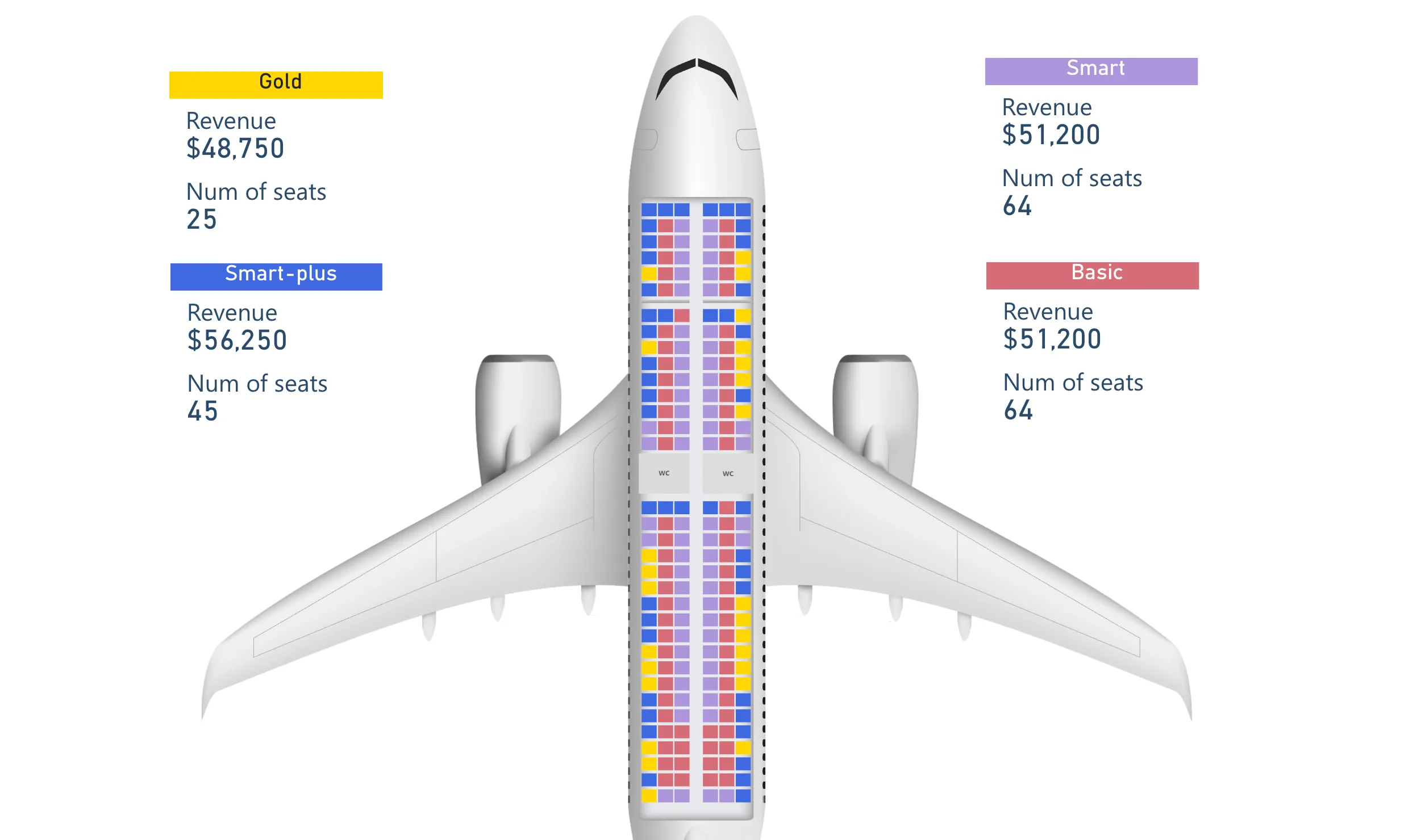
In this case, the business process involves tracking year-over-year growth in sales. For simplicity’s sake, we focus only on the high-level scenario for this KPI card. However, more specific business processes might benefit further from custom visuals tailored to support them. An example of this is with the Synoptic Panel custom visual by OKVIZ, which you can use to visualize spatial area, like parts of the human body, or airplane seats by location in the plane. Shameless plug, as OKVIZ is part of SQLBI.
Once you understand the business process, typically you would then proceed with creating a design.
Step 1: Design the chart
During these requirements gathering and discussions with users, you can work iteratively to design the chart. A good way to do this is by starting with a simple wireframe, or a more sophisticated mock-up. In this case, we create the wireframe by using Excalidraw, a sketching tool. However, we could have just as well used other tools, including a whiteboard or pen and paper.
The final design looks as follows:
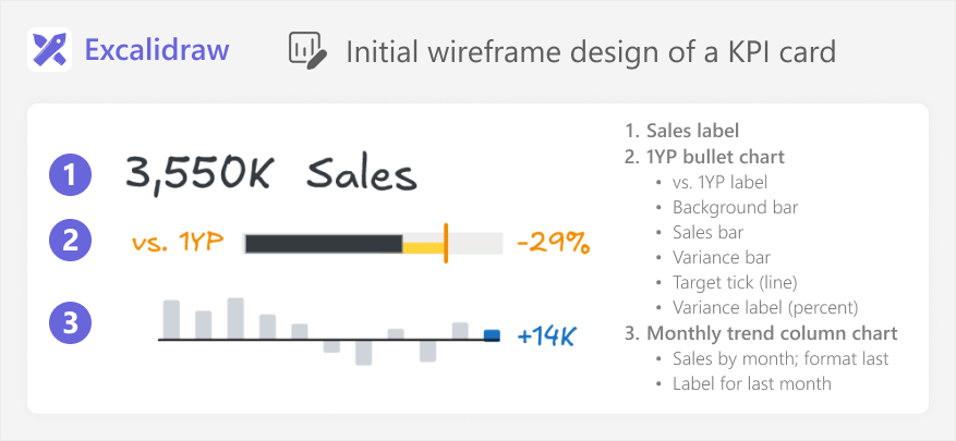
The design is straightforward, but it will be complex to implement in Power BI. There are multiple charts, labels, and formatting elements. We determine that we will not be able to create this chart easily by using the core visuals. There are also no existing templates that match exactly what we need.
Before you continue with a custom visual, you first have to evaluate whether this chart will be worth the extra time and effort to make it, at all. You can do this by discussing with users and proposing some alternative, simpler designs or templates that attempt to answer the same questions. You can also briefly try to estimate the effort it would take to build and test this custom visual by using one or more of the existing approaches, if you already have experience making custom visuals.
In this case, we decide that the KPI card is sufficiently important and useful for users, such that it is worth the extra resource investment to make it. So, we will create a custom visual, and we must decide on an approach.
Step 2: Choose an approach
As we discussed in previous articles, choosing an approach is not a science. Rather, it depends on your skills and your scenario. In this case, we have a complex, multi-element visual:
- “MacGyvering” this with core visuals is theoretically possible. You can bend, twist, and overlay visuals, but the result might become fragile and likely difficult to maintain or use.
- AppSource is not possible, since there are no visuals that look like what we need.
- SVGs are possible, but this would involve a large SVG specification, and very complex “DAX” code. Honestly, it would likely become a monster to build, test, and maintain.
- Python or R might be possible, but they are better suited toward statistical visuals.
- Javascript is possible, but a very complex, “last resort” option for most people, unless you have experience with this approach.
Given the above justifications, we opt for Deneb as our approach of choice in this scenario.
Step 3: Plan the Deneb visual
You might think that we can now start with the LLM tool, prompting for a specification. This is possible, but it is much more effective if you first think through what you are going to do in the tool or approach that you have chosen. Doing this planning will help you figure out where you can best leverage the LLM and why. By the end, this planning will save you a lot of time and frustration.
If you already have a good understanding of the technical topic – in this case, Deneb and Vega or Vega-lite specifications – then you might plan briefly in your head and skip right to the LLM tool. Beginners will mainly benefit from this planning, because it will help them create better prompts, learn the topic, and understand the LLM output. However, debatably, everyone can benefit by first creating an initial backbone-structure for your solution, before you start to use AI.
To plan the visual in Deneb, we first need to figure out which fields we need from our model, and whether we have all the necessary data and calculations. It is assumed at this point that you have a model available and validated. In case you do not, you would need to have one before you start building custom visuals. In this case, the fields we use include:
- Sales: Used for the sales label and the bullet chart. It is the total sum of all sales transactions.
- Month Short: Used in the monthly trend. It is an abbreviated month name (i.e. “Jan”).
- Sales PY: The target, used for comparisons and the target line in the bullet chart. This is the Sales for the same period in the previous year.
- Sales vs. PY: Used for the variance bar in the bullet chart, as well as the monthly trend and the label and formatting for the most recent month in scope. This deducts Sales PY from
- Sales vs. PY (%): Used for the bullet chart label. It shows the relative achievement of Sales against the Sales PY
Next, we have to choose whether we will use Vega or Vega-lite. In general, if you are less familiar with Deneb and Vega, you should choose Vega-lite, which is simpler and more concise. However, Vega might be required for more advanced scenarios. At this point, you might be tempted to ask the LLM for the difference between these two specifications, or advice about which one to use. Indeed, many people anecdotally claim to use LLMs and generative AI tools such as Perplexity to ask questions like this, which they previously asked in search engines. However, this might not necessarily be the most effective or useful way to get your answer.
We can ask an LLM about Vega vs. Vega-lite, such as Gemini Advanced 2.0 Pro Experimental:
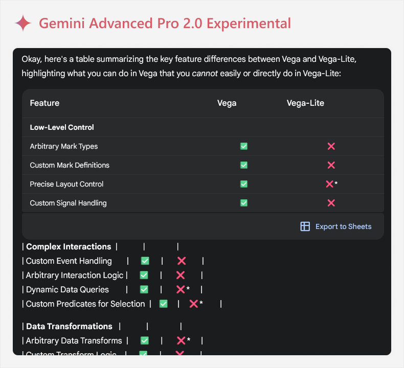
There are some challenges of engaging with LLMs in this way, particularly when you are new to a topic:
- Information may be too complex: LLMs are often verbose, and might use both complex and flowery language unless you tell them not to. Also, it can format the information in strange and sometimes unreadable ways, like the above example. An example of complexity might be the term “Arbitrary Mark Types”, which does not tell you anything if you are not familiar with Deneb. You might need to ask for the information to be rephrased or simplified to relate it to your scenario, and doing this increases the chance that you fall victim to AI mistakes.
- Information may be incorrect or misrepresented: LLMs are probabilistic, and aren’t guaranteed to produce factual information. The word choice may also be misleading, and certain information may be outdated if changes have occurred since the model was trained. In this example, for instance, it mentions “arbitrary mark types” which is a term that doesn’t even occur in the official Vega documentation. If you try to validate this information, it can lead to a lot of wasted time.
- Information may be missing: The answer provided by an LLM is not guaranteed to be complete, and may be inaccurate due to omission of true information rather than inclusion of wrong information. For instance, this output did not mention that Vega has additional animations, something which can be useful for interactive reports like in Power BI.
To clarify, these are not reasons to avoid using LLMs in this context. However, they are important considerations to keep in mind. Furthermore, you might get your answers in a more time-efficient way simply using traditional, non-AI approaches, first. For instance, we might do the following:
- Check trusted sources, first: Often, your question might be already answered in a very clear way in a trusted source. A trusted source includes official documentation, peer-reviewed literature (like technical papers), or media from unbiased community experts. For instance, the Vega-lite, Vega, and Deneb documentation is easy to find and very complete to answer basic questions. These sources are often the best source of truth about a topic. Even if you prefer to use LLMs, you should still validate information you find using them. This is particularly helpful if you use syntax (or operators) supported by search engines:
- Terms in “quotations” will be mandatory for the search result.
- You can force results to a specific site by using site:url at the end.
- You can exclude terms by using a dash prefix -like -this.
- You can search for specific file types using ext: or filetype:
- Use an LLM model with web search: The output example above comes from a model with web search, which means that it can get up-to-date results from the internet. This helps avoid the limitation of sparse training data.
- Provide the LLM tool more context: As we said earlier in the article, an LLM output becomes more useful when we provide more context and detail. So, if we describe our desired outcome, intent, and other context, the output will be more directly relevant.
For instance, the following is an output from Claude 3.7 Sonnet, after we provide our design and a description of what we are trying to achieve. We use Claude here to simply emphasize that the same strategies can be employed irrespective of which LLM tool you use (be it via Antrhopic, Google, or others).
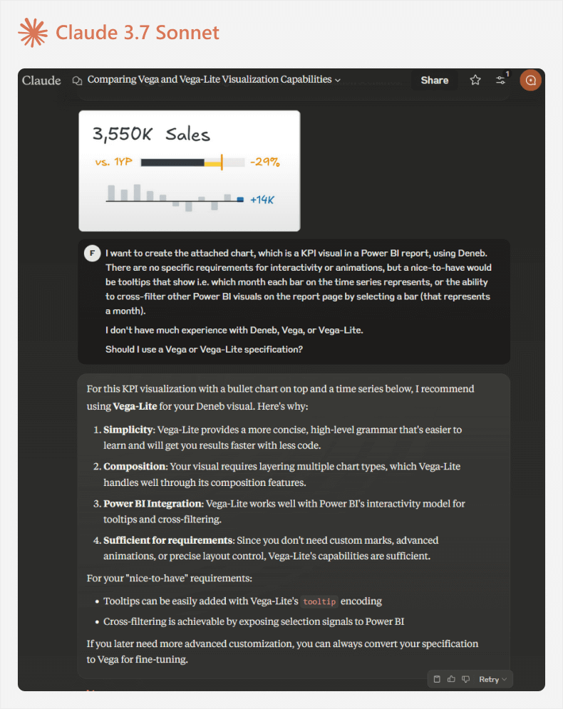
The output in this case is more useful and relevant to the scenario. We can validate what Claude says in the Vega-lite and Deneb docs, and then proceed with this specification.
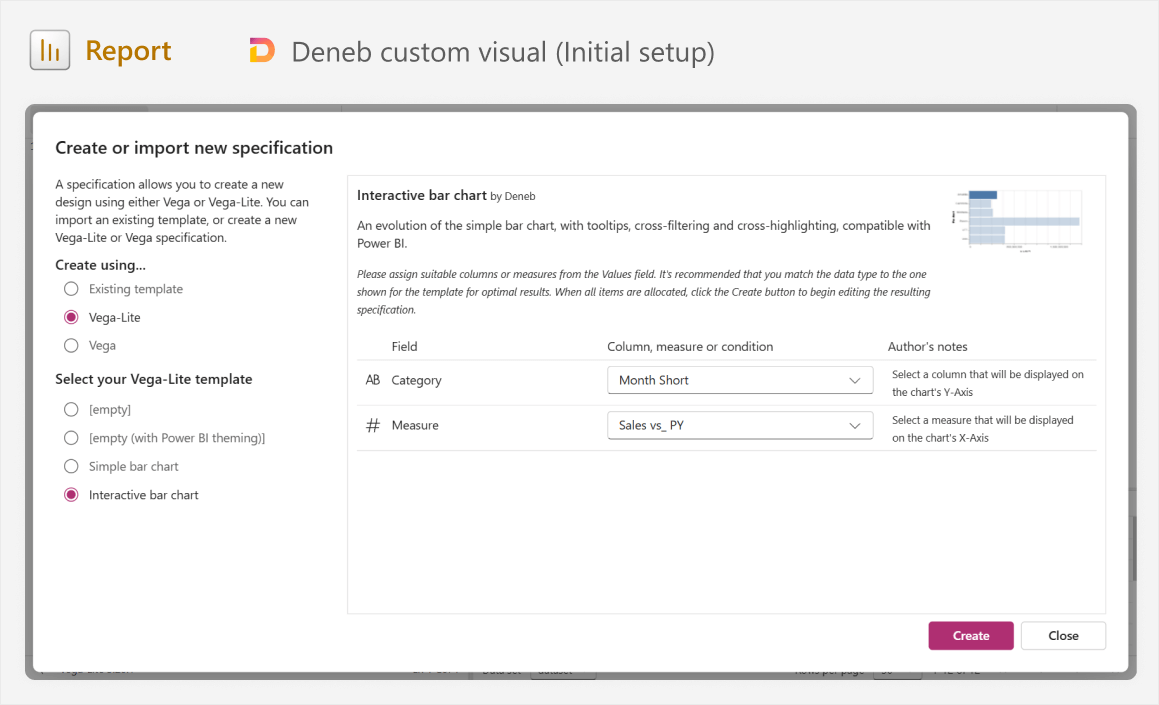
We can already open Power BI and add the Deneb visual (installing it from AppSource if you have not yet done so) and doing the following:
- Positioning and sizing the visual where you want it to go.
- Adding fields that we will use from the model.
- Choosing a Vega-lite template for an interactive bar chart, using Month Short and Sales vs_ PY.
The resulting visual should look like the screenshot below. If you need a more detailed explanation of the Deneb user interface, we discuss this in a previous article, and it is also explained in the Deneb documentation.
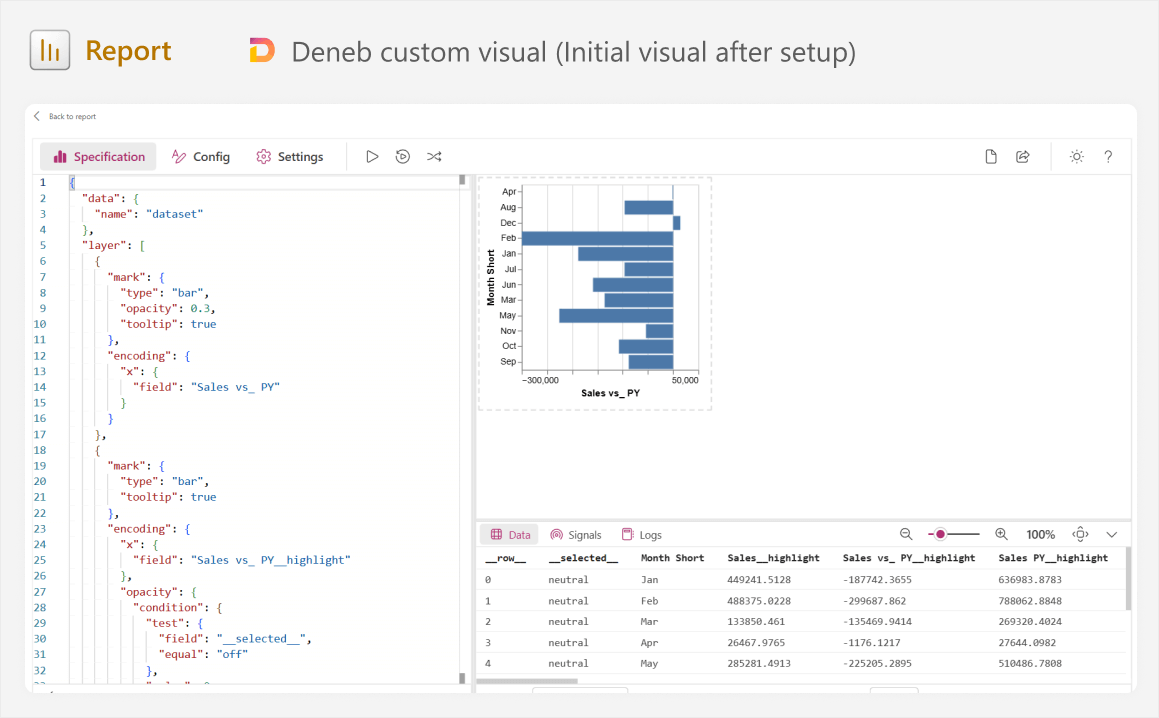
The reason why we already do this now is so that we can see the specification, which is the JSON definition using the Vega-lite syntax in Deneb. Having the specification gives us several benefits:
- We can immediately learn from it, understanding how it creates the canvas visual on the right. A good way to do this is by making little changes and seeing the effect on the result, like changing the mark type from “bar” to “line”, altering the field, and so forth.
- We can copy it into the prompt as an example, providing additional context.
Before we continue, it is prudent to provide a brief explanation about how Deneb (and Vega-lite) works, and how we should think about making this custom visual from this step onward:
- The fields you add to the visual are stored as a table; a visual dataset called “dataset” used by Vega-lite. You will notice that periods are replaced with underscores, but otherwise we can reference our measures and columns after the “field” key in a specification.
- The visual consists of multiple layers of “marks” on top of one another. For instance, our visual will contain a separate layer for the sales label, the time series, and so forth.
- Marks are just shapes, like “bar”, “line”, and so forth, which have encoding with properties. Encoding consists of not only formatting, but also axes positions and behavior.
- Data can be transformed in a visual and new calculations can be made. Sometimes this is appropriate, but other times it is wiser to create a new DAX measure to support the visual.
All of this information is important to know up-front, because it will help you design and submit better prompts, and use the outputs you get back. You will see examples of this later, but the alternative of “brute force iterative prompting” is a bad practice that can lead you to wasted time and poor results that you struggle to learn from or understand.
Step 4: Obtain relevant examples and information
Like we said already, LLMs will give you a more useful result if you provide more detail and context for your scenario. This does not just mean that you should write detailed and specific prompts, but also provide examples and supplemental information that is relevant.
In this case, we can provide the following context (the image is repeated for reference):
- Our desired result, which is a Vega-lite specification that produces a visualization resembling the image of the visual design (assuming that you use a multimodal model).
- A description of the desired result, including which visual elements are encoded by which fields in your model, and the names of those fields.
- Any interactivity that we expect, like tooltips or cross-filtering.
- That the Vega-lite specification will be used in a Deneb custom visual in a Power BI report, so fields will come from the Power BI model and not a URL or encoded in-line. This is important, since most Vega and Vega-lite specifications in the LLM’s training data likely were not used in Deneb in Power BI, but using other tools.
- The visual will consist of multiple layers of marks, as depicted in the image.
- An example Vega-lite specification, either from the starting template, or from another Deneb visual or template that more closely resembles our desired result.
To collect this context, you can already write a prompt in a text editor, which you can re-use with multiple chat windows or tools, if necessary.
Step 5: Choose an LLM tool
Not all LLM tools are equal. Depending on the tool you use, you might get different results. LLM tools can differ in various ways, such as the following:
- Whether you have to pay to use it or not: Some tools require a paid subscription. Models might also limit your usage per day, when you have to wait after you reach the limit.
- Whether they are multimodal or not: Some models accept only text as input, while others accept multiple forms of media, including text, images, or audio. A multimodal model is recommended so that you can provide images of your design for it to recreate.
- Whether they are “thinking models” or not: Some models incorporate additional computational pathways designed to replicate explicit reasoning before they return an output. These models take extra time to reason step-by-step and purportedly produce better outputs for complex tasks.
- Whether they use Internet search or not: Some models can search the Internet, while others are limited to only the information in their training data and user prompts.
- Recency of their training data: Older models like GPT-3.5 and GPT-4 have a training data cutoff further into the past, meaning that they are less likely to have up-to-date information if they do not use Internet search.
- Subjective performance in certain tasks: Different models perform better on different tasks. For instance, Claude 3.7 Sonnet is thought to perform best on coding tasks.
This is not a complete list, and there are other factors that you might consider, in addition to these. For instance, you also might be limited based on organizational policies or regional access. It is important to mention that unless your organization has specific enterprise plans (like for Azure Open AI) or you use a local LLM installed on your machine, you should avoid sending sensitive information to LLMs and AI tools.
Specific examples of LLM tools that you can use include those by Open AI (GPT series), Google (Gemini), Anthropic (Claude), Deepseek (R1), and others. You can also try LLM tools that leverage these models, such as Copilot, if that is all you have access to.
In this scenario, we will use Claude Sonnet 3.7, because it performs well with coding tasks, and the “concise” mode is convenient for experimentation and demonstrations. While writing the article, we also used Gemini models, although it seemed that Gemini struggled to generate useful Vega-lite and Vega specifications for our scenario.
Step 6: Write a prompt
It is finally time to start generating our Vega-lite specification for the custom visual. The first prompt will be the longest, because we are sending both the instructions and the context (from step 4), together. There is a lot of guidance about writing good prompts that you can find online, and some of this guidance differs depending on the LLM or tool you are using. In general, however, it is just important that your prompt is detailed, specific, and structured. You can see one example of how to do this, below:
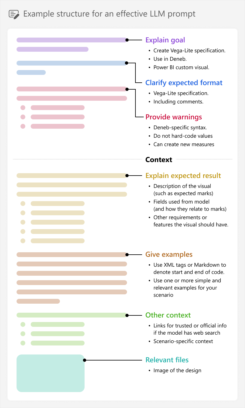
It is important to know that this is just one example, showing the different possible “parts” a prompt might contain. You might experiment with shorter prompts, adding more or less relevant context as you feel is necessary, for instance. There is not really one “best” approach that will consistently work for every scenario and model.
The visual that we want to build is complex, with many different marks and encodings. If we try to generate the entire thing in one shot, we can quickly get overwhelmed with a complex specification that will be too difficult to debug and fix. Instead, we should break up the visual into parts, generating just one mark at a time, and proceeding to the next one only once the previous looks and behaves how we expect.
This was also why we took the time to plan the visual and think about the specification, beforehand. We can break the problem into smaller parts and tackle one logical part at a time with the AI, which will make it faster and easier for us to get useful outputs. For instance, we can start with generating the simple “text” mark for the Sales label in the top left corner.
An example of the full initial prompt with its output is shown below:
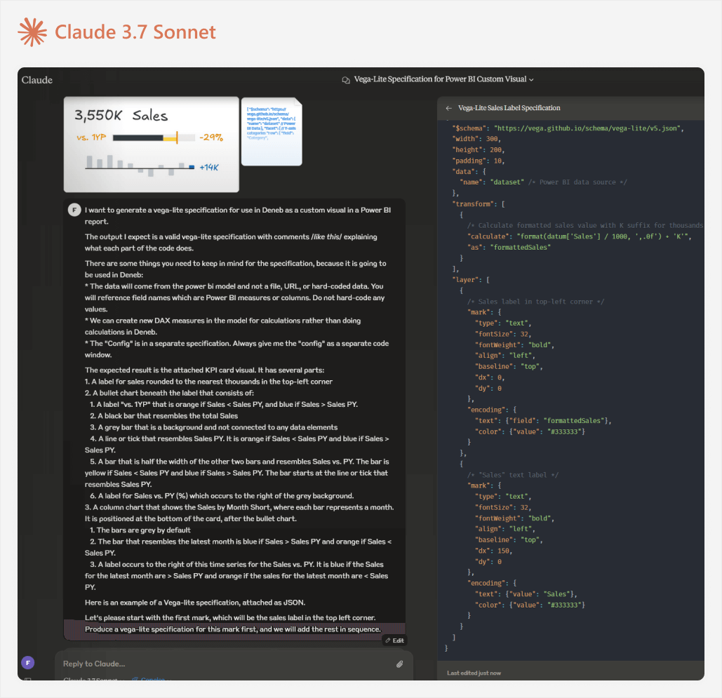
The full prompt is below:
I want to generate a Vega-lite specification for use in Deneb as a custom visual in a Power BI report.
The output I expect is a valid Vega-lite specification with comments /*like this*/ explaining what each part of the code does.
There are some things you need to keep in mind for the specification, because it is going to be used in Deneb: * The data will come from the power bi model and not a file, URL, or hard-coded data. You will reference field names which are Power BI measures or columns. Do not hard-code any values. * We can create new DAX measures in the model for calculations rather than doing calculations in Deneb. * The “Config” is in a separate specification. Always give me the “config” as a separate code window.
The expected result is the attached KPI card visual. It has several parts:
- A label for sales rounded to the nearest thousands in the top-left corner
- A bullet chart beneath the label that consists of:
- A label “vs. 1YP” that is orange if Sales < Sales PY, and blue if Sales > Sales PY.
- A black bar that resembles the total Sales
- A grey bar that is a background and not connected to any data elements
- A line or tick that resembles Sales PY. It is orange if Sales < Sales PY and blue if Sales > Sales PY.
- A bar that is half the width of the other two bars and resembles Sales vs. PY. The bar is yellow if Sales < Sales PY and blue if Sales > Sales PY. The bar starts at the line or tick that resembles Sales PY.
- A label for Sales vs. PY (%) which occurs to the right of the grey background.
- A column chart that shows the Sales by Month Short, where each bar represents a month. It is positioned at the bottom of the card, after the bullet chart.
- The bars are grey by default
- The bar that resembles the latest month is blue if Sales > Sales PY and orange if Sales < Sales PY.
- A label occurs to the right of this time series for the Sales vs. PY. It is blue if the Sales for the latest month are > Sales PY and orange if the sales for the latest month are < Sales PY.
Here is an example of a Vega-lite specification, attached as JSON.
Let’s please start with the first mark, which will be the sales label in the top left corner. Produce a Vega-lite specification for this mark first, and we will add the rest in sequence.
Again, this prompt is not intended as a perfect example. Rather, it shows one example of how to provide context. As you will see later in this article, even though this prompt is quite verbose, we still missed critical information.
Once you submit the prompt, the LLM will use it to produce an output: the Vega-lite specification. Unless there are any errors or strange elements in the resulting code, we can copy it to Deneb in Power BI for further inspection. If you get errors or an unexpected output, you should try again in a new chat.
Step 7: Validate the output in Power BI
When we copy the code, we should over-write the existing template that we had previously. Often, many people copying code from LLMs will try to run it immediately. If it produces an error or no result, they return back to the LLM to say “it doesn’t work”, maybe with a copy of the error. For simple scenarios this might be fine. But generally, this “brute force” approach is not very effective or time-efficient, especially when you are working with programming languages or specifications where you have little experience, or when you are working toward more complicated outputs.
Instead, before we even run the code, we can format it (by right-clicking and selecting format document), then check for some common issues, such as:
- Mis-named or mis-spelled fields.
- Redundant or excessive code in the specification that is not usually used in Deneb.
- Hard-coded values.
- Unexpected transformations, filtering, or encoding.
- Errors and warnings from syntax highlighting.
- Differences in the new versus previous version (if you are already iterating) which might include differences that you did not expect the LLM to make.
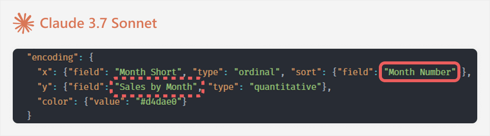
These issues are usually easier and faster to spot and fix manually. For instance, in the following example, the LLM made assumptions referring to the “Month Number” field (which is not available) and “Sales by Month” (which should just be Sales):
For error messages, it can be helpful to search the affected part of the code in the documentation before asking the LLM. This is because error messages can sometimes be ambiguous, and the LLM might propose over-zealous changes that do not target the specific problem. You can avoid this by referencing the specific affected line, if possible.
For instance, this is the initial result that we get; it is not exactly great.
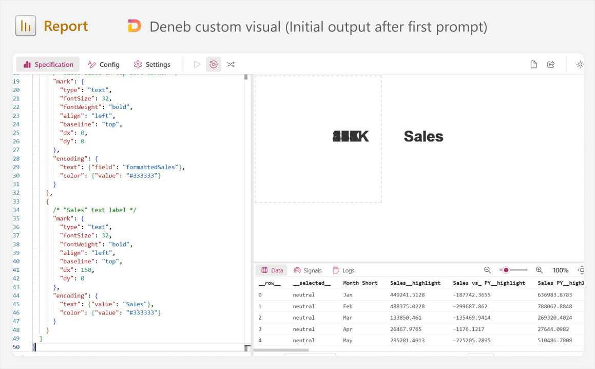
Looking at the specification and this output, we can see several things:
- It split up the sales label into two marks (number and “Sales”) rather than one.
- It specified “dx” and “dy” rather than a simple “x” and “y” coordinate.
- It appears to be showing the numbers many times on top of each other, but “Sales” occurs only once.
It is time to do some troubleshooting, and this is where most of our effort comes in.
Step 8: Consult documentation and examples to understand the output
When people generate code using AI, they often proceed until they get a usable output, without stopping to read, experiment with, and understand that code. If the output is unexpected, they toss it back to the LLM and ask it to try again. Generally, you want to avoid falling into this trap, because you will learn less, your code will have more mistakes, and it will be harder for you to maintain in the future.
For instance, we have an issue here where the label is in the wrong position, and it does not appear how we expect. We can give feedback to the LLM and try again, but the result is not much better.

This would be a good time to pause and digest what is happening on the screen. Why is the label appearing multiple times? To answer this, we could look at the Vega-lite documentation for the “text” mark; specifically, some examples. We can also look at other community examples that resemble what we are trying to do here. In doing this, we would notice that other examples use an “aggregate” transformation, and we do not. Reading about aggregate in the Vega-lite docs (or asking the LLM), we would understand that by not including this in our specification, it is not aggregating sales… It is displaying the label for sales by Month Short all on top of one another:
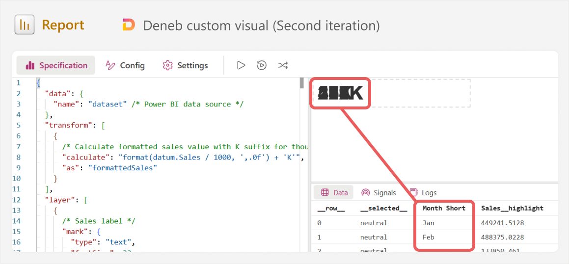
As you can see in the image, our “data” in the bottom right shows 12 rows; one for each month. That means that without aggregation, we are going to show 12 labels. We can validate this by filtering to a single month in Power BI, which causes only a single label to render. Now, with this revelation, we can either try to adjust the code ourselves, or give feedback to the LLM about what is happening, and get the desired result with an improved specification, this time using “aggregate” with an operation (or “op”) of “sum”:

So, did Claude make a mistake? Why did it fail to consider this possibility? Well, the truth is that even though we tried to be as context-complete as possible in our prompt, we still failed to tell Claude what the “visual dataset” would be that Deneb used. Claude “assumed” that we did not need to aggregate. Note that LLMs are non-deterministic, so even with the same prompt, you might get a completely different result that is better (or worse).
So we learned two things:
- What aggregation is in Vega-lite, and how (and when) to do it.
- That we should give the LLM a description of the Deneb dataset in the context; field names might not necessarily be sufficient.
A next good step is to optimize the first generated mark before we move on to the next one. Some good things to do or experiment with are:
- Testing how the value changes when you apply filters or slicers.
- Changing the font style, position, or size.
- Adding conditional formatting.
- Adding comments to the code to explain it. You can also ask the LLM to add these comments, but be sure that you ask it to avoid making any other changes, first.
- Experimenting with confusing or complex parts to understand what they do. For instance, the specification has a certain syntax for formatting the label which you can temporarily alter to understand it better. Alternatively, you can check these parts in the documentation, or in templates from the Vega-lite gallery or community.
We now have our first of many layers. As you can tell, this can still be a long and complex process, even with the help of AI! Official, trusted sources and examples are incredibly valuable, and it also helps to take plenty of notes and comments as you learn.
From here, we copy the specification back into the LLM, and create a prompt to generate the next mark. If you will generate the next mark in the same specification (and not a separate one, for simplicity), then it is important to prompt the LLM to not make changes to the code unless you explicitly ask it to.
Step 9: Iterate between steps 6-8
In a nutshell, you repeat the process for steps 6 through 8 iteratively, for each mark that you need to generate, proceeding only when you are happy with the result. You can either generate them separately as distinct specifications and combine them later, or try and add them incrementally to the same visual. The former is more time-intensive, but easier to troubleshoot each mark, while the latter might be more efficient when things work, but more troublesome to manage and fix if they do not.
This article focuses on the process, and not on generating this specific result. So, we will not go through each mark in detail; that would take too long. However, we will highlight some common caveats and challenges that you face along the way. In general, a pattern you want to keep in mind is thus:
- You need a specific outcome and do not know how to get it.
- You describe it and provide sufficient context to the LLM and request an output.
- You take the output and it either:
- Works, so you optimize and understand it, then proceed to the next part of the code.
- Does not work, so you search the error, function, pattern, or problem in trusted sources to either solve it yourself, or to point the LLM in the right direction, and repeat at 2 with describing.
For instance, one challenge is whether to perform calculations in Deneb, or supply them as new measures. When generating the specification, the LLM will be biased toward putting the solution entirely in Vega-lite. This works, but it might not be the simplest or most optimal solution. For instance, when generating the column time series, we need to conditionally format the last month. You could identify the last month in Vega-lite by using a “window” transformation, with a “last_value” operation. However, we could also solve this problem with DAX by writing a measure to return the last month value. Then, we can add the measure to Deneb to use in the specification:
LatestMonth =
CALCULATE (
    FORMAT ( LASTDATE ( 'Date'[Date] ), "MMM" ),
    ALLEXCEPT ( 'Date', 'Date'[Quarter], 'Date'[Year] )
)
Adding this measure might be easier if you are comfortable writing DAX code.
The lesson here is to not get tunnel vision when you are working toward a code solution in an LLM. There are multiple routes to the solution, some of which might be outside of the immediate scope of your LLM conversation. This is particularly true in Power BI, which involves integration and cross-communication between different tools, technologies, and programming languages.
A final note worth mentioning is that things are simple when generating individual marks, but they get complicated when you need to combine them together. This is a general property of LLMs; more mistakes happen when you integrate and scale. As you need to integrate more pieces of a solution into a single, functional unit, the LLM chat becomes slower and more sensitive to issues. Certain concepts will only arise during integration that are more advanced, and they might have consequences that you did not fully anticipate.
For instance, the column time series needs to be moved to the bottom of the visual; the top needs to have sufficient room for the other visuals. To do this, we partition the visual container, but this also prevents the visual from autoscaling if we need to make it larger on the report page. These kinds of considerations are important to keep in mind.
Step 10: Test the custom visual more thoroughly
Once the visual looks the way you want, it feels pretty good. However, do not stop and celebrate, just yet. As we mentioned before, custom visuals require not only more effort to make, but also to test. You need to make sure that the visual responds to filters, slicers, and other interactions the way you expect. Often, you will find issues that did not show up in the “default view”, but would be glaringly obvious when you filter the data. You will also find cases where you need to add additional flexibility, such as dynamic formatting when numbers reach a certain size.
For instance, when generating the visual with Claude 3.7 Sonnet, we observe the following output, which looks pretty close to what we want. However, filtering the data reveals a massive issue:
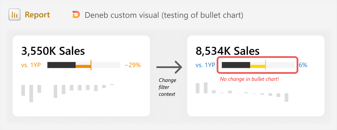
When filtering the data, we see that the bullet chart is simply just hard-coded shapes. Ideally, you should pick this up if you are generating each mark one at a time, but when integrating the layers together, you might end up with unexpected issues like this. Resolving the issues also simply means reverting back to the iterative steps 6-8.
A last mention is that it is important to be self-aware of a “point of no return”. This is a point where the code you are generating or the conversation with the LLM becomes so convoluted, that you are not making progress anymore. When you reach this point, you may consider trying a new chat with the LLM (starting over from the last specification that worked), or spending some time reading and learning about the area where you are struggling, before you continue further. Do not underestimate the value of taking one step back to learn, so you can take three steps forward, later!
In conclusion
AI assistive tools like LLMs can be helpful for certain tasks like building custom visuals. These tools can help you do things that were not possible previously, and they can help you improve efficiency. However, they are not a magic bullet, and they have certain risks and considerations to keep in mind if you use them. You can use them to build interesting and useful things, but doing so still requires that you take a thoughtful approach with deliberate planning and critical thinking. It is also important to regularly find and incorporate trusted online sources in your process, rather than relying solely on LLMs alone. If you make something that will be used beyond a screenshot for a LinkedIn post, then you should expect that it will still require significant time and effort.