 Kurt Buhler
Developing a good semantic model or report takes a lot of time and effort. One way to reduce this cost is by re-using parts of an existing solution for a new model or project. This modular approach is particularly valuable when a developer faces common or recurring challenges and processes. Despite this, many developers commonly repeat efforts when they start new projects, models, and reports. For example, developers will often manually recreate measures, date tables, and patterns in a new model, or spend precious hours formatting visuals in a new report, while they have already created the same or similar things in the past. One reason for this is that it is difficult to identify candidate elements to re-use, or how you can re-use them in a convenient and scalable manner.
In this article, we want to introduce a conceptual framework from UI/UX called the atomic design methodology from Brad Frost. This framework can help developers to approach Power BI models and reports in a modular way to improve productivity and consistency of a developer’s work. The purpose of this article is to introduce the concept as well as some approaches that exist to re-use parts of your model and report. In future articles and videos, we will elaborate on these and other methods in additional detail.
Introducing atomic design
The atomic design methodology is described by Brad Frost as “…a mental model to help us think of our [solutions] as both a cohesive whole and a collection of parts at the same time”. To summarize, it means that this approach can help you to identify (and re-use) the modular parts that make up your models and reports, as you develop them.
In brief, this methodology describes how you combine simple, re-usable building blocks to create more complex solutions. To illustrate this, Frost uses a metaphor from chemistry (thus the name atomic design), which describes how atoms combine to form molecules, which eventually comprise organisms. In total, Frost describes five layers (whereupon only the first three follow the chemistry analogy). These five layers are depicted in the following diagram.
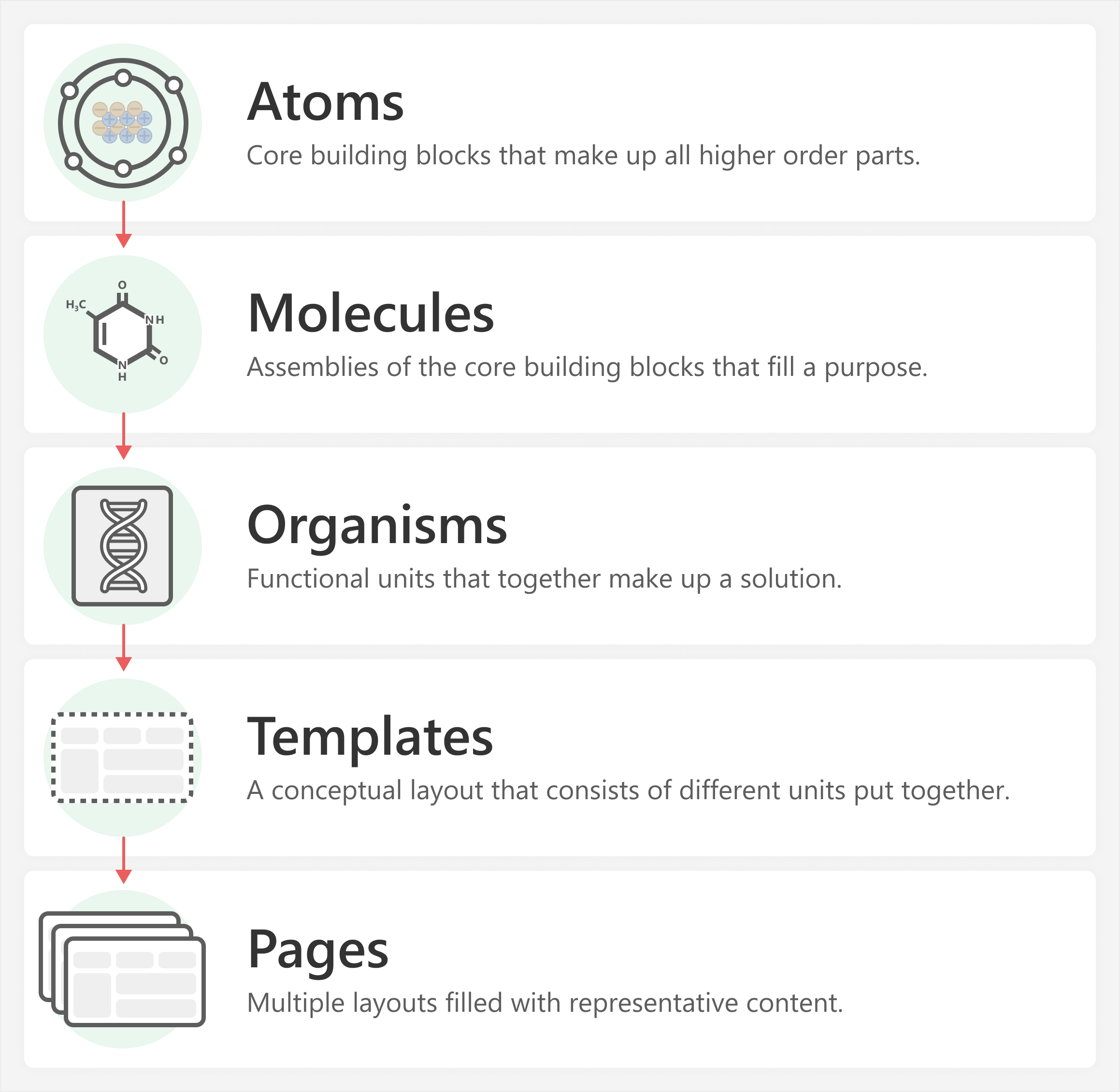
The five levels of the atomic design methodology consist of:
- Atoms: Core building blocks that make up all higher order parts.
- Molecules: Assemblies of the core building blocks that fill a purpose.
- Organisms: Functional units that consist of many different complex molecules.
- Templates: A conceptual layout that consists of select functional units (or organisms). At this point, the element more logically represents a whole solution, rather than a sum of different parts.
- Pages: Multiple layouts filled with representative content that refers to a final solution.
This methodology was originally created about UI/UX. However, it can also apply to the development of semantic models and reports. To apply this framework to business intelligence, we feel that these levels must be more practically defined. Unfortunately, it does mean that we lose the chemistry metaphor (although it is still helpful to understand the underlying concepts).
The following diagram clarifies this framework as it might apply to the development of Power BI reports.
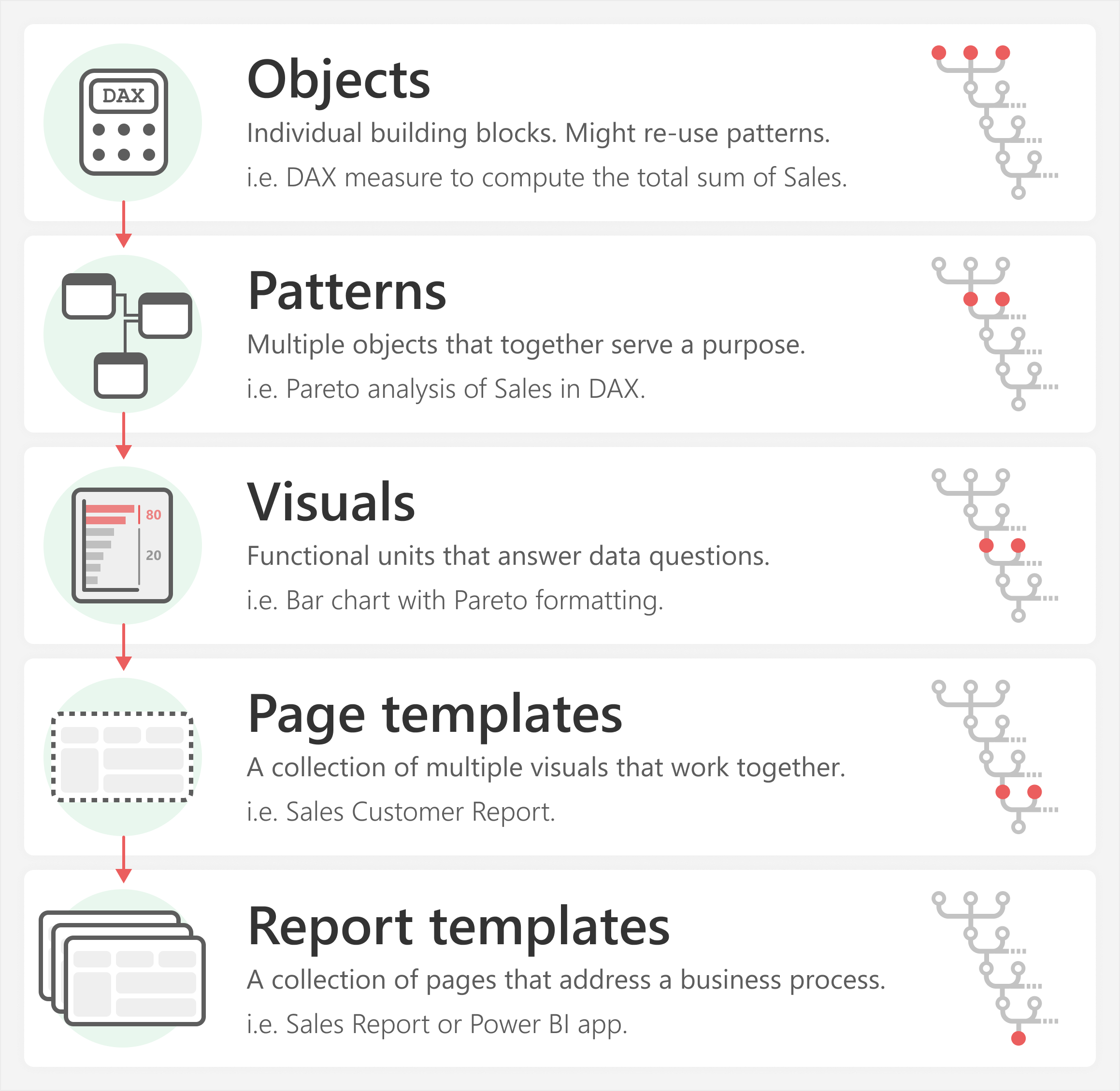
These same five levels as they apply to BI are:
- Objects: Individual, foundational building blocks of a model or report. Objects have no dependencies, and come together to make patterns. An example of an object is a DAX measure that you use to compute the total sum of sales. Objects are not necessarily limited to things in the model, and could also be self-contained elements for a report, such as an image, button, or text.
- Patterns: Multiple objects that you put together for a specific function or purpose. Common examples of patterns could be dynamic currency conversion, pareto analysis, or ABC classification in DAX. Patterns could also comprise a collection of elements in a report, like a title area in a report (described later in this article).
- Visuals: Functional units that answer data questions. Visuals combine both objects and patterns. These can be from the model or visual formatting. An example could be a bar chart that shows the Total Sales by customer, with conditional formatting that uses the result of a pareto analysis. Visuals aren’t limited to report items; an Excel Pivot table is also an example of a visual.
- Page templates: A collection of multiple visuals that work together in a single view. Different visuals in combination can sometimes (but not always) answer more questions more effectively. For example, a sales customer report could use different visuals to most effectively describe and break down sales both within and across customers.
- Report templates: A collection of multiple views that together address a business process. A report template might also be an app template. For instance, you could have multiple pages or reports that together comprise a template for a month-to-date sales reporting process.
To apply this framework to Power BI development, we must identify what parts of a semantic model or report can be re-used, and how we can effectively re-use them.
Practical examples
The following sections walk through some simple examples to demonstrate how this methodology applies to the creation of a Power BI report.
Level one: Objects are your building blocks
Objects are the foundational elements you use to make a Power BI model or report. These objects typically comprise measures and columns that you create in the model, but they can also include foundational elements in a report, like text boxes, icons, or background images. A foundational object generally does not have any dependencies on other objects that you create. You use multiple objects to define patterns that perform a specific function, which one object cannot do alone.
The following is a simple example of objects with Orders Amount and Sales Amount measures that are objects which aggregate columns.
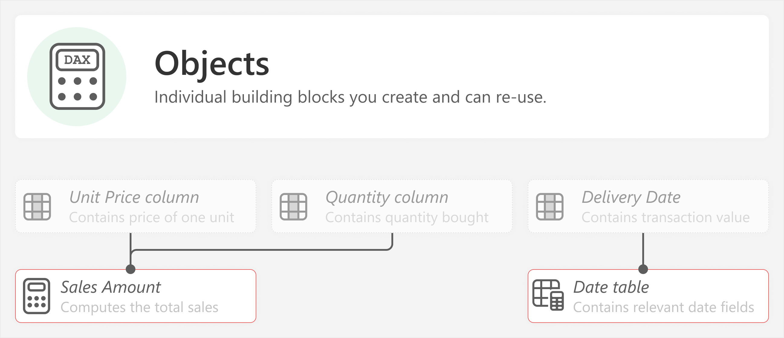
Orders Amount =
SUMX ( 'Orders', 'Orders'[Unit Price] * 'Orders'[Quantity] )
Sales Amount =
SUM ('Sales'[Sales] )
In this example, Orders Amount is a basic measure that aggregates the quantity by unit price for each transaction with SUMX. Sales Amount only aggregates the Sales column with a SUM. Both of these measures are examples of foundational objects that might be used for many downstream patterns or visuals.
To reiterate, these basic elements are not confined to the model. An object might also be a basic piece included in a report. An example of this is in the next section.
Level two: Patterns combine objects to do something
Patterns combine objects to make more complex, functional elements. For instance, they might include a calculated table, like the following example of a simple currency conversion pattern for multiple sources and single target.
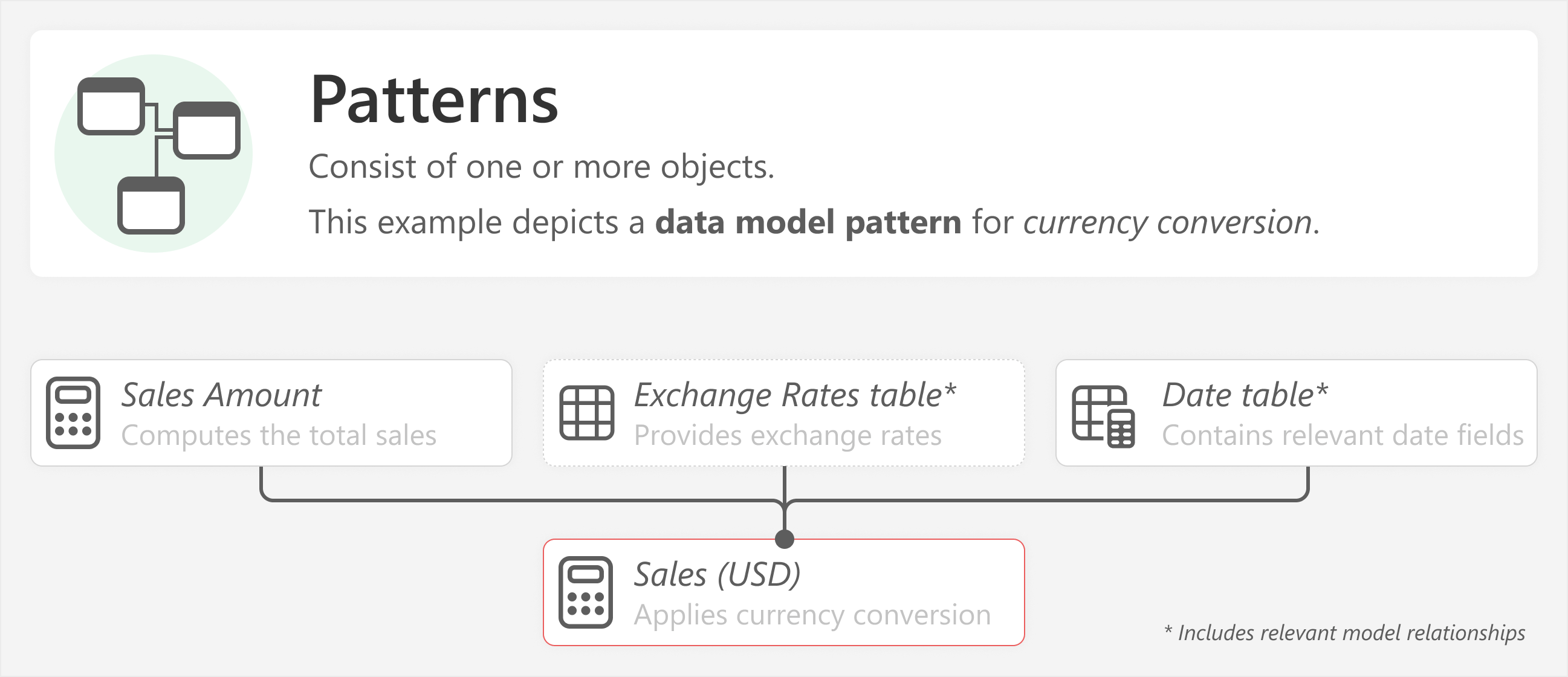
In this scenario, the currency conversion pattern uses multiple objects, such as another base measure, an exchange rate table, and a date table. The pattern is applied to Sales Amount to produce the Sales (USD) measure.
Patterns can also be specific to reports. These are usually a collection of different elements and properties on a report that don’t necessarily come from a data model, or are specific to a reporting requirement. Consider the following example of a simple pattern for a left-hand title area on a report, which you can copy and re-use modularly across multiple report templates.
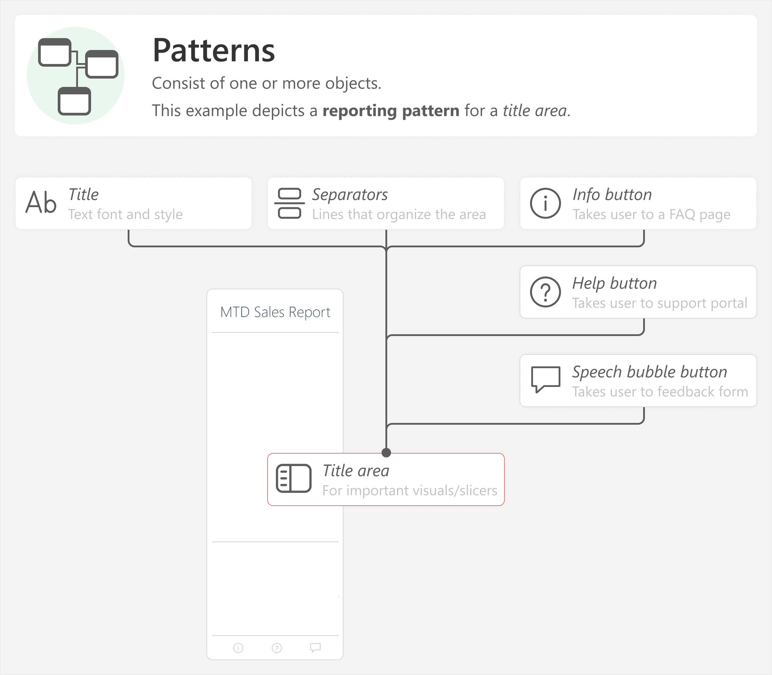
In the previous example, you could make the title area from scratch each time you make a report. However, it is much more convenient to combine elements from a library that you just copy and paste from. This is even more beneficial if you have fixed styles or functionalities that apply to many reports (like a centralized portal that you link to from a help button).
In both examples, some foundational objects are combined in a logical way to obtain a meaningful, functional result. Patterns are a combination of different objects that fulfill a specific purpose. Typically, you use patterns to produce more objects, or to achieve a specific functionality. You can apply multiple patterns at once, such as using currency conversion with time intelligence to aggregate figures depending on a user selection. Then, you can use measure format string expressions to format the numbers in a specific way. In that example, three different patterns together produce the desired result.
A pattern does not necessarily have to be something that is common or popular. A pattern is specific to you. It is simply something that you do regularly in your work to obtain a desired result by combining some basic parts together. For instance, other examples of patterns can include:
- Dynamic selection of measures in a report, such as by using fields parameters.
- Incremental refresh of import or hybrid tables in a semantic model.
- Displaying different currency symbols in a report for currency conversion, such as by using dynamic measure format strings.
- A custom Power Query function to find and replace multiple characters at once.
- A set of formatting rules for visual containers that achieves a specific aesthetic (such as one applied via a Power BI theme.json file).
- A combination of buttons and slicers in a report, which can produce a pop-up navigation or selection menu.
If you are developing a model, you might be most interested in re-using objects and patterns. Indeed, these are the elements you will likely re-use the most. However, typically, you create these objects and patterns to use in a table or visual.
Level three: Visuals use patterns to answer data questions
Objects and patterns together are required to create one or more visuals. The following example shows how a simple card visual comprises several different patterns.
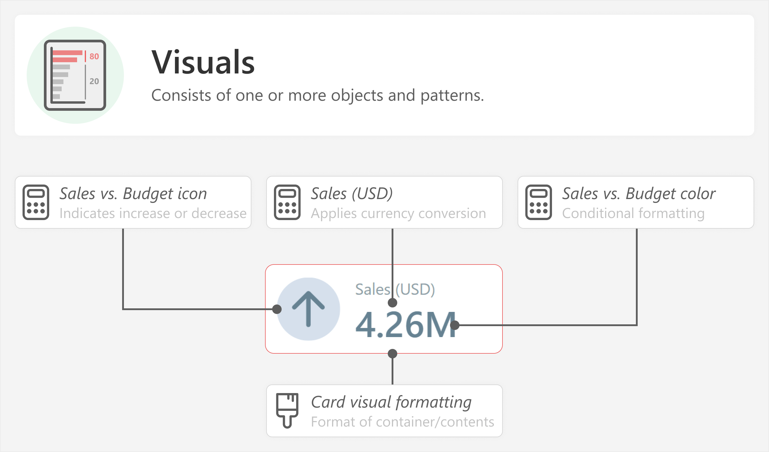
To make this card visual, you require the following:
- The Sales vs. Budget icon measure, that will conditionally return an up arrow if sales are higher than the budget and a down arrow if they are lower.
- The Sales (USD) measure, which provides the sales callout value.
- The Sales vs. Budget color measure, that will conditionally return a blue hex color code if sales are higher than the budget and orange if they are lower.
- The card visual formatting, which is a set of properties for the visual container and elements to look the way they do. This might be saved as a theme.json file, or applied with the Format painter tool in Power BI Desktop from an existing visual template.
You then combine one or more visuals together in a single report page to fully cover the necessary questions the user might have about their data.
Level four: Pages combine visuals in a single view
Report pages consist of multiple visuals or other elements in a single view. Consider the following example from a previous article, which includes the card visual from the previous example, and several other visual elements which together help answer questions about the MTD Sales compared to different targets. Note that a page template does not have to be used as-is, and can be selectively modified to include different combinations of visuals, layouts, and styles.
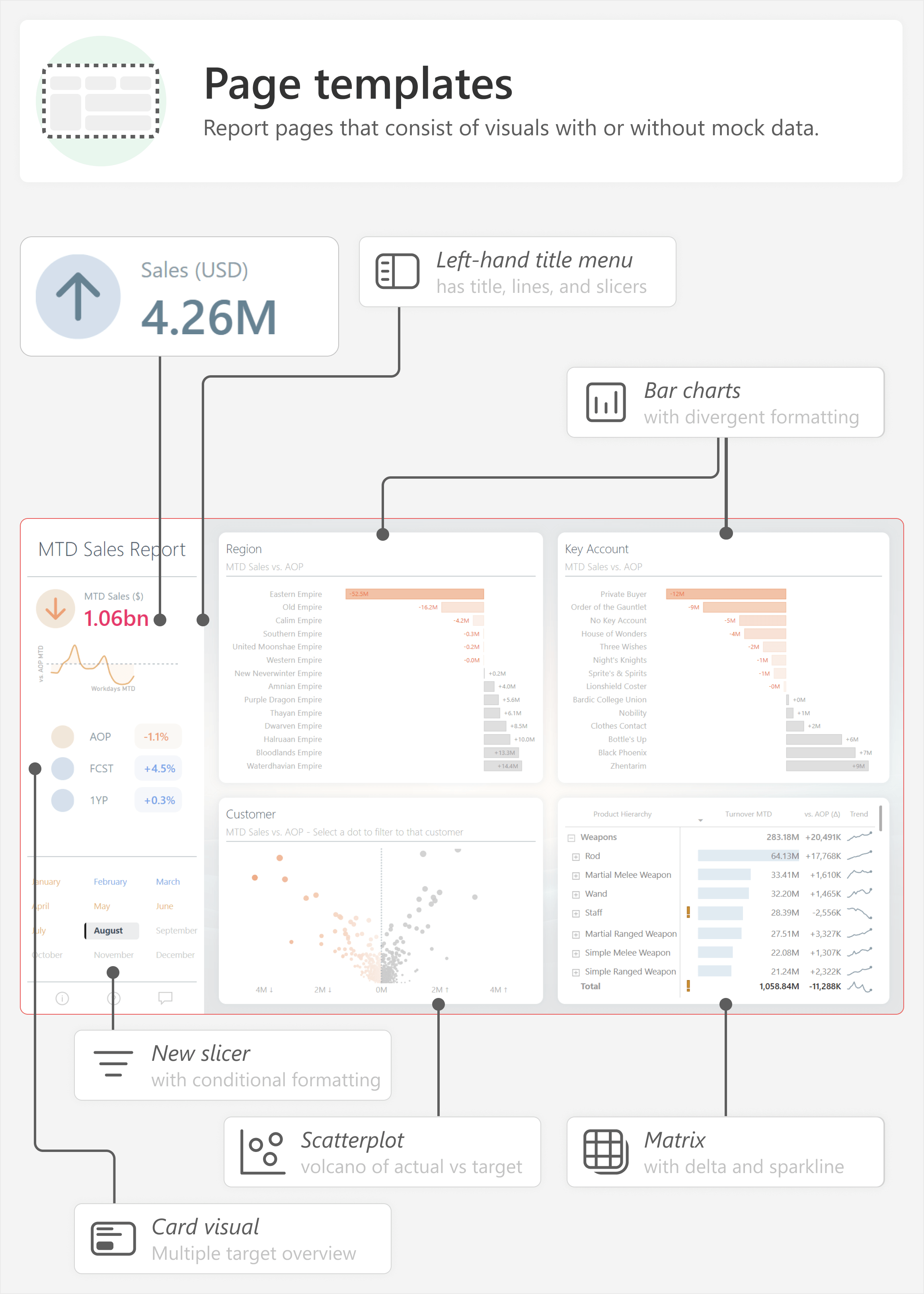
Report page templates are designed to address a set of specific questions or data needs. For instance, this report provides an overview of MTD Sales versus a target, where the focus is on categories that under-perform for that month. It is specifically constructed to understand sales performance within a month, then to dive into two key breakdowns (in this case, by region and customer key account) and with cross-filtering to get details for those areas that under-perform.
Page templates are typically adapted to suit the needs of specific users. For instance, users might prefer a larger table that covers the width of the bottom page, or they might prefer a line chart that shows the cumulative MTD sales plotted against one or more targets. Adapting these page templates is simple if you keep rigorous visual templates, because you can swap one visual (like the regions breakdown) out for another (like a line chart).
In many cases, it is necessary to have multiple report pages that provide a logical and convenient flow for users to interrogate their data.
Level five: Templates comprise multiple views that work together
You combine multiple report pages into a single report, or across reports in a Power BI app. Whether you use a single report or an app depends on how you organize and distribute your content; for the purpose of this article, they are both simply a collection of multiple report pages.
Consider the following example that places the MTD Sales Report in the context of a Power BI app, which has other reports and links to supplemental resources.
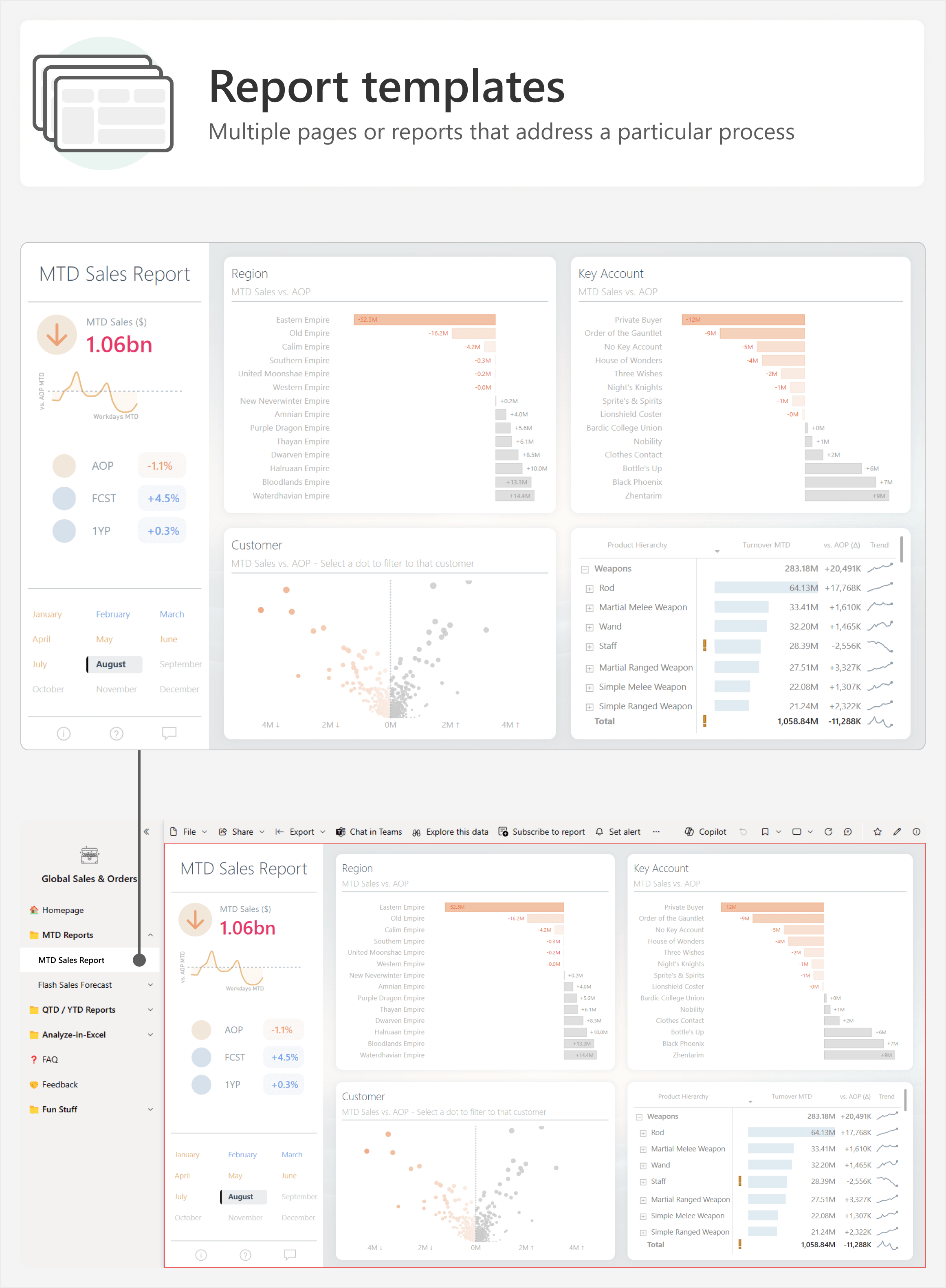
In this example, the Global Sales & Orders app comprises multiple reports and pages. It is designed to structure these pages into a logical organization so that it is easier for users to find what they need, including an overview (Homepage) or help (FAQ and Feedback).
Re-using elements in a model or report
To obtain this final result, you typically want to re-use the simpler, modular parts of the lower levels. To re-use these parts, you need to:
- Identify the objects, patterns, visuals, and reports that are candidates for re-use.
- Save and catalogue them in a library. Ideally, you should organize and catalogue them so that they are easy to find. Then, you continue adding to this library over time while tracking changes.
- Define a convenient and straightforward way to apply these templates to new or existing models and reports.
You do each of these three things differently, depending on whether you are re-using parts in a model, a visual, or an entire page or report. The following sections discuss ways to catalogue and re-use these parts. In the rest of this article, we focus on how you can re-use objects and patterns. It is beyond the scope of this article to discuss in detail the re-use of visuals, report pages, and reports (or apps).
Re-using objects and patterns
Objects and patterns typically come in three different types:
- Model objects, like tables or columns.
- DAX objects, like measures or calculation groups.
- Reporting objects, like text, shapes, formatting, or measures that support specific reporting functionalities.
For objects and patterns, your library might consist of one or more .pbix files that contain the re-usable parts. You can copy these parts into a new .pbix file. For report elements, this is easy; however, this can be a tedious process for model objects and patterns, such as multiple measures and tables.
More advanced users will prefer more sophisticated, automated ways of handling these modular components. For instance, using code, you can create scripts that will automatically create one or more objects, or entire patterns. There are different tools and approaches that you can use to script Power BI development. Below are some examples of such tools you can use:
- Bravo: A free, open-source Windows application from SQLBI that provides a user-friendly interface to perform basic model management tasks. Bravo comes with date table templates you can use to add date tables and time intelligence measures to a semantic model with a single push of a button. You can customize these templates, or create other DAX templates to add other DAX objects.
- Tabular Editor: A Windows application to manage your semantic model that has a free version (Tabular Editor 2) and a more sophisticated, paid version (Tabular Editor 3). You can create and use C# scripts on a semantic model to create objects and patterns, and save them as macros to easily re-use. You can do this in a local model or remote model, and both with the user interface or command line interface of Tabular Editor. If you have Tabular Editor 3, you can also use DAX scripts, which specifically let you create DAX objects (and do not require any knowledge of C#).
- Fabric notebooks (semantic-link-labs, formerly fabric_cat_tools, which uses Semantic Link): An open-source Python library from Microsoft (created by Michael Kovolsky) used in Microsoft Fabric notebooks that lets you define objects and patterns in a Jupyter notebook. You can run the Python code to apply the patterns to different models and reports (or generate and deploy new ones). This requires a Fabric capacity, and uses Fabric capacity units.
The following is an example of a C# script that you can use in Tabular Editor to create foundational measures, which aggregate all of the selected columns with a sum. You can adjust the code to modify the aggregation, such as changing SUM to AVERAGE, or to SUMX (such as for Orders Amount in the previous examples):
foreach( var _column in Selected.Columns )
{
    // Add the measures to the newly created measure table
    var m = _column.Table.AddMeasure(

        // Measure name
        "Total " + _column.Name,

        // Measure DAX
        $"SUM ( {_column.DaxObjectFullName} )"
    );
You can then use another script to apply a pattern to these foundational measures. Alternatively, the script can apply both the foundational measures and the pattern at the same time, if you prefer.
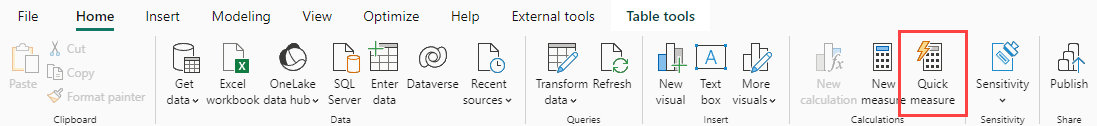
This same approach can be applied to many patterns, such as cumulative totals, time intelligence, or dynamic measure replacement. Many of these patterns are already available in Power BI Desktop as quick measures. In the ribbon, you can select Quick measure to get an out-of-the box library of some common patterns.
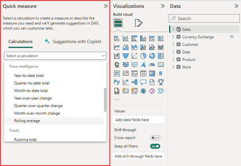
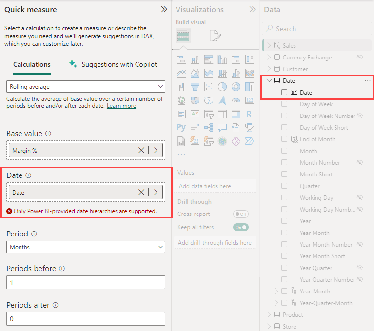
Unfortunately, it is not possible to personalize this set of patterns for you or your organization. Additionally, there might be specific requirements for your model to use these patterns, such as the following example of the rolling average quick measure, which expects a Power BI-provided date hierarchy, which is not generated if you disable Auto Date/Time in the application or file options.
Quick measures—while limited—can be a nice starting point for self-service users or the most common patterns.
While creating this re-usable library of objects or patterns costs time and effort, it delivers you many advantages and a high potential long-term return of your investment. For example, these libraries can be used and contributed to by peers in your team and organization. It can help others to develop models and reports more quickly and easily in Power BI. It can also improve the quality of these models and reports with more consistency.
However, some model patterns require your data to be structured in a specific way. For instance, currency conversion patterns expect an exchange rate table, as well as source and/or target currency tables, each of which should be structured in a certain way. Additionally, you might have specific requirements that you need to fulfill, such as a distinct calendar, multiple exchange rate types, or other exceptions and nuances particular to your scenario. Creating re-usable patterns for these scenarios will thus always involve some level of interpretation and human intelligence to obtain the desired result from a starting point.
Re-using visuals
The easiest way to re-use visuals is to catalogue and save them in a separate, documented Power BI Desktop file. For example, you can maintain several files that organize examples of how to visualize different things, like actual versus target, trends, and so forth. This is best done in combination with one or more Power BI theme.json files that you maintain to define report styles for font, color, and more.
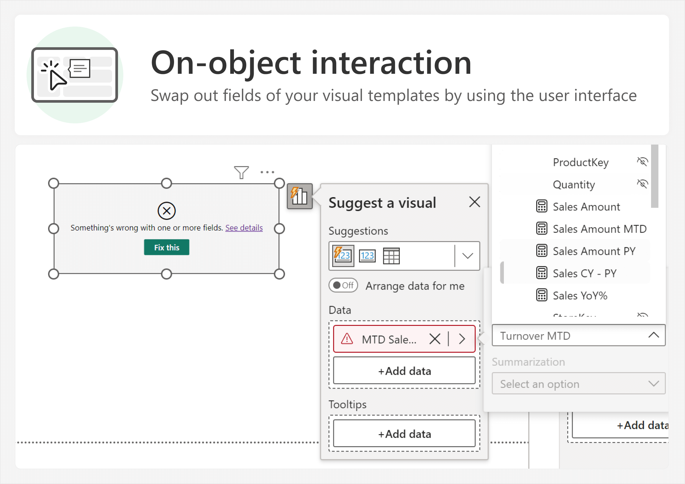
However, there are limited options to apply these visuals in new reports as templates. For instance, you can apply container formatting (such as for backgrounds, titles, and so on) with either the format painter or Power BI theme.json files. However, it is only possible to replace fields from your template visual if you use on-object interaction. An example of this is shown below, where a visual template results in a “grey box of death” because the MTD Sales field cannot be found. The user can select an alternative field, like Sales Amount or Sales CY – PY to swap, and retain the visual formatting (to thus use the template).
There is no really straightforward way to streamline this process, such as maintaining templates as separate files, or applying templates (or template changes) in bulk. To rephrase—it is possible, albeit challenging. There is thus an opportunity for new tools here to fill an unmet need.
Reports and report page templates
You can save reports as Power BI Template (.pbit) files, which can contain both model and report metadata. This can be useful to catalogue and share report layouts, particularly since a .pbit file can come pre-loaded with a report theme file and miscellaneous report elements like background images. You can even combine this approach to provide very common patterns in your .pbit file, such as date tables, common calculation groups, and more. Power BI Template files can be a good starting point to save layouts and report-wide formatting, or to distribute templates and patterns in a user-friendly way.
Alternatively, in Microsoft Fabric, you can also maintain report definitions as .json files in a remote repository, such as in Azure Repos or GitHub. Then, you can retrieve these report definitions and deploy them to a workspace by using the Fabric REST APIs. During this deployment, you can even programmatically make modifications to the report definition. However, it is important to carefully validate that any programmatic changes to the report definition do not produce unintended effects in the report.
Conclusion
To improve efficiency and reduce the cost of developing semantic models and reports, developers should identify elements that they can repeatably re-use. One example of a structured way to approach this is by using the atomic design methodology. With this approach, you build up a library of re-usable parts, prioritizing objects, patterns, and then visuals. There are various tools you can use to do this. For example, for DAX objects and patterns, the best way to have a repeatable library is to use C# scripting in Tabular Editor.
Returns the sum of an expression evaluated for each row in a table.
SUMX ( <Table>, <Expression> )
Adds all the numbers in a column.
SUM ( <ColumnName> )
Returns the average (arithmetic mean) of all the numbers in a column.
AVERAGE ( <ColumnName> )