 Kurt Buhler
Pie charts are one of the simplest and most well-known chart types. Chances are that almost everyone has made or seen a pie chart. However, pie charts are also one of the more controversial chart types. They are often seen as ineffective or even misleading visuals. That is why many data or design professionals—including SQLBI—have recommended a rule or best practice to “avoid pie charts” in reports. We have presented many rules in the past, but it is important to understand that sometimes these rules have exceptions, and there are scenarios where you must deviate from these rules to obtain the best result.
In this article, we explain the underlying principles behind this rule while giving a few examples of its exceptions. To be clear, the purpose of this article is not to advocate for or to defend pie charts. Rather, we simply want to highlight that rules like this can be helpful but that they do not apply to every scenario.
Why are pie charts so controversial?
A pie chart is well-known and needs no real introduction. It is a chart that has been used for over 200 years (the first use of a pie chart was documented in 1801, according to Ian Spence; 2005). Now, the pie chart is a common staple of visualization and reporting in popular culture from shirts to cartoons and—of course—social media and internet memes. The pie chart is a part-of-whole chart type (or part-to-whole when using the visual vocabulary from the popular Financial Times poster). The chart divides a circular area into proportional slices by category. The size or the angle of these slices corresponds to whatever you measure, showing a given category member’s contribution to the total.
The following is an example of a pie chart in a report:

The pie shows the proportion of sales that come from either online or retail store channels, with labels for both the total quantity (in units) and proportionality (in percent).
Despite the bad reputation of pie charts among data or design professionals, many people often still opt for pie charts in their reports for various reasons, like the following:
- Familiarity: The pie chart has survived so long in part because it is so common. It is likely that everyone has seen a pie chart before, and likely even made one. Pie charts have been used in presentations and slides even before computers because they are easy to see and explain to a room of people who are otherwise naïve about the content.
- Simplicity: Pie charts require no special information to explain and are implicitly understood by most audiences, especially layman audiences without expertise in data or design. Many people like to use and view pie charts because they are easy, especially in comparison to other chart types like a waterfall, treemap, or even a stacked bar chart.
- Aesthetics: Sometimes people opt for certain chart types just to have something different than the straight lines of tables, matrixes, and bars on the page. Maps and pies are familiar to most users and easy to read. So, many report creators like to use them to break up the “sameness” of their report design, even when a bar chart might be more effective.
- Space: A pie or doughnut chart is compact, and it can fit well beside a card or even overlaid atop maps or placed within table rows.
These might be valid reasons for people to make that design choice, and to consider a pie chart for their report. However, despite the prevalence and popularity of pie charts in some audiences, in the data and design world, they are not regarded fondly (to say the least). Thanks to a discussion on Bluesky, we have even learned that the debate about pie charts has been raging since at least 1914!
There are good reasons to be careful with pie charts, but the story is more nuanced than simply
sticking to the rule of “avoid pie and doughnut charts”.
Problems with pie charts
The biggest problems with pie and doughnut charts are accuracy and precision. While it is easy to quickly identify the biggest and smallest slices, it becomes more difficult with more than three categories or when slices are similar in size. This is because, in general, humans perceive changes in angle or area less effectively than length (like bar charts) or position (like dot or barcode plots) (Mackinlay 1986).
Consider the following example, which shows the same data from the previous example in four different charts.

With two categories, the pie or doughnut (angle and size) is debatably as effective as the bar chart (length) or dot plot (scatterplot with 1 axis; position) to determine that “Online” sales are higher than “Retail” sales. Many prefer the doughnut because the total can be placed in the middle.
The situation becomes very different, however, when we have more than three categories, like the next example.

In this example, we can clearly see that the pie and doughnut charts are much less effective than the bar charts (the fourth example is actually a “lollipop chart”). In general, pie and doughnut charts become ineffective and hard to read when there are more than about 3 categories (this is not a hard threshold, but an approximate). Typically, when you have more categories, you focus on the top few and group the rest into “others” in a single slice. In Power BI you can do static grouping and binning, but unfortunately, the dynamic “TopN and others” pattern is typically too complex for the average user to implement or maintain.
Indeed—aside from precision—when there are too many categories, color also becomes a problem. With more than three categories, it is difficult to make good choices of colors. Either the colors are too similar, or the number of different colors is overwhelming, and you must take care to avoid using color gradients that indicate quantity.

It is difficult to avoid choosing colors that are too similar (like the colors in the first pie indicated by the arrows, which are too similar to easily distinguish) or colors that implicitly represent volume or sentiment (like various gradients and reds/blues/greens). If you need a deep guide specifically about color in data visualization, then we recommend this article on Datawrapper by Lisa Muth (which is tool-agnostic).
These examples highlight the importance of making good chart type choices when you make your report. This is often where many report creators struggle and why pie charts tend to have a bad reputation: inexperienced report creators choose pie charts when other chart types would be more appropriate or effective. As such, pie charts have become synonymous with other mistakes that newbies make, which, to an expert, culminate in the impression of a poor-quality report.
If the purpose of the chart is to evaluate magnitude and compare categories, then a pie chart is not a good option. You generally opt for pie or doughnut charts and other part-of-whole visuals when your focus is on answering data questions about proportionality.
For instance, you should avoid comparing multiple pie charts as a way to measure progress against a target, like the previous year.

In the previous example, it is hardly possible to even tell that you should compare the two doughnut charts; the bar charts are clearly more effective. The first, stacked bar chart better shows proportionality, while the second bullet chart better compares each category to the previous year. Note that if you are truly interested in the evolution of proportionality over time, you might also consider a stacked area chart or 100% stacked area chart, too (although stacked bars work with discrete data like yearly trends).
Consider another example, this time focused on breaking down the Cost of Goods Sold into four different cost types.

In the example, the doughnut chart is better suited toward the data question. However, even with four categories, precision is still a problem. We can see one cost is higher than another (DM, for instance), but this is much less clear and effective than a waterfall chart, especially when using a custom sort order, like we do here. The waterfall is even better when you depict proportionality that has an implied flow or process. A common example of this is visualizing Open Orders by status (like Past due, Current, and Future orders) in order-to-cash or demand planning reporting.
Another caveat of pie or doughnut charts is that they do not show negative numbers or percentages above 100% (like overachievement). Consider a scenario where you want to visualize the breakdown of cost in the context of your margin. Here, the cost is negative, so a pie chart is not possible.

The doughnut chart does not work with negative numbers, and with positive numbers, it presents a potentially confusing or misleading breakdown of the margin. Instead, the margin breakdown is better represented in the waterfall, which is one of the few chart types that can show part-of-whole and negative values.
Generally, pie charts are used when your measures are a percentage, like the percent of the grand total. A good example of this might be in a project management dashboard visualizing the status of individual work items or tasks in a period.

Note that—even here—the pie or doughnut is not necessarily more effective or appropriate than the bar chart or waterfall, which are arguably clearer. Truthfully, choosing between either of these charts would be a matter of subjective user preference.
As you have seen, there are some caveats of using pie charts to consider. In summary, we gave examples of issues with pie charts, such as the following:
- Audiences perceive differences in angle and area less accurately than length or precision. As such, it is difficult to compare categories when the slices are of a similar size.
- Comparing many, ungrouped categories can be difficult and messy, particularly if there are many colors.
- Pie charts show proportion (typically percent) and are not an appropriate chart type to show magnitude or compare to a target.
- Pies, doughnuts, and many other part-of-whole charts do not show negative values or values over 100%.
Given the previous examples and caveats, you might now be thinking, “Okay, so it is a best practice to avoid pie charts, after all”. If you are a beginner completely new to making reports, then perhaps this is a helpful way to summarize the previous discussion. However, for everyone else, while this might be the easiest way to draw conclusions about the previous examples, it is not necessarily the most helpful.
When focusing on rules and “best practices” is not helpful
Be it data visualization, data modeling, or DAX… when learning a topic, we like to look for clear guidance, rules, and patterns to follow. It is easiest for us to have definitive lines in the sand that tell us something is one way or another, black and white. “Do this; don’t do that”. This is much quicker and simpler to act upon than the nuanced grey of “it depends”. Especially for beginners.
Beginners do not like “it depends”, which they often find confusing and vague. This is because they do not have the experience and context yet, to detect and understand the nuances of certain topics and scenarios. For them, best practices or rules are straightforward and helpful. By following some simple rules, beginners can definitely improve their outputs, in general, across many scenarios that they encounter. If you do not have time or experience, then you can stick to the rule.
However, in reality, many scenarios simply do not fit in the neat, square boxes that these rules imply. The real world is messier, more chaotic, and full of exceptions, ambiguity, and limitations. Sometimes, you simply must deviate from such rules to get the best outcome. If you over-focus on rules and best practices, then you can hinder your own learning and the usefulness of the things that you make.
Examples of these rules and when one might deviate from them include:
- The 3-30-300 rule for better reports. In general, in most reports, following the principles of this rule can ensure more effective report layouts and user experience. However, certain types of reports, like exploratory dashboards or paginated reports, might need to deviate from these principles since effectiveness might mean something different than time-to-insight.
- Avoid many-to-many or bidirectional relationships in your semantic model. In general, in most models, these relationships can create model ambiguity and unexpected results. However, certain data or functionality might use these relationships, like using multiple fact tables (like Sales and Forecast) at different levels of granularity (product code for sales transactions, but a forecast set at the product subcategory level).
- Do not filter tables in your DAX measures. In general, in most DAX measures, filtering tables can lead to slower DAX and less performant reports. However, you might need to filter tables for certain optimizations or functionalities that you can otherwise not achieve.
Again, in general, these rules serve as a useful starting point for beginners, but they are really just concise summaries of important underlying principles that you should learn and apply.
Do not use rules for “how” to replace an understanding of “why”
In Power BI (and truthfully, in most disciplines), there is a tendency to over-focus on rules and best practices with complex topics. Many people like to paint a picture: if you follow strict guidelines, or complete a perfect checklist of best practices, or a clear framework and process, you will end up with good results. This is simply not true.
There is no approach, no set of rules, no perfect guidelines that, when followed, will guarantee success: useful models or reports that deliver real value. These rules and guidelines are useful proxies of real understanding that exist in the theoretical world, away from the nuances and chaotic mess of your real-world scenarios. While these rules can be helpful, you should not extrapolate them. Ultimately, it is imperative that you understand why they exist and when you might deviate from a given rule or “best practice”.
If a report or dashboard is not providing value or being used, chances are that changing all pie charts to bar charts will do nothing to improve that. The equivalent here might be polishing the limp, hanging mirror of a car that went through a horrible crash—what is the point? You still are not going to get anywhere. Instead, you have to understand why the proverbial car crash happened by understanding the users and the process you are reporting on.
If you want to make good, useful reports, then consider rules not as black-and-white but as shades of grey. A good way to do this is to accept subjectivity and embrace user empathy in your design.
Into the grey: subjectivity and empathy in design
Unlike DAX calculations, data pipelines, or a data model—which typically have objective definitions of the “correct” result—generally, a particular report visual or design is never objectively “correct” over another (excluding cases when data is presented in a misleading or inappropriate way). Some designs might be more efficient or more elegant by certain standards… But ultimately, data visualization is a subjective discipline. Different people have different preferences about what charts and styles they like and find useful. Often, they might not be able to express why, because it might be for aesthetic, implicit, or even emotional reasons.
We have seen the most sophisticated and beautiful dashboards completely fail in organizations. Reports created with precise attention to every aesthetic detail by an experienced designer. On paper, from a distance, these reports tick all the boxes and follow all the best practices. However, in reality, these reports were built without taking into account the particulars of the organization, and they neglected users, so they now rot in a corner, unused… except for the occasional export to Excel. We have also seen the opposite: clunky, messy reports that bend or break rules (including plenty of pie charts!), but because they were built with a clear understanding of user needs and business processes, they were actively adopted in the organization and delivering value.
If users insist on seeing a pie chart in the report you make, or they find pie charts to be the most useful or interesting way to display the data for them, is that a problem? Not necessarily. In this scenario, you can engage with users in a short discussion to understand their perspective:
- Perhaps you disagree and propose an alternative, which they simply did not consider. In many cases, some people simply might not know that there are other ways to display the information.
- Even if you disagree, users might reject alternatives for a variety of reasons. Maybe they are used to seeing the data as a pie or doughnut, or they just prefer it. In this scenario, you will not win a medal for fighting them hard.
- Alternatively, you might learn that—for this specific data or process—the pie or doughnut chart actually is the most appropriate approach.
Similarly, if you are creating a design and you find a pie or doughnut chart to be elegant or effective, that is also fine. If it works, it works. Using a pie chart is not the end of the world, and there are probably more impactful parts of your model or report where you could direct that attention.
Pie and doughnut charts can be fine… in the right scenarios
Despite their caveats, you might still find pie and doughnut charts to be effective for certain scenarios. For instance, you can use pie or doughnut charts when there are few categories, like the first example in this article (repeated below for convenience).
To give a different example, you might also use pie or doughnut charts to highlight important categories to direct attention or tell a narrative. For instance, highlighting that global online sales are higher than regional sales for each other country, combined.

In this visual, “Online” sales are highlighted in blue, while the slice of each individual country is grey. At first glance, this seems strange: so many categories, and many of them are the same color? While in general you might avoid pie charts with more than three categories and coloring them similarly, here, it is done intentionally. This use of color emphasizes how online sales make up more sales than any individual store, combined. We could show the same thing in a bar chart, but it takes up more space and might be less effective.
Of course, Power BI reports are interactive, and filtering the data might change the picture. This is something that you should never forget – after applying a few filters, the data might look quite different, and the chart is no longer effective.

The previous example also highlights why “data storytelling” does not easily apply to most Power BI reports. You can craft a data story with your visuals, but ultimately, the user is the storyteller. The user chooses their own narrative with the filters and interactions that they apply. Of course, this is again reflective of the whole “it depends” message here: when you aim for a certain outcome, you have to address various aspects of both your model and report so that visuals remain useful.
It is easy to show a screenshot that looks nice, but it is another thing entirely for the report to remain useful after interaction. We will leave that discussion for another, future article.
In a final example, some people like to use pies—but more commonly, doughnuts—to demonstrate progress, or achievement against a target. For instance, this is very common in dashboards and user interfaces using data from wearable devices, such as measuring a daily step count against a target. The problem with using these charts to measure achievement is that they cannot show overachievement—values above 100%. Some solve this problem by abstracting the metric to a “score” with a maximum of 100 arbitrary units.
You can see two examples—a light and dark mode design—of how to show this type of “KPI visualization” below by overlaying a card on top of a doughnut visual.

Debatably, other visualization types like a bullet chart or a connected dot plot (charts which we discuss in a previous article) might be more effective here. Especially if overachievement matters. Again, realistically, this comes down to your scenario, and user preference.
A pie or doughnut is certainly inappropriate when overachievement (values over 100%) has a specific meaning in the process you are reporting on. An example of this might be when you visualize achievement against a target for employee bonus plans (like a sales compensation plan for account managers), where overachievement can affect how large an employee’s paid out bonus is.
In summary, there are certainly valid scenarios where you might consider using pie charts, some of which we already discuss in this article:
- Showing proportion with three or less categories.
- Showing proportion with more categories, but highlighting one or two that are important, and potentially grouping the rest.
- As a visual compliment to a KPI at the top of your report.
- Incorporated appropriately in other visuals, like maps, cards, or tables.
Again, you can show this same information in many various different ways, each of which are—subjectively—equally valid approaches. What is most important is that you critically think about your approach and your choices of chart type and formatting. For instance, ensuring that you use effective and consistent colors, that you keep formatting simple, and so forth.
You might also find different variations of the pie chart to be useful, depending on the data and the questions you are trying to address.
Variations of the pie
Excluding obvious aesthetic changes (like making charts 3D…), there also exist several variations of the pie chart. These include well-known chart types to the doughnut chart to more obscure ones like the sunburst.

There are several part-of-whole chart types that I would consider variations of the pie chart:
- Doughnut: As the name suggests, a doughnut chart is just a pie with a hole in the middle. We have discussed doughnut charts throughout this article. Some experts claim that a doughnut is more effective than a pie, because there is less “ink” and the reader can focus on arc size over angle.
- Exploded pie: This variant separates—or “explodes”—at least one of the pie slices. Separating a slice can be useful for emphasis, but users might find that comparison becomes more difficult.
- Spie chart: This variant attempts to show both proportionality and magnitude at the same time, making comparisons more viable. It is similar to the polar area diagram, although the polar area diagram has slices with equal angles that represent a cyclic process. Both of these charts have specific, niche applications, and require custom visuals (like Deneb) to make in Power BI.
- Sunburst: This variant—also known as a multi-level pie or ring chart—shows multiple, hierarchical levels overlaid on top of a standard pie, where the outer areas are more granular than the inner areas. The sunburst is more advanced but can be useful to display hierarchical proportionality. However, using this chart first requires good explanations and training for end users. This chart requires custom visuals today, although Microsoft has indicated that it is on their visual roadmap for core visuals.
Notably, variants like the spie and sunburst charts entail additional complexity which make them harder to read and interpret for most audiences.
You can also combine pie and doughnut charts with other visuals, like the following examples:
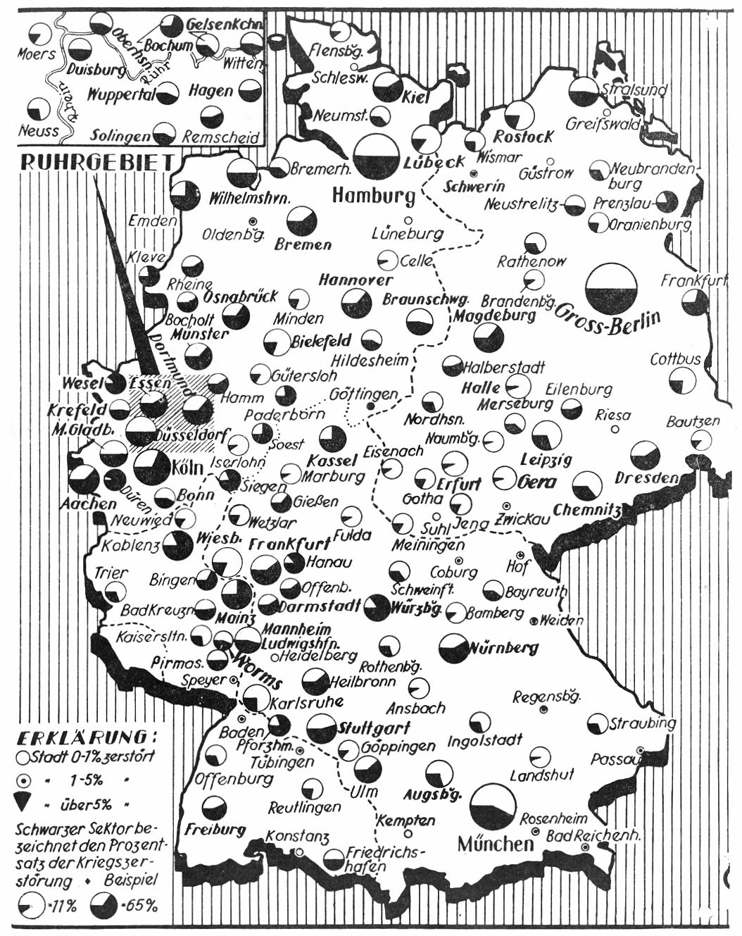
- Maps: Pie charts have been used to great effect throughout history on maps to demonstrate proportions across geographical areas (the linked example seen on Chartography). However, in reports, you should always be critical and consider whether another chart type (like a stacked bar chart) can more clearly or effectively show the data.
- Cards and tables: You can incorporate SVG custom visuals in cards or tables to create KPIs or microvisualizations that track achievement or show simple proportionality between 2-3 categories. For instance, if you want to use small multiples with pie charts or doughnut charts in Power BI, then this is currently your only option. There are many examples and templates nowadays that you can find online, but if you need a basic introduction to this approach, see our earlier article.
Each of these variants has similar caveats and considerations as pie charts, in general. In addition to the variants above, you can of course always consider other alternatives to pie charts that we discuss earlier in this article. These include other part-of-whole visuals like stacked bar charts, or waterfalls.
To reiterate, we are not advocating for or defending the pie chart. Generally, in most cases, pie charts and their variants are not the best charts. However, it is important to understand why, so that you can think about the information that your report is trying to convey, and which charts and formatting choices can most effectively communicate this.
To conclude
Pie charts are beloved in some audiences, but disliked in others. A common “rule” of report design is to avoid pie and doughnut charts, since other chart types can be more effective. However, the truth—as always—is more nuanced. Rules can be helpful for beginners, but the real world exists in shades of grey.
In general, pie and doughnut charts can be replaced with more effective chart types. However, in the right scenario, they can be just as effective or appealing for some users. Even if they are not optimal, the world will not end just because an executive insisted on a pie chart in your report… If your report is useful and delivers value to your organization, that is what matters most.