Is there a secret recipe to create a beautiful dashboard? Why do we need to use “beautiful”? Would “useful” be a better adjective?
If you think for a moment, you know that we are attracted by the “beautiful”. It is important for a first impression, but after that, you want to discover more, and at that point other factors are considered. I usually work in many of these “other factors”. The data model, the accuracy of the numbers, the performances that could affect usability. You need all of this, and as “technical” people (data analysts and BI developers are both classified as “technicians”), too often we simply underestimate the importance and the efforts required to work on the “last mile” of a BI system.
I always tried to understand the “secret recipe” of a good dashboard. I’m not talking about a Power BI dashboard now, I’m considering the broader definition of a dashboard that you might implement in a single page of a Power BI report. Is it the graphic? The colors? The numbers? The position? The alignment?
I’ve never been a good dashboard designer, but over time I understood how to recognize dashboards that were not working well. However, fixing them is not easy. When I started working with Daniele Perilli, I’ve seen that “beautiful” was not enough. A dashboard is a communication tool, and there is a huge bibliography of what you should do and what you should not. Personally, I think that Stephen Few created the best reference for this industry, and if you spend 40 hours a week designing charts, reports, and dashboards, you should stop reading this post now, and spend your time reading his books.
However, I don’t spend all the time designing dashboards, but that “last mile” is what communicate to end users the result of a large effort made by DBAs, developers, and data analysts. It is also the way to show the result of a one-man-show model you worked on for hours, days, or weeks. Where to start? How to apply rules that are easy to learn and to implement, in a limited amount of time?
I struggled with these questions for years. Working with Daniele, we started to think about a learning path that would be accessible to anyone, providing the basic principles that you need to apply in a good dashboard in a very direct and practical way. This initial idea started to grow, and it was one of the reasons we invested in the custom visuals that you can find on okviz website. Sometimes we didn’t have the right tool to implement a few principles required for a good dashboard, so we (well, Daniele) created it.
Nevertheless, custom visuals are not the solution. They could be a tool, a useful and necessary tool, but you can always obtain a good dashboard with a very limited set of features (just think about Power BI Desktop in October 2015, if you tried it at that time). How is it possible? The reason is very simple. You can have a very powerful tool, but just because you have a feature, it doesn’t mean you need it or you have to use it. You have to make choices, and you need a plan.
Thus, Daniele created the master plan of the 15 rules that all of us can apply to any dashboard to obtain a beautiful and useful result. When I say “all of us”, I include myself. I don’t have 1% of Daniele’s design skills, but I can apply his 15 rules to my reports, and after “the cure”, my reports are always much better. Not as beautiful as those designed by Daniele, but “good enough” to be shown to a larger audience without hearing people laughing or being distracted by useless details. They see the numbers, the trends, and get the message from the dashboard. This is the goal, after all.
Once Daniele completed this huge amount of work, we faced the issue of delivering such a content. After considering many other options, our decision has been to learn the content from Daniele, make practice, and record a video training using slides and demos prepared by him. This helped us (me and Alberto Ferrari) using a language that is probably less “technical” than what we typically use in our DAX classes, and this was another goal of our choice.
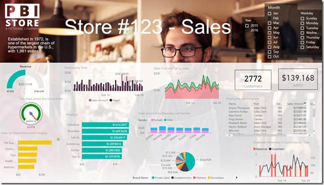
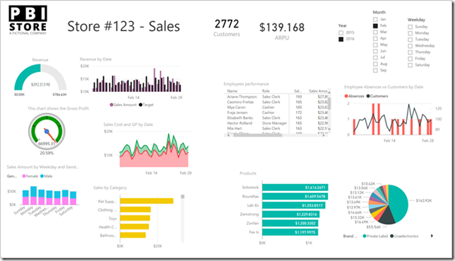
The third of the 15 rules is “keep it simple”. Here is how a dashboard looks like before and after implementing this rule (please note there are other 12 rules to apply after that to complete “the cure”).


Applying the rules could be harder than you think. You can watch the videos related to the “keep it simple” rule in the free preview of the Power BI Dashboard Design Video Course.
The course also includes a reference that will help you choosing the right chart, and you can find a complete description of the course content here.
It has been a very long journey, but I am really proud of this work. Now, I really look forward to read feedbacks and reviews!