When creating reports in Power BI, you regularly come across scenarios where you want to show data in a certain way that is not straightforward in the standard “core visuals”. Sometimes, the visualization needs to reflect particularities about an organization’s business processes or its data. Other times, you simply want a more creative design to visualize the data in the most effective way. In this article, we discuss what to do in these scenarios, describing one method where you can make custom visualizations by using a single DAX measure, and the caveats and limitations of this particular approach.
In this article, our objective is to produce a matrix visual with the Timeline SVG, like in the following diagram.
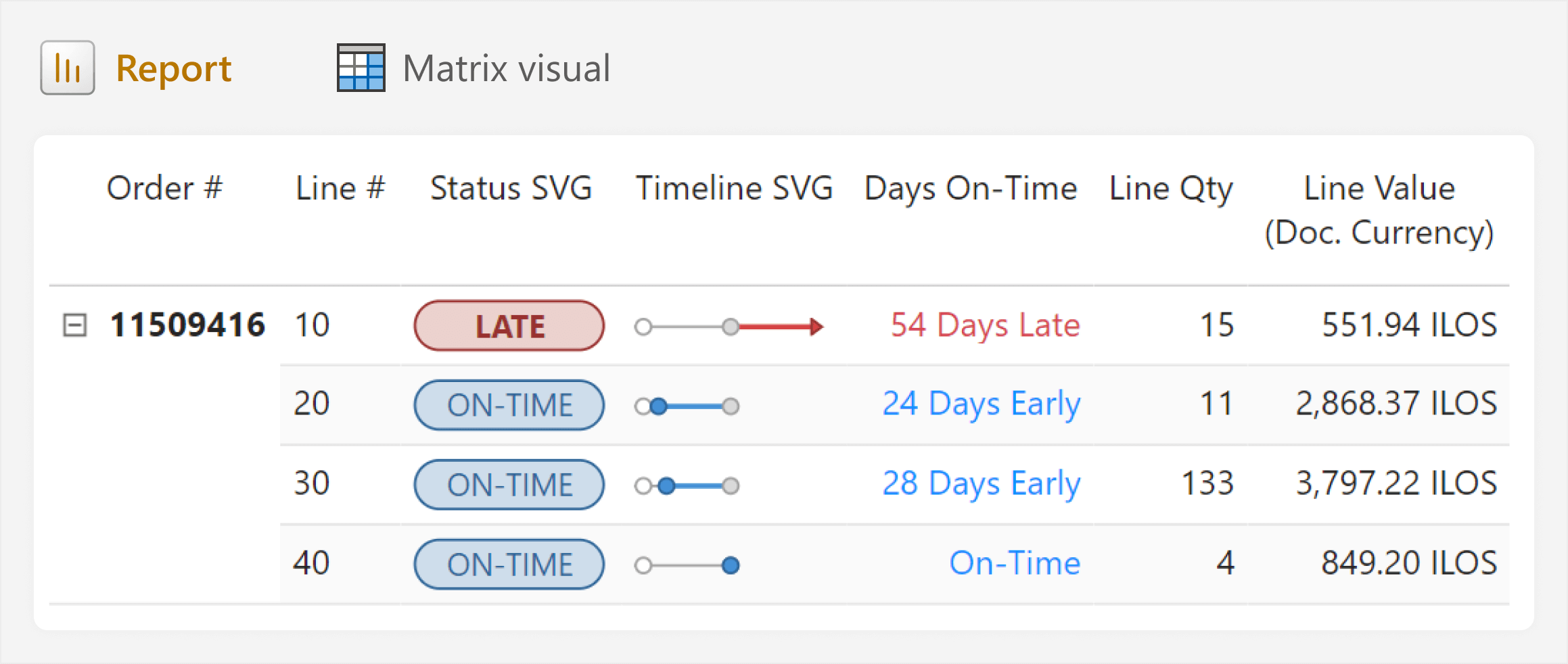
The matrix in this report looks nice, but we pay for this elegance. As you will see later in this article, adding custom visuals like this can introduce complexity and make reports harder to maintain. The cost of this complexity might outweigh the potential benefit when compared to simpler approaches, but we can mitigate it by using templates and documenting the custom visual.
In the rest of this article, we explain how to make custom visuals like this and the considerations for doing so.
Explaining the scenario
Consider the following scenario that tracks On-Time Delivery (OTD) performance. To present a simplified version of this real-world scenario, we use the SpaceParts Co. sample dataset. That is, complex sample data for learning Power BI, available for free from Tabular Editor.
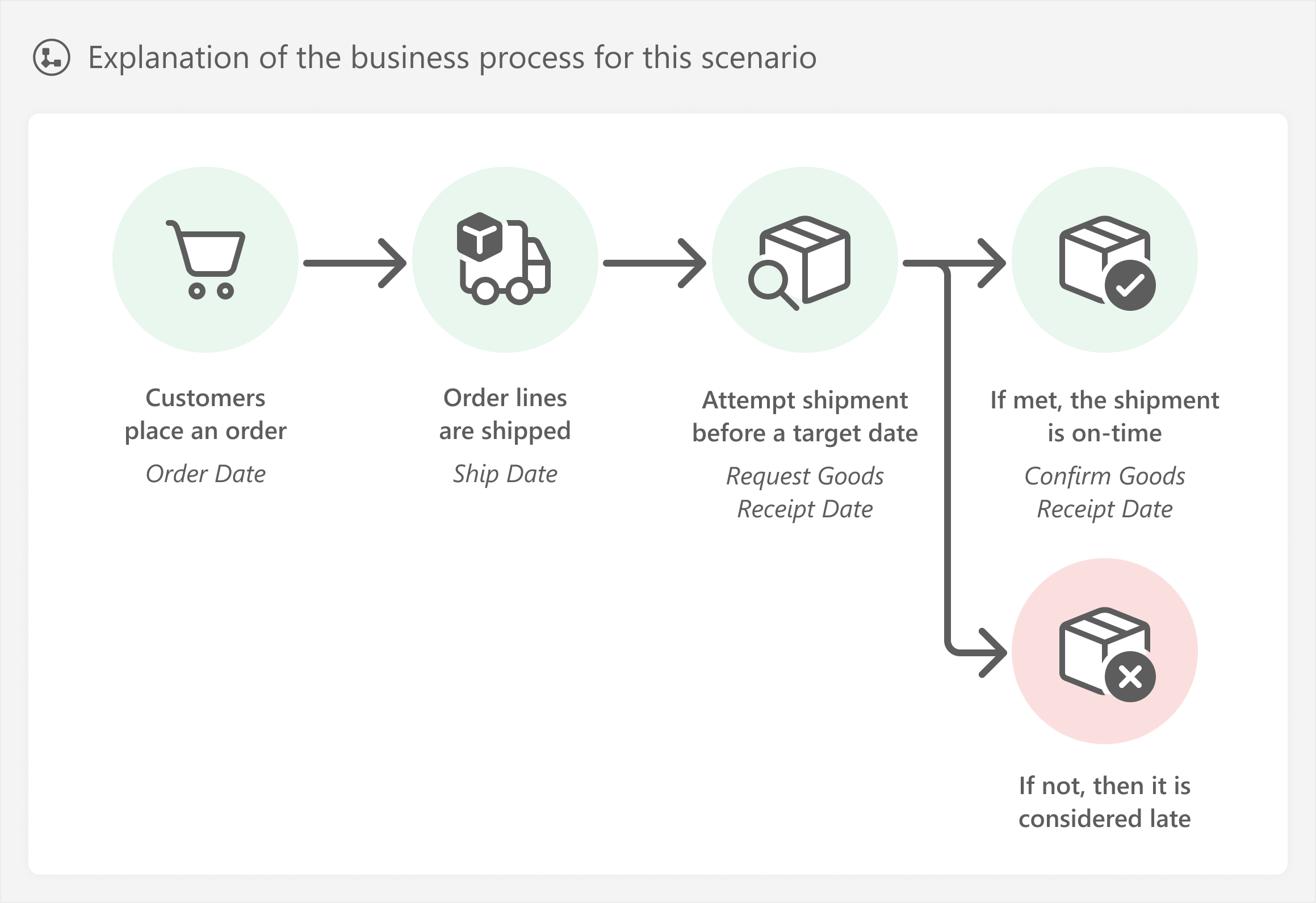
In this scenario, an organization aims to improve customer satisfaction by increasing the proportion of orders that are delivered on time. The order is considered on time when it is delivered before or on the requested goods receipt date. Customer service teams want a detailed report to investigate important orders that are already late or at risk of being late.
The report they request contains a lot of information. For instance, in this report, they initially wanted a large table down to the level of order line items with many fields. These fields would include several different dates, which you can see for a randomly-selected order, shown in the table below.
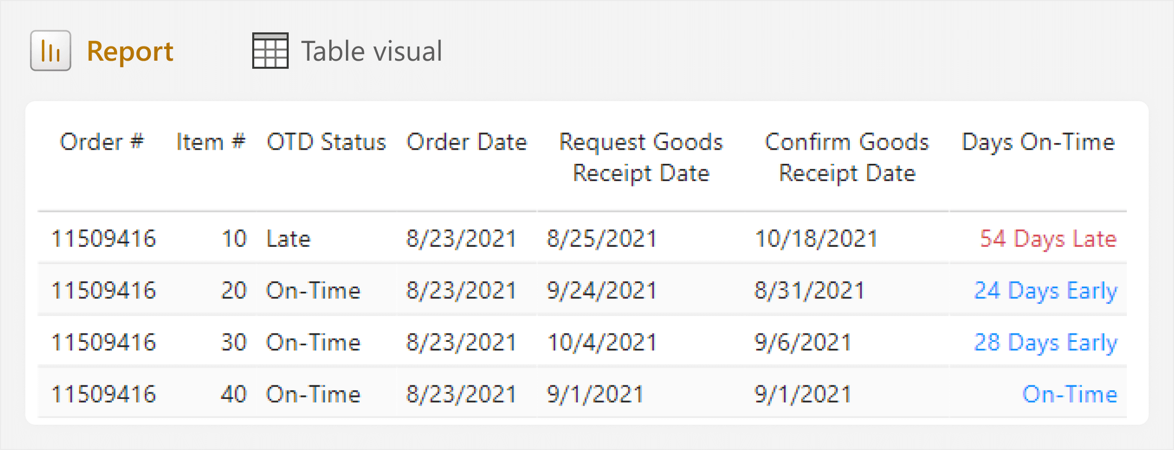
This table is already overwhelming, and it does not include even half of the requested columns. With only several rows, it takes too long to read and interpret the various date fields, and the differences between them. After a discussion with this team, they agreed that having a visual timeline in the table would help. The result of this discussion is a sketch (or wireframe) of how they would like to see the table in this report.
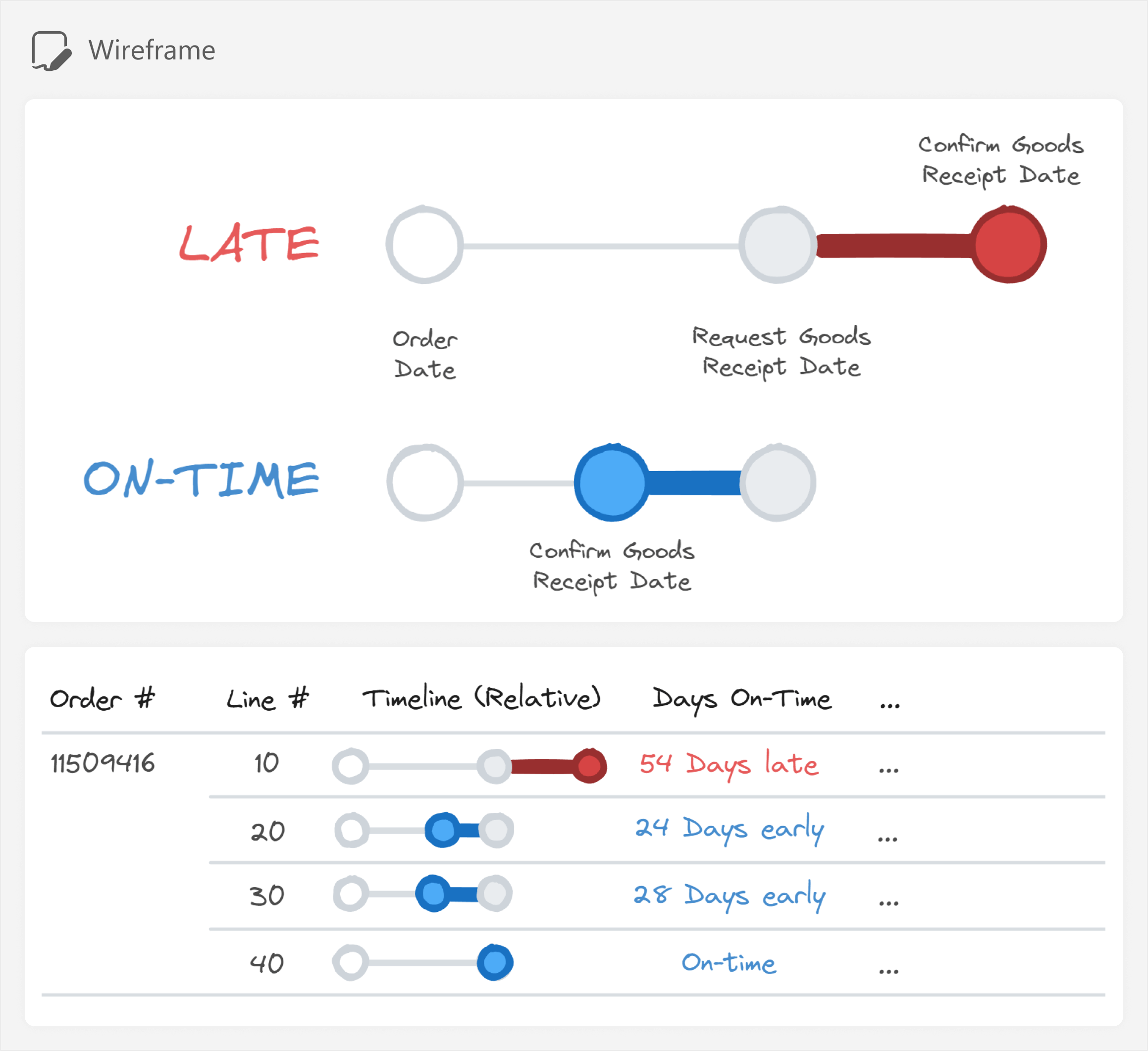
In the wireframe, the three date fields are replaced by a relative timeline. Each date is represented by a dot, connected along a timeline. When the actual Confirm Goods Receipt Date is later than the targeted Request Goods Receipt Date, red shapes depict how late the order is. Vice-versa, the connected dot for Confirm Goods Receipt Date is blue if the order is to be delivered on time.
While the visual could show an absolute timeline in days, in this particular case, the absolute dates are less relevant for the users. The business instead wants to see how early or late any given order line is relative to the time between the Order Date and the Requested Goods Receipt Date.
The requested visual—while maybe not ideal—still seems more useful (and it is certainly more elegant) than the original table for the customer service team. However, unfortunately, there are no out-of-the-box visuals, formatting, or other options that we can use in Power BI to create this. So… what can we do?
What to do when “that is not possible in Power BI”?
When you cannot fulfill a reporting requirement in the core Power BI visuals, do not simply give up! Aside from seeking an alternative approach, you might consider one of six possible options to make custom visuals.
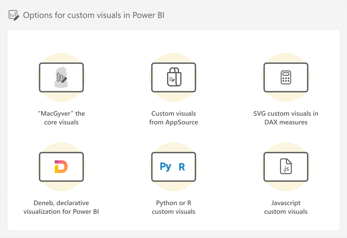
- “MacGyver” the core visuals: This method is named after the 80s action hero MacGyver, known for using unorthodox methods to adapt everyday tools to get himself out of a problem. Like MacGyver, in this approach, we use the formatting options for Power BI visuals in unorthodox ways to achieve the result we want. While not a custom visual per se, we do customize the core visuals in atypical ways. An example of this is using error bars in a bar chart visual to create a bullet chart. While the simplest and easiest option, “MacGyvered” visuals can still be prone to issues and higher maintenance costs if you push this too far. These visuals are often a good choice but are limited in terms of the formatting options and chart types that they can create.
- Custom visuals from AppSource: You can download a pre-made custom visual from within Power BI Desktop that you can use. These custom visuals are made by other people or third-party vendors. They can be open source, but some visuals might require a paid license to use them. Notably, commercial custom visuals provide a direct line of support from the vendor; in contrast, free visuals are “as-is”, with no guarantee of support. Additionally, for all custom visuals, you cannot typically customize these visuals beyond the options available from their developers. To use custom visuals from AppSource, they have to be enabled by the administrator of the Power BI / Fabric tenant in your organization. These visuals are a good choice if they give you what you need, and do not have other limitations with formatting, interactions, or performance.
- Scalable Vector Graphic (SVG) custom visuals in DAX measures: You can specify the specification of an SVG image in DAX, which can dynamically render vector shapes to create a custom visual. SVG visuals are natively supported in Power BI without extra downloads or plugins. These visuals are often a good choice if you need them as a “microvisualization”, which is a visual that is a complimentary part of a larger visual, such as a card or table. Later in this article, we explain SVG visuals in more detail, including their caveats.
- Deneb, declarative visualization in Power BI: You can use Deneb to define custom visualizations with Vega or Vega-Lite specifications, a JSON-like syntax to define how the visual works and looks. These specifications are straightforward to read and understand, both for humans and large language models (LLMs) like ChatGPT. Deneb is actually an open source custom visual from AppSource, but it is unique in the sense that it provides a framework to create custom visuals, and even save and re-use templates. Deneb is very mature and has an active community with many such templates available; however, writing, testing, and managing a visual specification costs more time. We will explain more about how you can use Deneb in future articles.
- Python or R custom visuals: Power BI reports natively support Python or R integration. This means that if you have a local installation of Python or R, you can use visuals like those made with the seaborn library in Python or the ggplot2 package in R and its extensions. Python or R visuals can be a good choice if you know these languages or if you need more statistical or scientific capabilities. However, this code is a significant step up in complexity and effort to maintain for the average Power BI developer.
- Javascript custom visuals (Power BI visual API): You can create your own Power BI custom visuals in Javascript, like those available on AppSource. Creating a custom visual this way is often considered the most complex of the available options. This might be a good choice if you know Javascript, but it requires that you understand and effectively use Power BI’s visual API.
Like everything, there are many options, and which one to use depends on your specific circumstances. Before you choose between these different options, however, you should first decide whether you should commit to making a custom visual at all or seek an alternative, simpler approach.
Choosing whether to make a custom visual, or not
The previous options differ in many ways, but generally, you pay for increased flexibility and customization with complexity. This complexity has a cost that you must always consider before you decide to proceed with making a custom visual:
- The cost to make it: Creating a custom visual can take more time because you must define, test, and optimize it before you can use it in a report. This is particularly true when you need to write custom code. You can offset this cost using validated templates, like scripts or Deneb templates.
- The cost to maintain it: Custom visuals can cost more time to maintain. Additionally, others on your team might not know how you created the visual, and might struggle to fix or change it if they need to. You can offset this cost by documenting the custom visual and training colleagues on how to maintain it.
- (Optionally) the cost to use it: If you pay for a license to use a custom visual from AppSource, this can present an additional cost.
Because of these additional costs, generally, you should always first consider simpler, core visuals before custom visuals. You should use custom visuals when there is a clear business case or benefit for the people using the report. There are many, many cases of people creating overly-complicated reports in the pursuit of an impressive or beautiful design, when the result is a report that becomes too painful to maintain or too slow to use.
If you do choose not to make the core visual, you must then approach users with an alternative proposal and try to find a compromise.
Some examples of reasons why you might choose not to make a custom visual include the following:
- You can already make the visual with the core visuals of Power BI.
- You or your organization lack the maturity or skills to build or maintain a custom visual.
- There is insufficient time to invest in making the custom visual.
- The performance of the custom visual is too slow compared to the core visuals of Power BI.
- The benefit is only aesthetic (like rounding the tops of bars in a bar chart or using a custom font). Generally, you want to avoid making chart type choices for strictly aesthetic reasons.
In our scenario, we choose to make a custom visual because the limited cost to make it is offset by the usefulness and convenience for the customer service team. In a real-world scenario, we would also consider the cost to support this visual, including the likelihood of future changes (like adding an additional date field, labels, or so on).
Choosing which approach to take
When choosing between one of the six approaches to make custom visuals in Power BI, you should consider several factors:
- Whether the approach supports your use case; whether it is possible to make your design.
- The time investment required to build and test the visual.
- You and your team’s maturity in Power BI and skills in using the particular tool or language.
In our scenario, we opt for the SVG visual, for the following reasons:
- We can use it inside of the native table visual of Power BI to get the result we want.
- We can make the visual quite quickly with the help of tools like Figma and Tabular Editor.
In the rest of this article, we explain how to make this visual.
Creating a custom visual in a DAX measure with SVG
In Power BI, both columns and measures can contain image information that reports can render in certain visuals. This image information can be from a hyperlink of an image on the web, encoded image data with base64, or an SVG image specification.
Scalable vector graphics, or SVG, is an image format that defines vectors with code; specifically, XML. SVG images comprise of different layered vectors, which are different from bitmap formats like PNG, because they can be scaled up or down without loss of resolution. Since an SVG is simply a specification, it means that the image is actually code. Thus, we can define an SVG as a string value of a column, or DAX measure. To do this, the SVG specification string requires a special prefix, “data:image/svg+xml;utf8, ” so that Power BI visuals can understand that the measure can be rendered as an image.
The following is an example of what this string looks like in a DAX measure. Note that the SVG specification has been altered, such that any double quotes (“) are changed to single quotes (‘). Alternatively, you can escape double quotes in the specification by including two adjacent quotes (“”), which is what we do later in this article. This specification results in an SVG image used for an indicator that states the status of an order line, which we showed earlier in the article:
1 2 3 4 | Status SVG ="data:image/svg+xml;utf8, <svg xmlns='http://www.w3.org/2000/svg'><rect x='0.5' y='0.5' width='98%' height='95%' rx='9.5' fill='#EBD2CE' stroke='#982F2F'/><text x='50%' y='58%' font-family='Segoe UI' font-size='12' font-weight='700' fill='#982F2F' text-anchor='middle' dominant-baseline='middle'>LATE</text></svg>" |
If the data category property of this measure is set to ImageUrl (Image URL in Power BI Desktop), then some visuals will render the code as an image. In tables and matrixes, you can also change the size of images by adjusting the Image size property of the visual in the Format pane; however, other visuals also support rendering images, like the new card and new slicer visuals, as well as the scatterplot background.
You can see an example of this Status SVG in the below diagram, as well as a depiction of which visuals support rendering images from DAX measures.
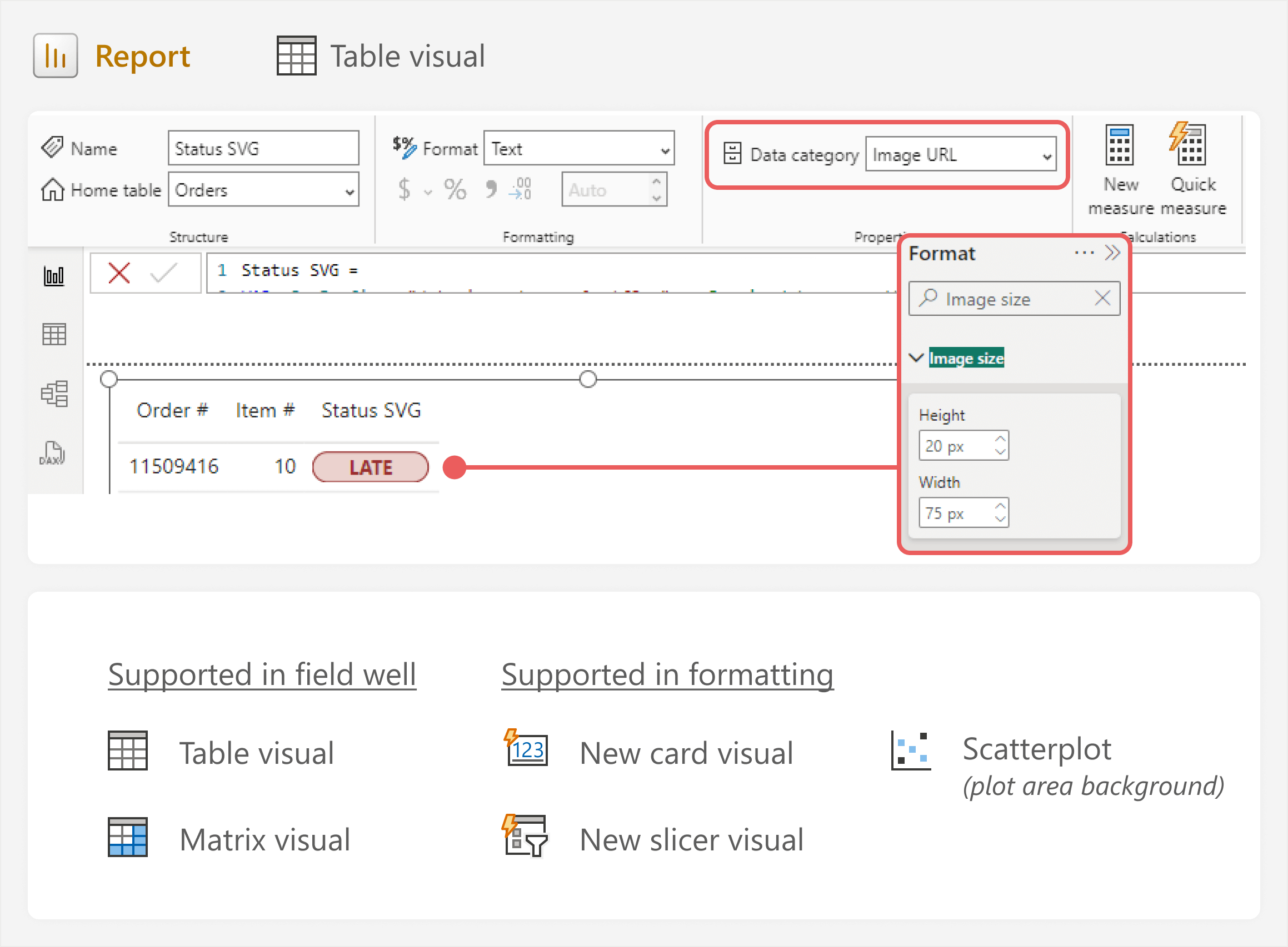
To review, a DAX measure in Power BI that contains an SVG specification string can render it as an image if:
- The appropriate prefix is in the string of the SVG specification (data:image/svg+xml;utf8, ).
- The SVG specification is valid and is also a valid string in the measure (i.e. double quotes are escaped).
- The data category property is set to Image URL.
- The measure is placed in the field well of a visual that supports rendering images (like a table).
You might look at an SVG specification and think it is complicated – and you would be right. For the average Power BI developer, opting for this approach is a significant step up in complexity. However, you do not need to make this code by hand. If you are totally new to making SVGs, you can get very far by simply using design tools like Figma, alone or together with LLMs like ChatGPT.
Using Figma to streamline SVG creation
To create a custom visual with SVG, you have to define the vectors that make up the chart. Normally, this means that you write the specification manually, either from scratch or starting from an existing template. There are many quality community SVG templates that you can use, including those of Kerry Kolosko, Andrzej Leszkiewicz, Štěpán Rešl, David Bacci, and many others.
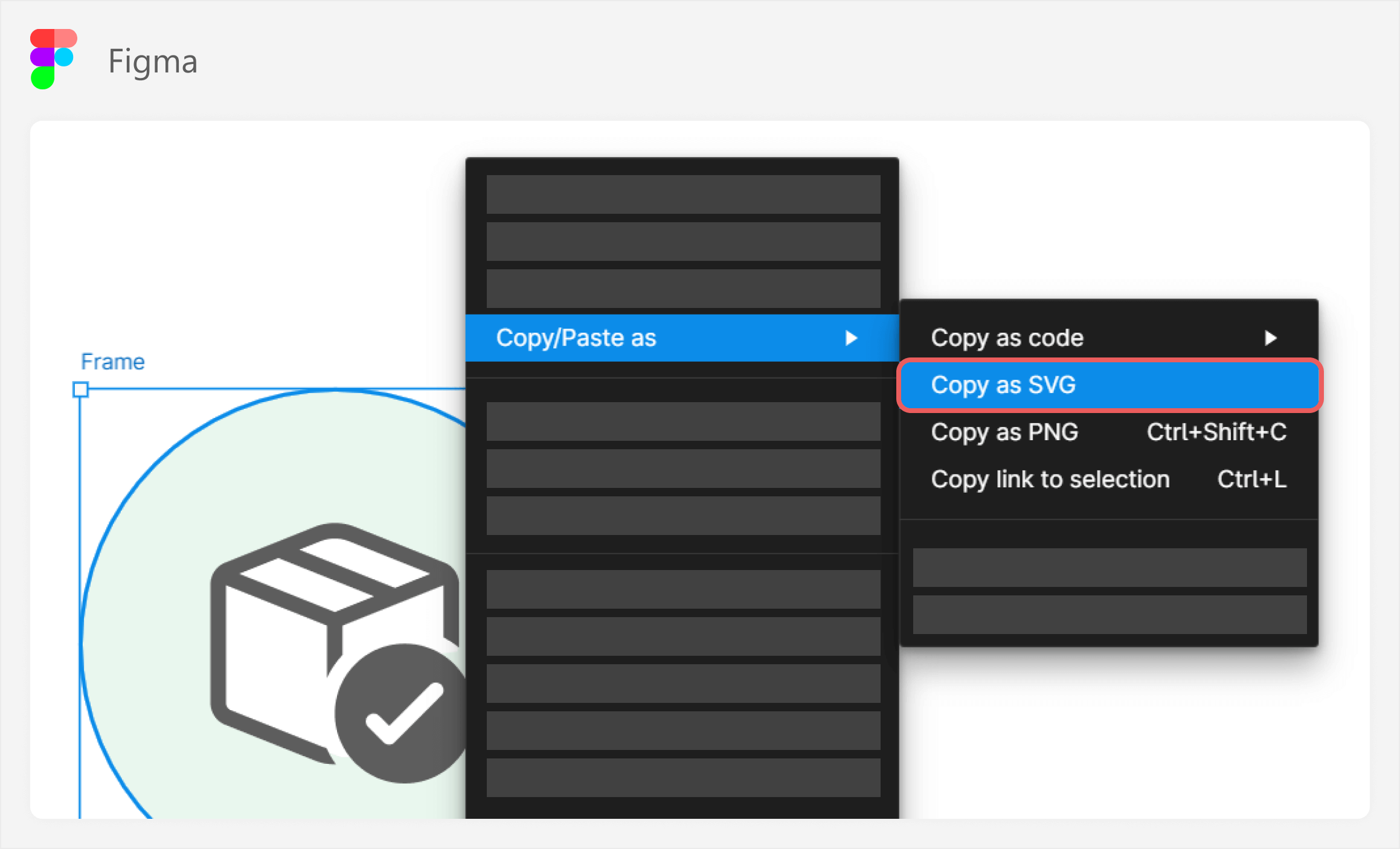
To create your own SVGs, you can use any design tool, like Figma. Figma has many useful features, including cross-compatibility between SVG specifications and their rendered vectors. Essentially, you can draw shapes in Figma and then copy the SVG specification directly from the image in Figma’s UI. Vice-versa, you can copy an SVG specification and paste it into Figma as an image.
You can copy an SVG specification in the Figma application by right-clicking an image, as you can see in the following diagram of a Figma design file.
To render this image in a Power BI Desktop table visual, we just make the SVG specification a valid string in a DAX measure, and set the data category property to Image URL.
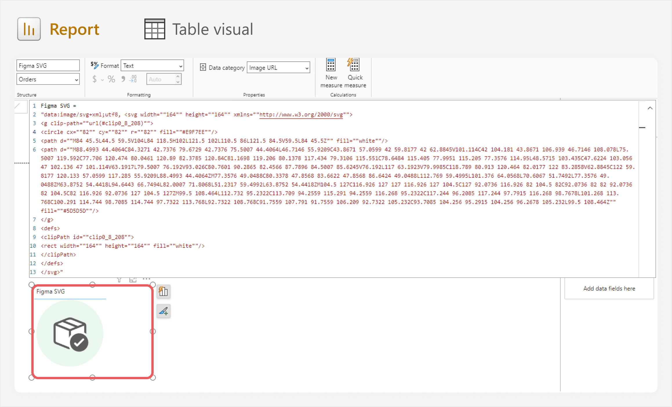
As you can appreciate from the previous image, the SVG specification is complex, and the code is not maintainable by hand. However, we can manage it entirely in the UI of Figma. This means that you do not need to know the details of how to produce this code, you just have to know how to design what you need in Figma, instead.
One advantage to this approach is that if we use Figma to mock-up any custom SVG visuals, we immediately also have the SVG specification. However, note that Figma will often use the more complex <path> tag for some vectors like text, which can be hard to understand or make dynamic in DAX.
Designing our custom SVG visual in Figma
To return to our On-Time Delivery scenario, we now have a way to easily convert our sketch into an SVG. To do this, we break apart the design into its fundamental components and draw each of these using shapes in Figma. Drawing shapes in Figma is the same as in PowerPoint and other tools, and requires no specific training or proficiency.
In minutes, we can get a Figma mock-up of our visual and copy the SVG specification for use in Power BI.
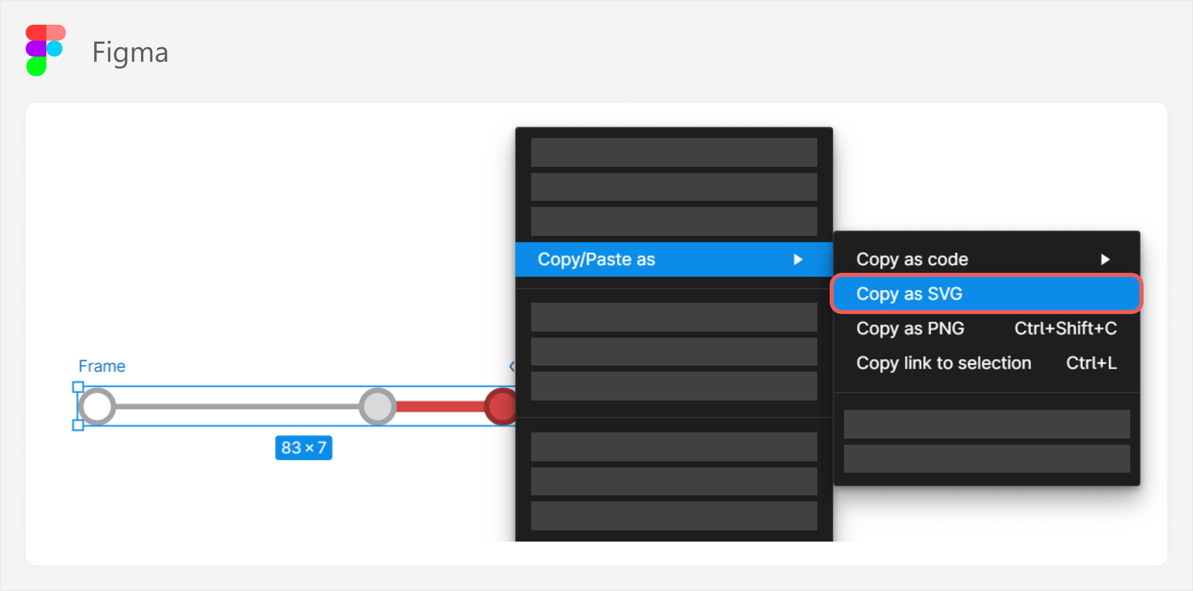
The resulting measure expression with the SVG specification is as follows:
1 2 3 4 5 6 7 8 | Timeline SVG ="<svg width="125" height="7" viewBox="0 0 125 7" fill="none" xmlns="http://www.w3.org/2000/svg"><line x1="0" y1="3.5" x2="100" y2="3.5" stroke="#A3A3A3"/><circle cx="3.5" cy="3.5" r="3" fill="white" stroke="#A3A3A3"/><line x1="100" y1="3.5" x2="120" y2="3.5" stroke="#D64444" stroke-width="2"/><circle cx="100" cy="3.5" r="3" fill="#D9D9D9" stroke="#A3A3A3"/><circle cx="120" cy="3.5" r="3" fill="#D64444" stroke="#982F2F"/></svg>" |
Currently, this measure will not render in a table or matrix visual. We need to first adjust the SVG specification so that it is a valid string, meaning that we escape the double quotes, add the prefix, and remove some unnecessary elements like viewBox, and fill, which are not required to render the image.
We can also optionally make the SVG specification easier to read. This will help in the next step when we add dynamic values. We break apart each vector to their own variable, and also set variables for important values, like positions, color, and height. When adding these variables back to the specification, we have to replace part of the string (the substring) with ” & _TheVariable & “. Doing this generally makes the visual easier to change and maintain.
The resulting measure with the string looks as follows:
1 2 3 4 5 6 7 8 9 10 11 12 13 14 15 16 17 18 19 20 21 22 23 24 25 | Timeline SVG (With Variables; Not Dynamic) =VAR _SvgWidth = 75VAR _SvgHeight = 7VAR _AxisMax = _SvgWidth / 2VAR _OnTargetFill = "#448FD6" -- BlueVAR _OnTargetStroke = "#2F6698" -- Dark BlueVAR _OffTargetFill = "#D64444" -- RedVAR _OffTargetStroke = "#982F2F"-- Dark RedVAR _SvgPrefix = "data:image/svg+xml;utf8, " -- Required to parse the result as an imageVAR _SvgSuffix = "</svg>"VAR _Background = "<svg width=""" & _SvgWidth & """ height=""" & _SvgHeight & """ xmlns=""http://www.w3.org/2000/svg"">"VAR _Axis = "<line x1=""0"" y1=""" & _SvgHeight / 2 & """ x2=""" & _AxisMax & """ y2=""3.5"" stroke=""#A3A3A3""/>"VAR _Origin = "<circle cx=""" & _SvgHeight / 2 & """ cy=""" & _SvgHeight / 2 & """ r=""3"" fill=""white"" stroke=""#A3A3A3""/>"VAR _DumbbellLine = "<line x1=""" & _AxisMax & """ y1=""" & _SvgHeight / 2 & """ x2=""25"" y2=""" & _SvgHeight / 2 & """ stroke=""" & _OnTargetFill & """ stroke-width=""2""/>"VAR _TargetIndicator = "<circle cx=""" & _AxisMax & """ cy=""" & _SvgHeight / 2 & """ r=""3"" fill=""#D9D9D9"" stroke=""#A3A3A3""/>"VAR _ActualCircle = "<circle cx=""25"" cy=""" & _SvgHeight / 2 & """ r=""3"" fill=""" & _OnTargetFill & """ stroke=""" & _OnTargetStroke & """/>"VAR _Svg = _SvgPrefix & _Background & _Axis & _Origin & _DumbbellLine & _TargetIndicator & _ActualCircle & _SvgSuffixRETURN _Svg |
As you can see, even when breaking apart the SVG specification, it gets quite complicated and difficult to read. We will go more into why this complexity can be problematic later in the article.
For now, the image now renders in a matrix, but repeats for each row.
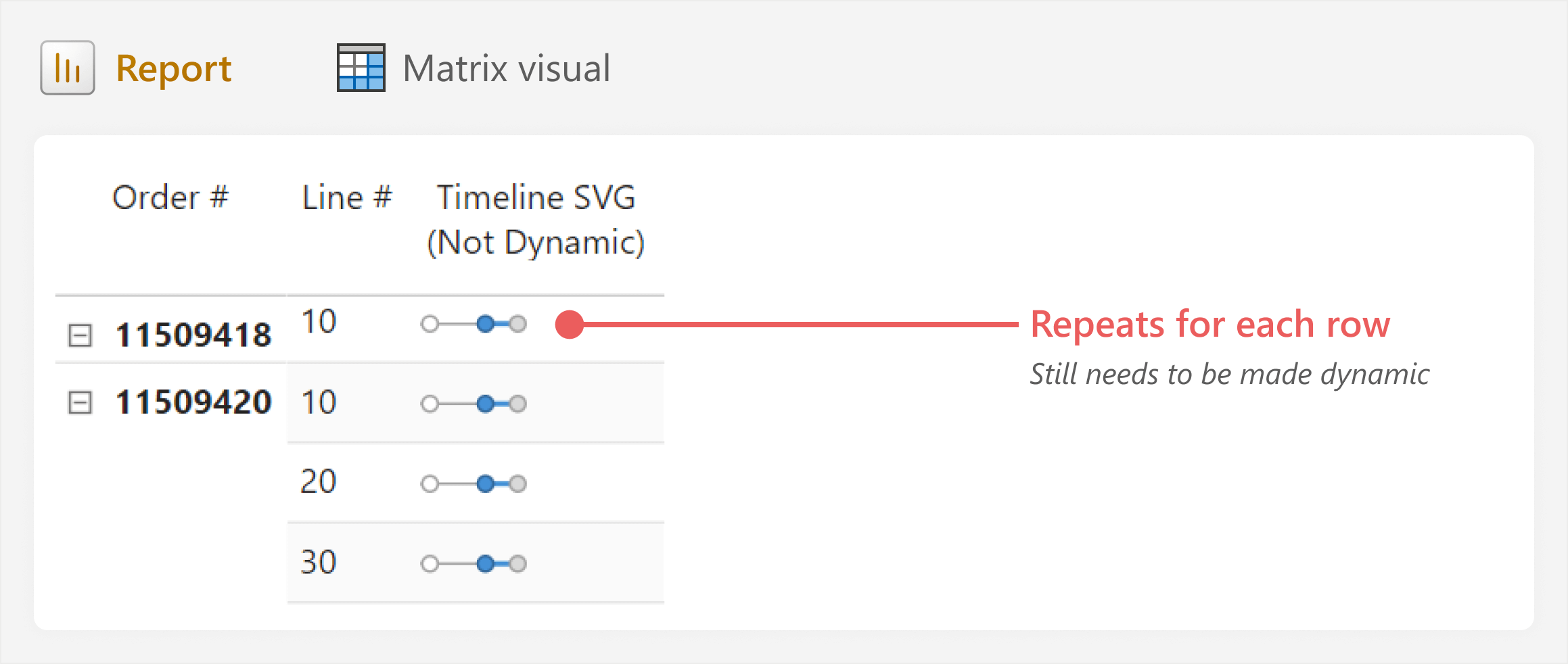
To convert the static SVG image to a data-driven visualization, we need to use DAX to replace parts of the string with dynamic values.
Making the SVG dynamic with DAX
The SVG specification defines various properties that in turn, define the position, length, and size of each vector. Currently, these properties are static and hard-coded in the SVG string. To make our visual, we replace these static values with ones that are dynamically evaluated.
In this case, our visual is designed to show several different data points. We create several measures to compute this. First, the Days to Delivery, which is what we measure:
1 2 3 4 5 | Days to Delivery = AVERAGEX( 'Orders', DATEDIFF ( 'Orders'[Confirmed Goods Receipt Date], 'Orders'[Order Date], DAY ) ) |
And next the Days to Requested Delivery, which is the target:
1 2 3 4 5 | Days to Requested Delivery = AVERAGEX( 'Orders', DATEDIFF ( 'Orders'[Requested Goods Delivery Date], 'Orders'[Order Date], DAY ) ) |
We next want to add these measures to the SVG, using them to define the position of each circle, the length of the lines, and the conditional formatting:
1 2 3 4 5 6 7 8 9 10 11 12 13 14 15 16 17 18 19 20 21 22 23 24 25 26 27 28 29 30 31 32 33 34 35 36 37 38 39 40 41 42 43 44 45 46 47 48 49 50 51 52 53 54 55 56 57 58 59 60 61 62 63 64 65 66 67 68 69 70 71 72 73 74 75 76 77 78 79 80 81 82 83 84 85 86 87 88 89 90 | Timeline SVG (Intermediate) =-- Measures used in the custom SVG visualVAR _Actual = [Days to Deliver]VAR _Target = [Days to Requested Delivery]-- SVG size and absolute position configurationVAR _SvgWidth = 75VAR _SvgHeight = 20VAR _AxisMax = _SvgWidth / 2 -- Position of the target along the X-axis-- Conditional formatting configurationVAR _OffTargetFill = "#D64444" -- RedVAR _OnTargetFill = "#448FD6" -- BlueVAR _Fill = IF ( _Actual > _Target, _OffTargetFill, _OnTargetFill )VAR _OffTargetStroke = "#982F2F" -- Dark RedVAR _OnTargetStroke = "#2F6698" -- Dark BlueVAR _Stroke = IF ( _Actual > _Target, _OffTargetStroke, _OnTargetStroke )-- Determining the position of the actuals relative to the targetVAR _ActualPosition = (DIVIDE ( _Actual, _Target ) * _AxisMax) + 5-- SVG prefix and suffixesVAR _SvgPrefix = "data:image/svg+xml;utf8, <svg width=""" & _SvgWidth & """ height=""" & _SvgHeight & """ xmlns=""http://www.w3.org/2000/svg"">"VAR _SvgSuffix = "</svg>"-- VectorsVAR _Timeline = "<line x1=""5"" y1=""" & _SvgHeight / 2 & """ x2=""" & _AxisMax & """ y2=""" & _SvgHeight / 2 & """ stroke=""#A3A3A3""/>"VAR _Origin = -- Order Date "<circle cx=""5"" cy=""" & _SvgHeight / 2 & """ r=""3"" fill=""white"" stroke=""#A3A3A3""/>"VAR _Variance = "<line x1=""" & _AxisMax & -- Between the target """ y1=""" & _SvgHeight / 2 & """ x2=""" & _ActualPosition & -- ...to the actuals """ y2=""" & _SvgHeight / 2 & """ stroke=""" & _Stroke & """ stroke-width=""2""/>"VAR _TargetIndicator = "<circle cx=""" & _AxisMax & """ cy=""" & _SvgHeight / 2 & """ r=""3"" fill=""#D9D9D9"" stroke=""#A3A3A3""/>"VAR _ActualCircle = "<circle cx=""" & _ActualPosition & """ cy=""" & _SvgHeight / 2 & """ r=""3"" fill=""" & _Fill & """ stroke=""" & _Stroke & """/>"VAR _Svg = _SvgPrefix & _Timeline & _Origin & _Variance & _TargetIndicator & _ActualCircle & _SvgSuffixRETURN _Svg |
The resulting visual now dynamically displays how early or late each order line is, relative to its own Request Goods Receipt Date.
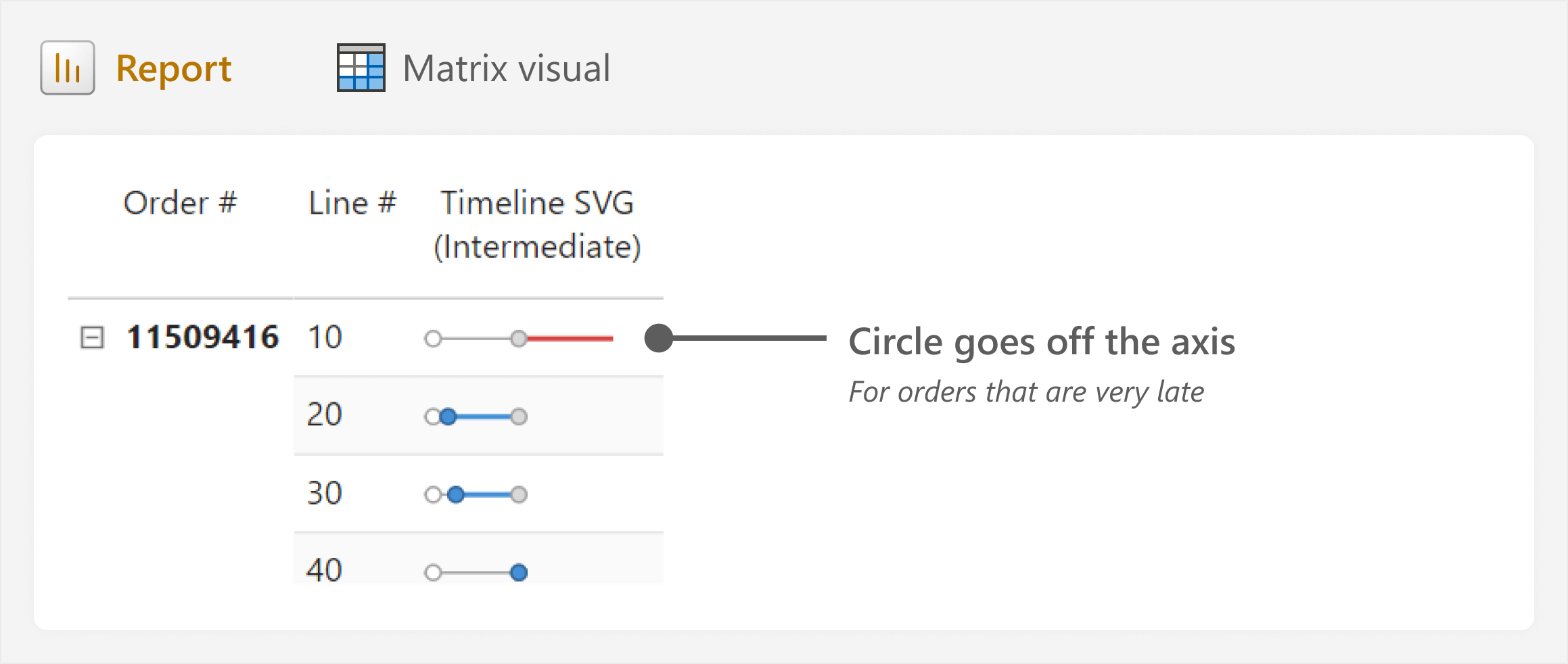
The visual already looks quite good. However, there are exceptional cases where the lines stretch beyond the bounds of the image. When designing visuals, this is common: upon implementation, the visual is used on data that often contains quirks and oddities that you could not anticipate during the design. Here, we have two cases that we need to handle:
- Orders that have not yet shipped or delivered: For these orders, we add a condition: When the Ship Date or the Confirm Goods Receipt Date are empty (determined in the Order Status measure), we visualize Days in Progress instead of Days to Deliver (since the order has not been delivered).
- Orders that are exceptionally late: For these orders, we cap the maximum possible value, adding an arrow at the right-most position to visually indicate that the real value goes beyond the range.
This provides the final code for our custom SVG visual (excluded here for brevity since the code is long, but you can find the final code in the sample files). The resulting visual now appears as expected.
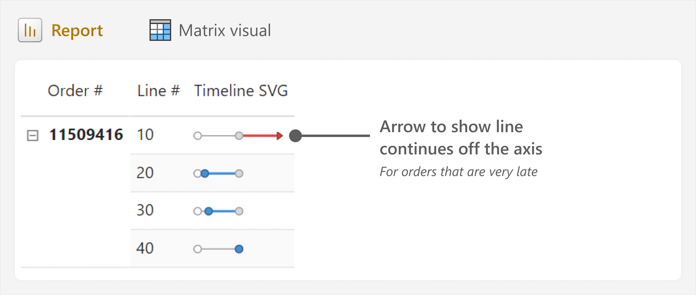
From here, you might try yourself to make some additional changes or improvements to the visual:
- Changing the visual from relative to absolute days on time or late.
- Adding labels (dates or the difference between them).
- Adding additional data points or lines (like the ship date).
In the sample files, you can find a C# script for Tabular Editor to add this visual to your own reports, as it prompts you to select the actual and target that you intend to compare.
Before you get too far, though, it is time to pump the brakes. We need to consider the cost of this approach and what it will mean for us to use and maintain it moving forward.
Caveats and concerns about SVG custom visuals in measures
As you can see, to achieve this result, the DAX measure defining the SVG becomes long, complex, and painful to read or change. Without commenting and documenting this code, it will be difficult to maintain. Furthermore, as complexity increases, the chance of bugs and performance issues also increases.
Aside from the added complexity, another concern for this approach is where this “SVG measure” should reside. A DAX measure like this does not belong in a semantic model. It supports a single visual requirement, and cannot be used outside of this context. We have discussed this concern in previous articles, and weighed the consideration of including such report-specific objects in either thin-reports (such as report measures) or composite models. However, both of these alternatives have their caveats.
At the very least, SVG measures should be isolated from the rest of the model, in their own measure tables, and hidden. If you manage the model using Tabular Editor, you can also enable the Private property for this measure table to ensure that the measure cannot be viewed in client tools or DAX autocomplete. This is a good choice when people connect to the model to make their own reports.
These increased costs must be carefully weighed against the potential benefits of using this approach for your report. SVG measures can be valuable and have their use cases… They certainly seem to be more and more prevalent and popular in reports, over time. But pump the brakes… Consider first whether you can achieve a similar result using a simpler, more sustainable approach.
In conclusion
When creating visualizations, you often encounter scenarios where you need additional flexibility and customization. In these cases, you might opt for one of six different ways to make a custom visual, like dynamic SVGs in DAX measures. Designing these SVGs is trivial by using tools like Figma, but the specifications and DAX can quickly become complex, and they can pollute a semantic model. It is important to be aware that these options exist in your toolbelt for when you need them.
However, you must keep in mind that the ultimate purpose of a Power BI report is to be useful and not only to look nice. If you can create a useful report using more straightforward means, then you probably should do so.
 Kurt Buhler
 Copy
Copy Conventions