Topic: Data visualization
-
This article is about a process to use AI tools like LLMs to create custom visuals in Power BI, and how this still requires deliberate thought, planning, and learning. Read more
-
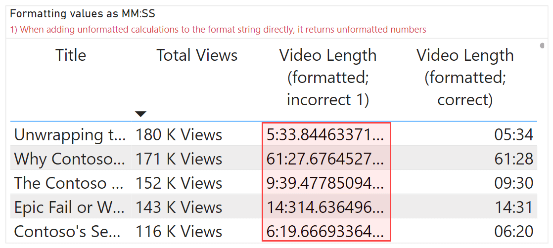
This article describes the different approaches to format your DAX measures in Power BI semantic models using custom and dynamic format strings. Read more
-
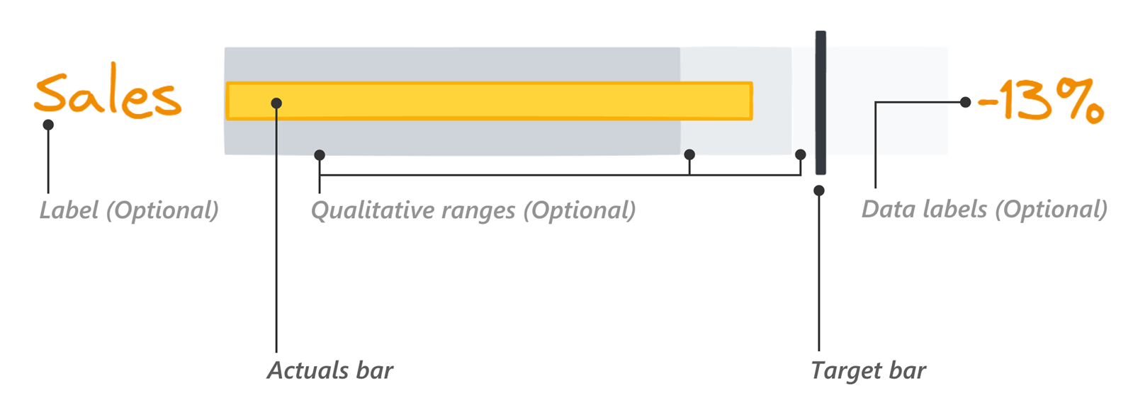
This article is about how to read and use bullet charts when comparing actuals to a target in Power BI, and the different options you have available to make these charts in Power BI reports. Read more
-
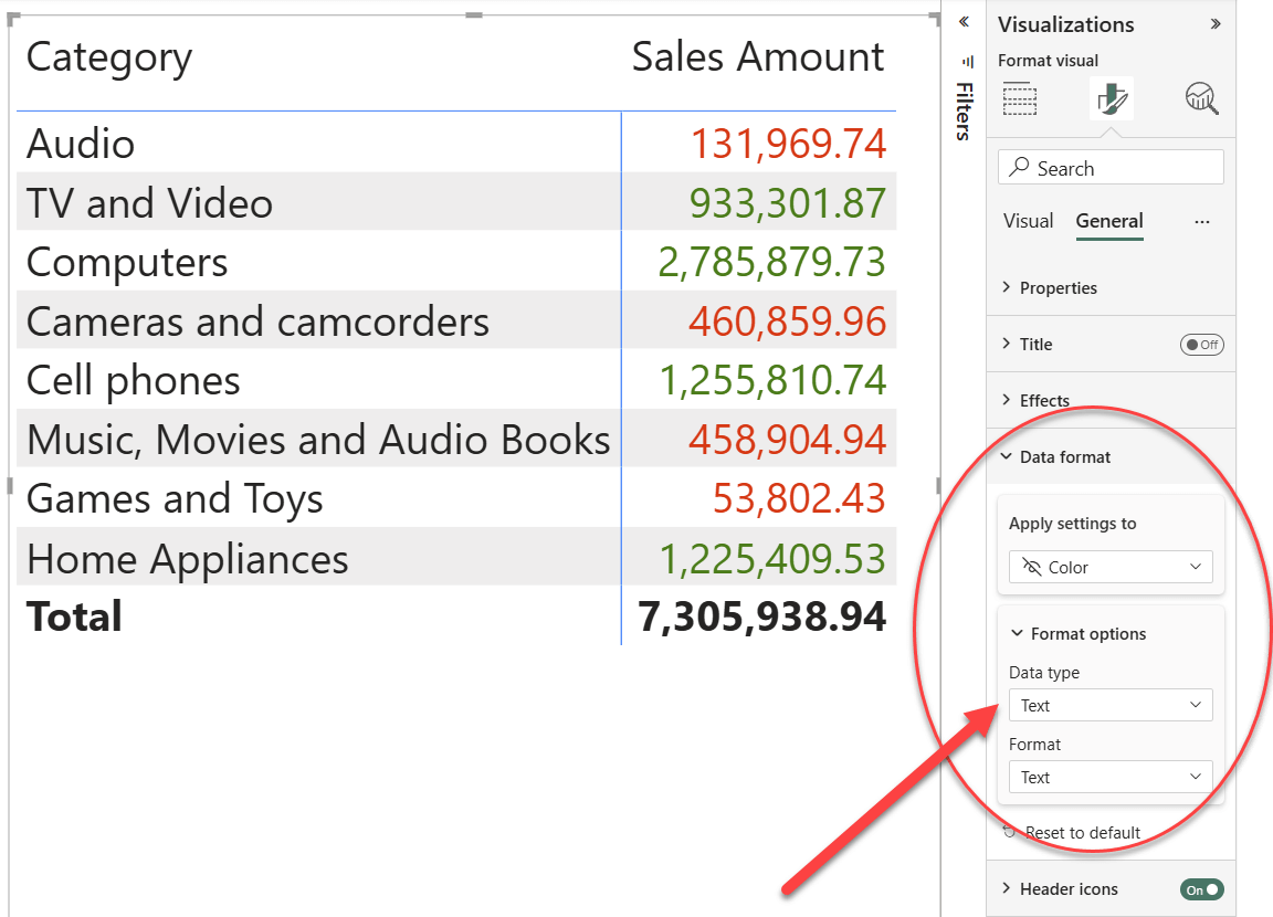
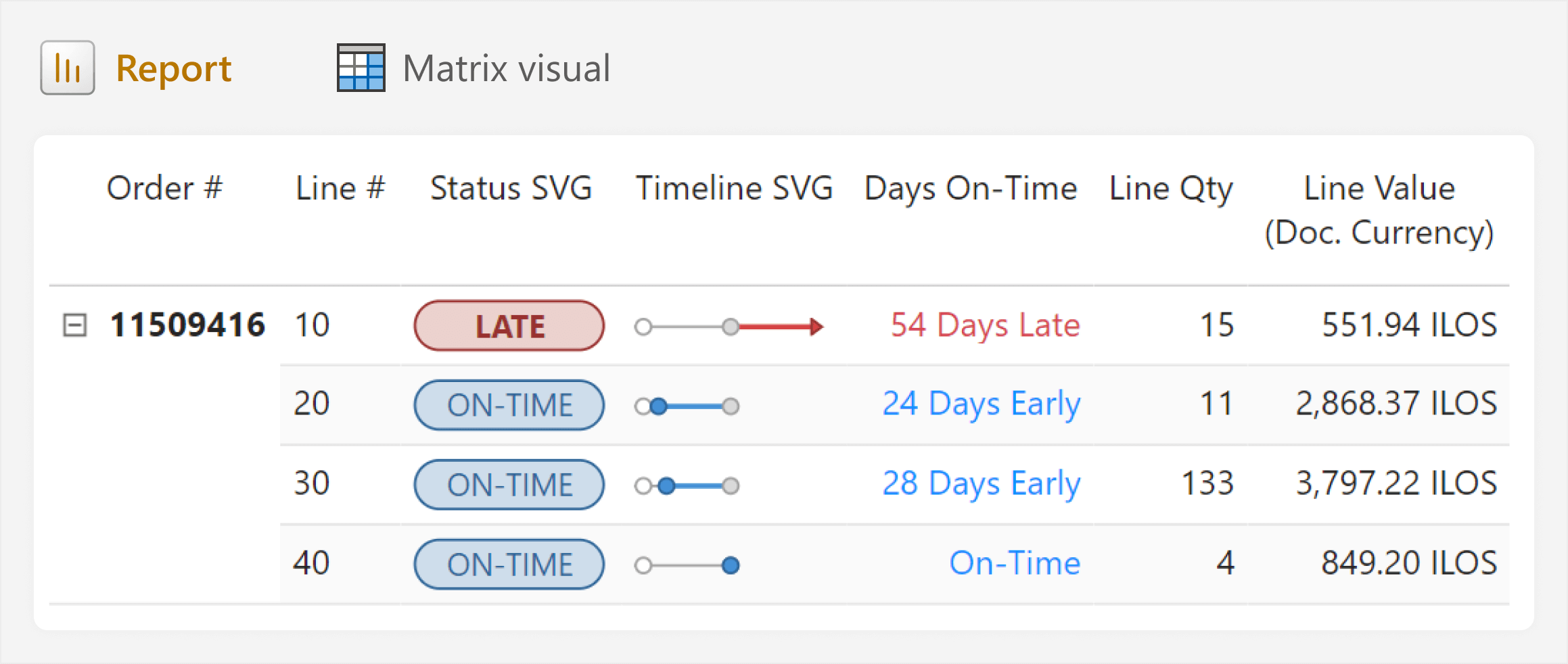
Visual calculations are useful for performing calculations specific to a visual. Conditional formatting is a great example of this concept. In this article, we show how to easily implement conditional formatting through visual calculations. Read more
-
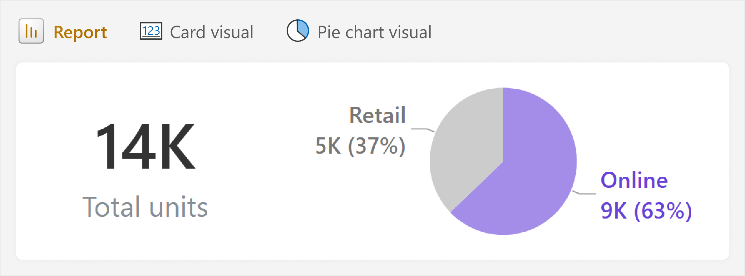
This article is about how rules like “avoid pie charts” can be useful for beginners, but also unhelpful in real-world scenarios with more nuance. Instead of learning rules about “how”, try to understand the “why”. Read more
-
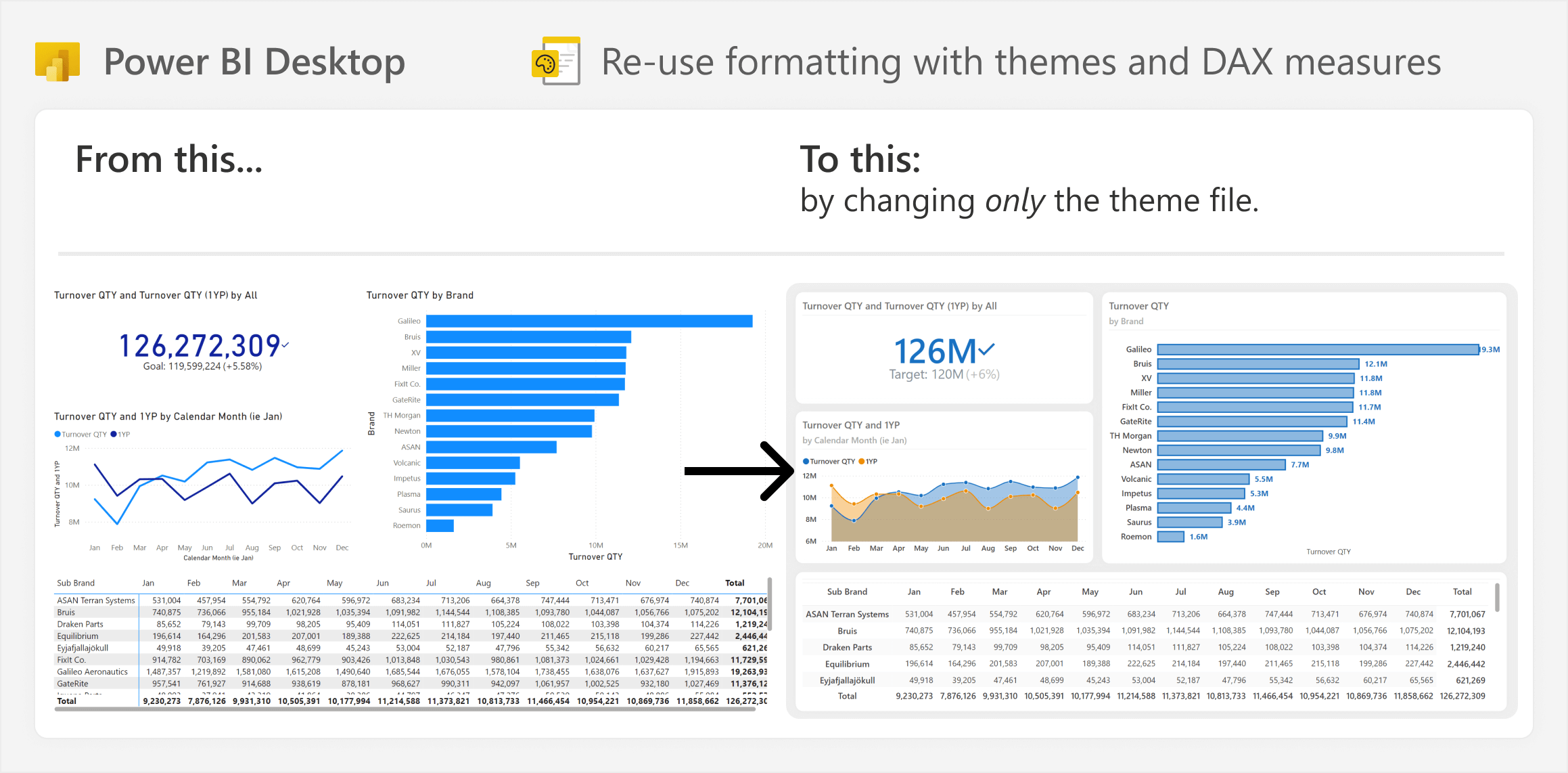
This article is about how you can save time when building and maintaining Power BI reports by using strategies to re-use visual formatting. Read more
-
This article is about creating dynamic images in DAX measures to visualize data in tables or cards, including an easy way to do this in Figma, and a caution for using these DAX measures in real-life scenarios. Read more
-
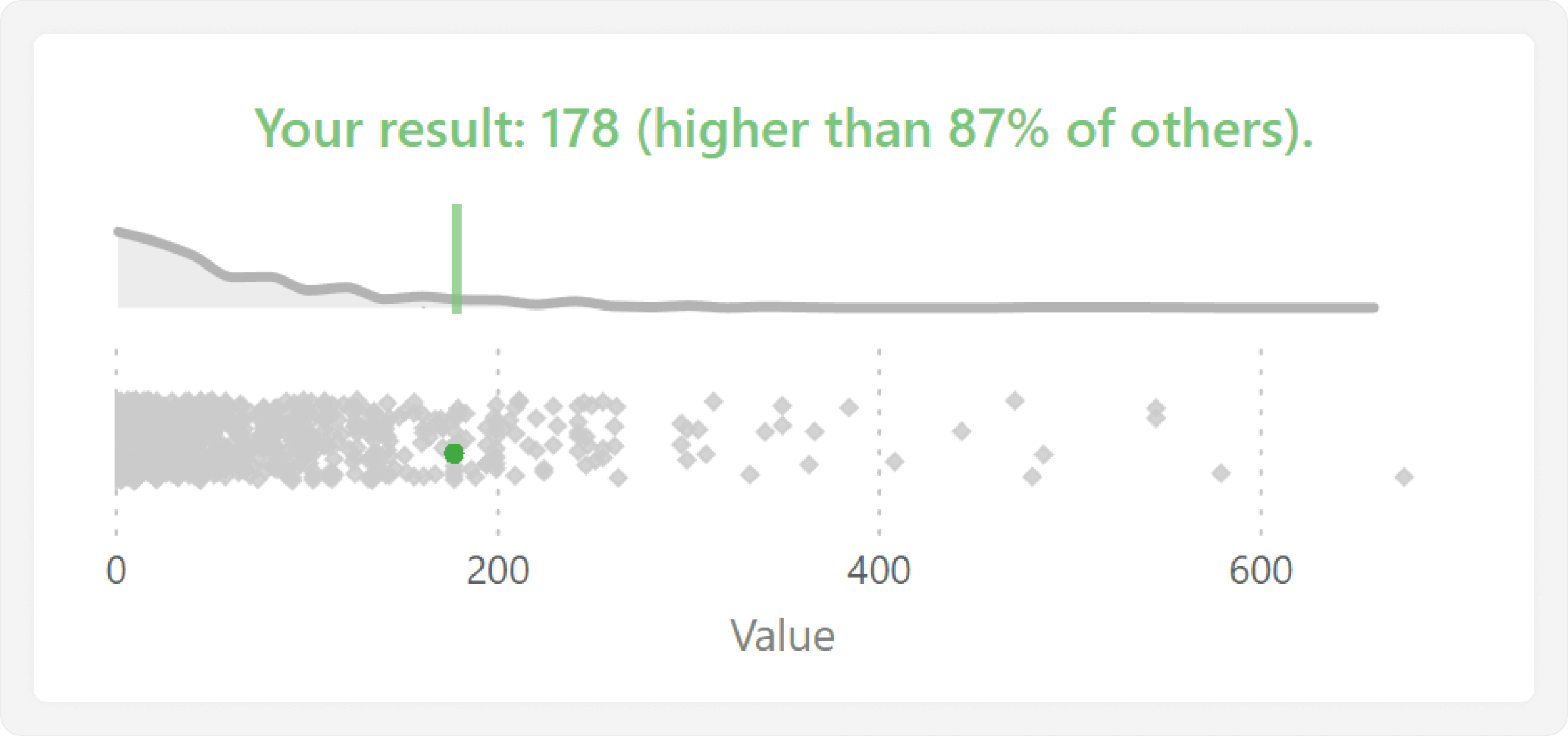
This article shows how you can highlight a single value in visual when comparing the distribution of a measure for one value versus all others. Read more
-
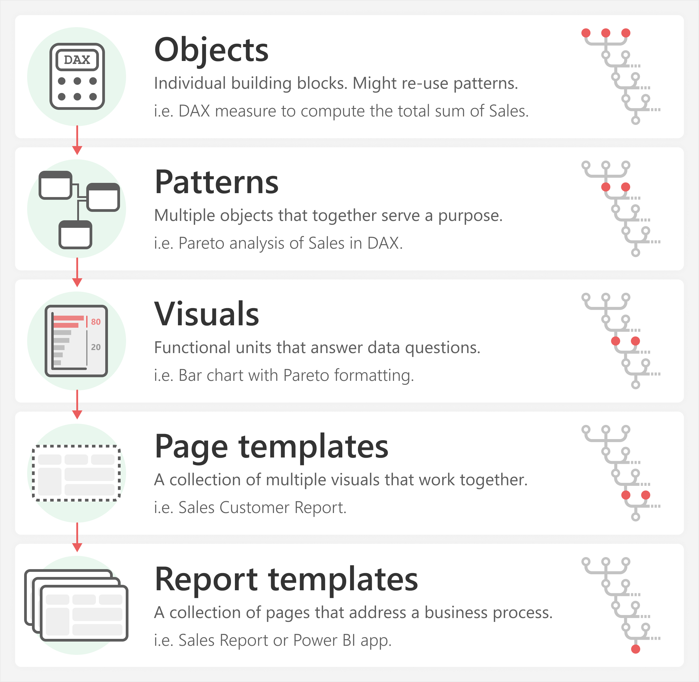
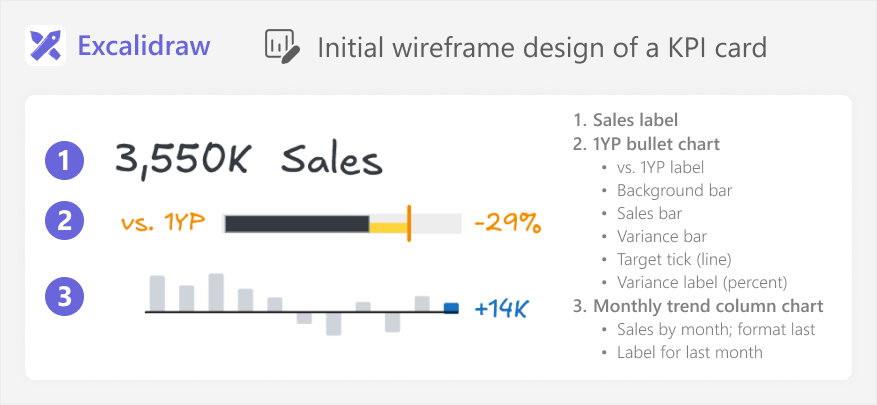
This article introduces the ‘atomic design methodology’ as an approach to make Power BI development more efficient and repeatable. Read more
-
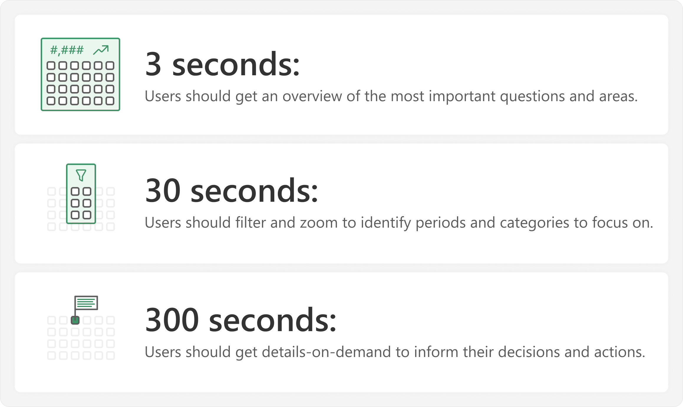
This article describes a simple approach that you can apply to improve your reports and dashboards. Read more